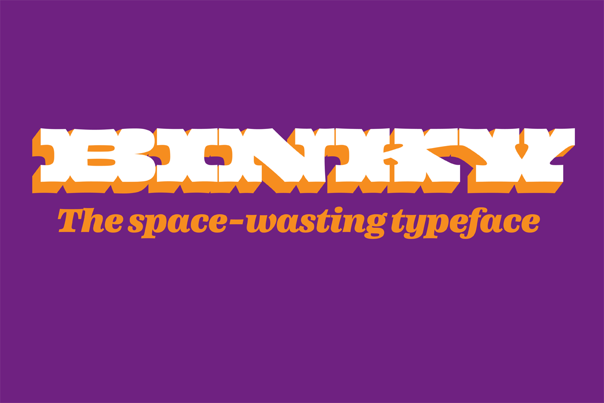
Binky process
My final project deals with combining wood type inspired display styles with more regular text styles. The display styles have very exaggerated proportions, forms and weight while the text styles share some key features with them in a more subtle way. One of the questions I was trying to answer with my project is how different can the display and text styles be while still belonging to the same family.
Design space
I started off with a hand drawn chart which helped me to define my design space. I knew I wanted to design a family with different proportion to those I was used to, and that I wanted to combine display and text styles. Using the chart allowed me to figure out weight and width relationships that the styles would have.
The chart I used to define my design space
First ideas
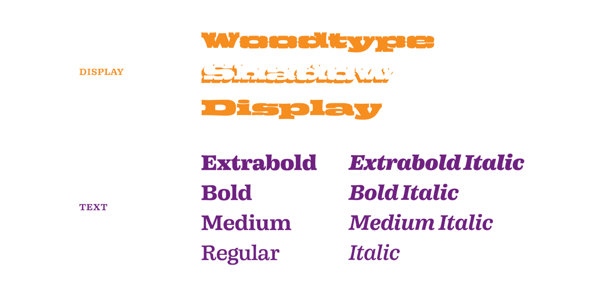
My first ideas all tried to combine condensed and extended styles into one family. The final family plan is a combination of ideas #2 and #3, with the condensed styles dropped out. I did this in order to have more time to focus on the text family, which needed more styles than two in order to be useful as a typographic tool. I still want to add the condensed style in the future.
Three preliminary family plans I presented in January
Searching the aesthetics
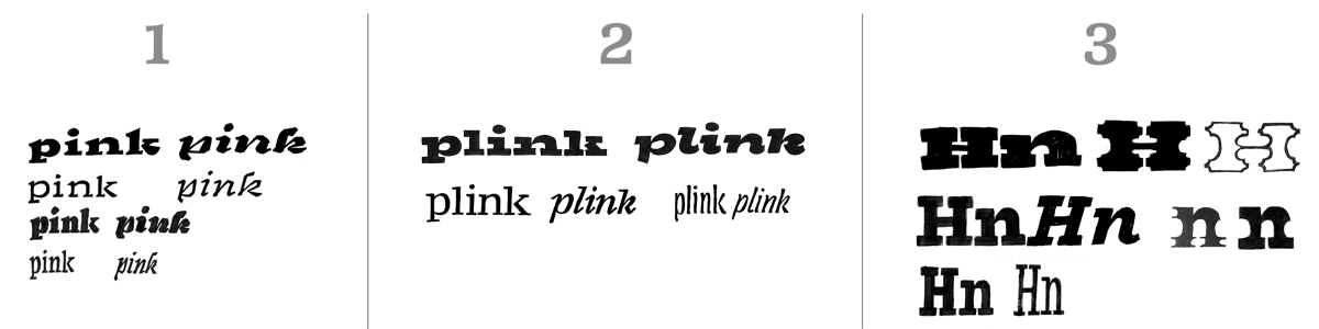
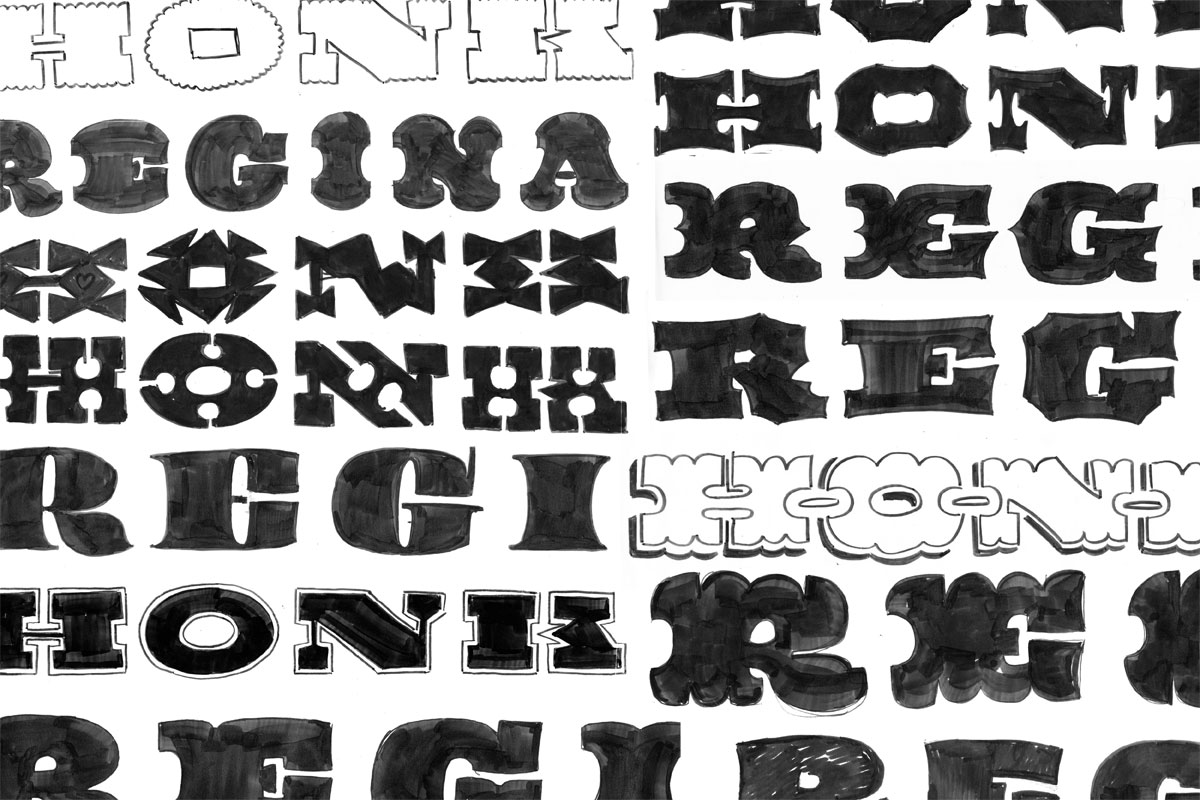
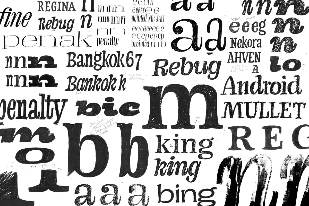
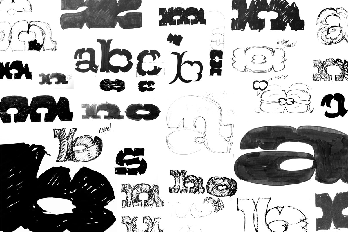
My main method of generating ideas and designing the family was by doing a lot of hand drawn sketches. After I had settled on a rough plan of what I wanted to do, I started searching for a more clear aesthetics for the family. I started with the display styles because I wanted those to dictate the key features of the text family as well. The possibilities of wood type seemed endless and I did a lot of sketching and experimenting to define what I wanted to do. I happily bloated and distorted the letterforms on the road to find a style and aesthetic that I liked.
Sketches for the display style
Sketches for the text styles
Refining the family plan
I was somehow drawn to a Tuscan like construction in the display style and also liked the look of concave stems. I also tried different serif and stem treatments in order to figure out what would work and give me the look I wanted. I tried split serifs directly derived from the Tuscan sketch, convex stems and differently distorted solutions. In the end I decided to emphasise the concaveness that I liked so much, and used it in the serifs as well.
The final family plan which I started refining
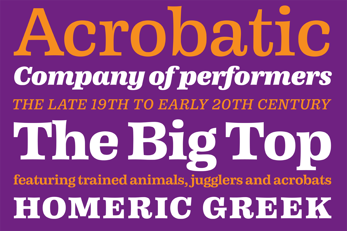
Text family
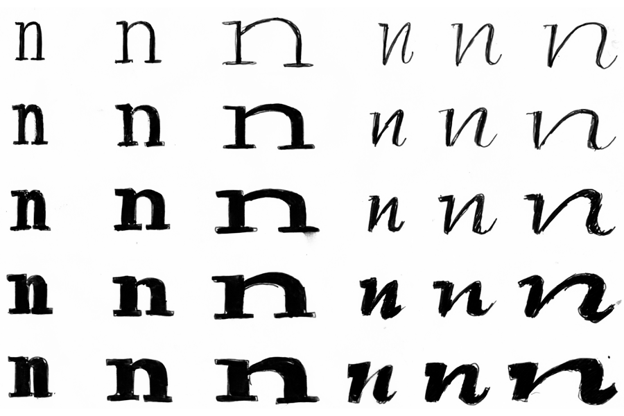
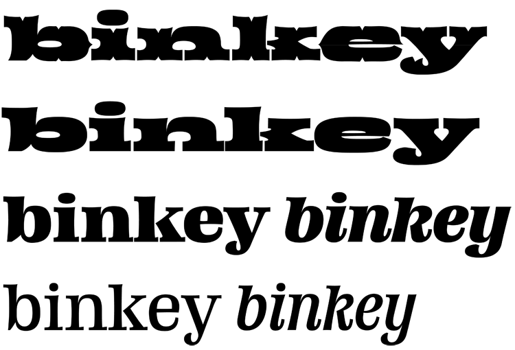
After the aesthetic direction was clear I begun working on the text styles starting from the regular. I first drew an extremely light and a very bold version using only the letters b, e, i, n, k and y. This was a good set of characters because it included a round and straight letter, ascenders and a descender as well as a diagonal shape. From the light and bold extremes I interpolated multiple instances and took test prints of these. Like this I was able to accurately define the weight of my regular style. I did the same treatment to the width and contrast of the regular style as well and after this started working on the extra bold master and italics using the same method.
Test prints of interpolated instances
Display family
I was working on the display styles in tandem with the text family. I first drew the clean display style, which thought me how to deal with exaggeratedly extended forms and extreme weights. Unsurprisingly there was a lot of optical adjustments that had to be made in order make the letters work together. At times I felt quite lost since I couldn’t rely much on measurements, but instead had to judge most things by eye and feel. Some letters needed to be made wider or narrower than I thought in order to make them fit each other.
Sketches for the display style
Tricky business
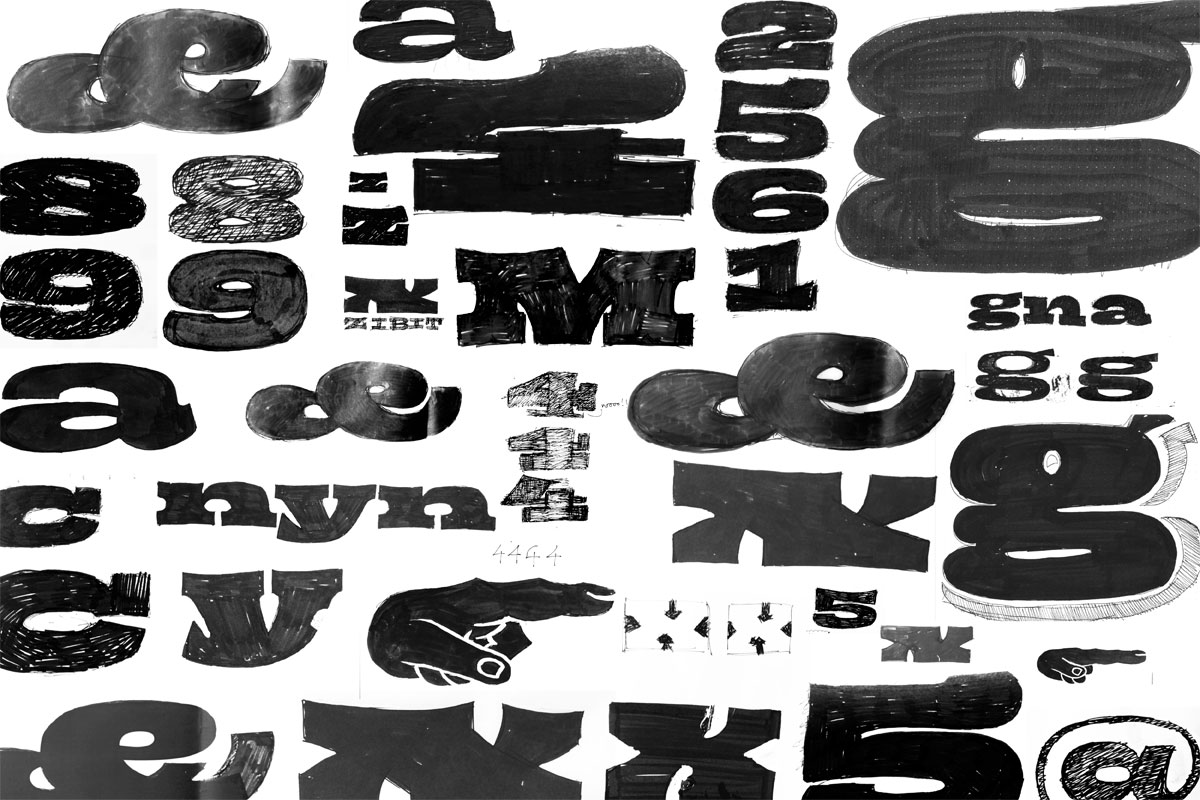
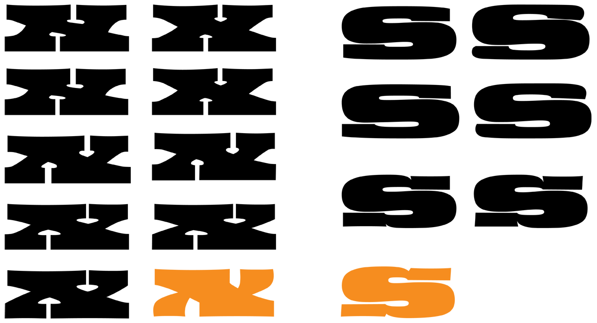
Some letters proved to be extremely difficult to figure out. Especially the x of the display style went through many revisions during the design process. The final version seems rather obvious now, but it took some time to get there. One of the biggest challenges of the display style was to get the overall blackness of the letters appear equal. Because of this some letters needed to have very thin parts, such as the e and s, even though the general contrast of the style is rather low.
Evolution of the letters x and s
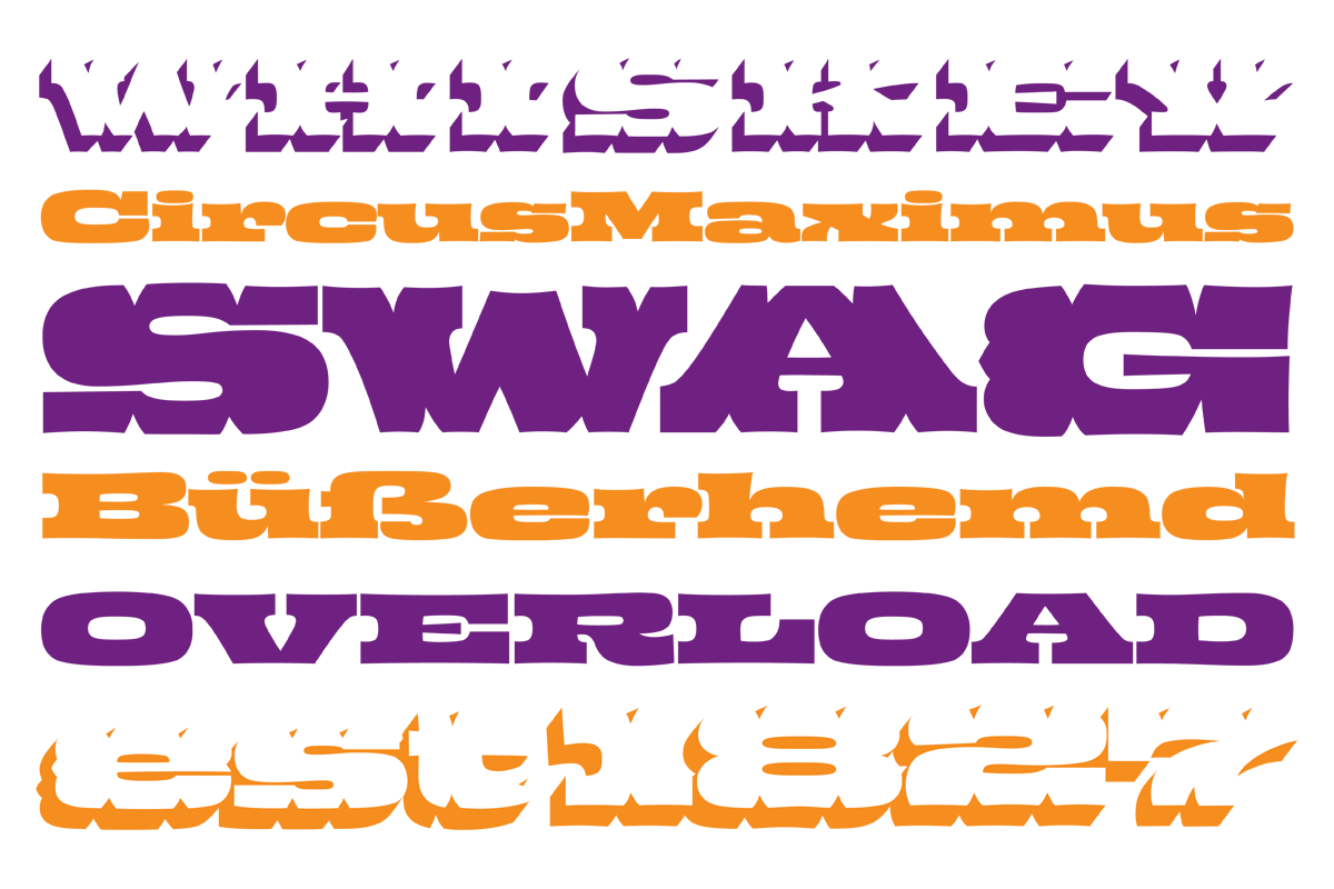
Woodtype
I originally thought that the wood type style would work just by adding some cuts to the display version. Of course this proved to be a totally wrong assumption. The wood type style needed it’s own treatment and logic completely. I had to do a lot of experiments in order to figure out how and where to put the cuts and how to tweak the letterforms in order to make them work.
Sketching the wood type version
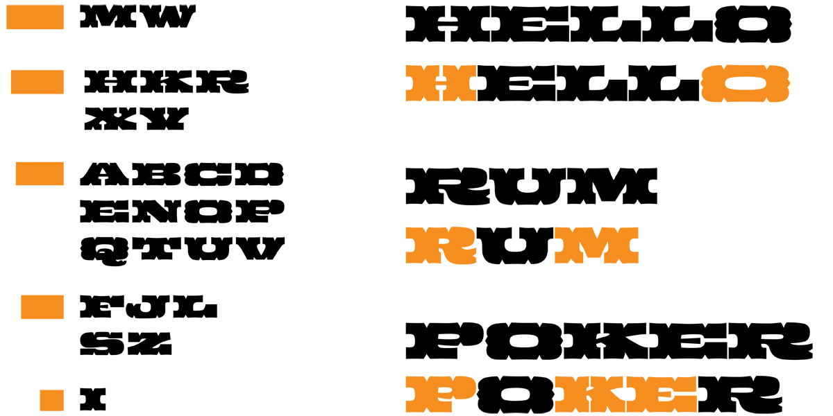
As a nod to the wood type tradition I designed a proportion system made out of “blocks of wood”. These blocks I used to define how wide or narrow the letters should be. To my surprise, the overall feel and flow of the style didn’t change much after forcing some letters to their assigned widths.
I also felt that the proportion system could be used for something more than just the default character widths. I started drawing the capital letters in other widths as stylistic sets to mix up the style a little and to make it a bit more lively.
Proportion system