Project overview
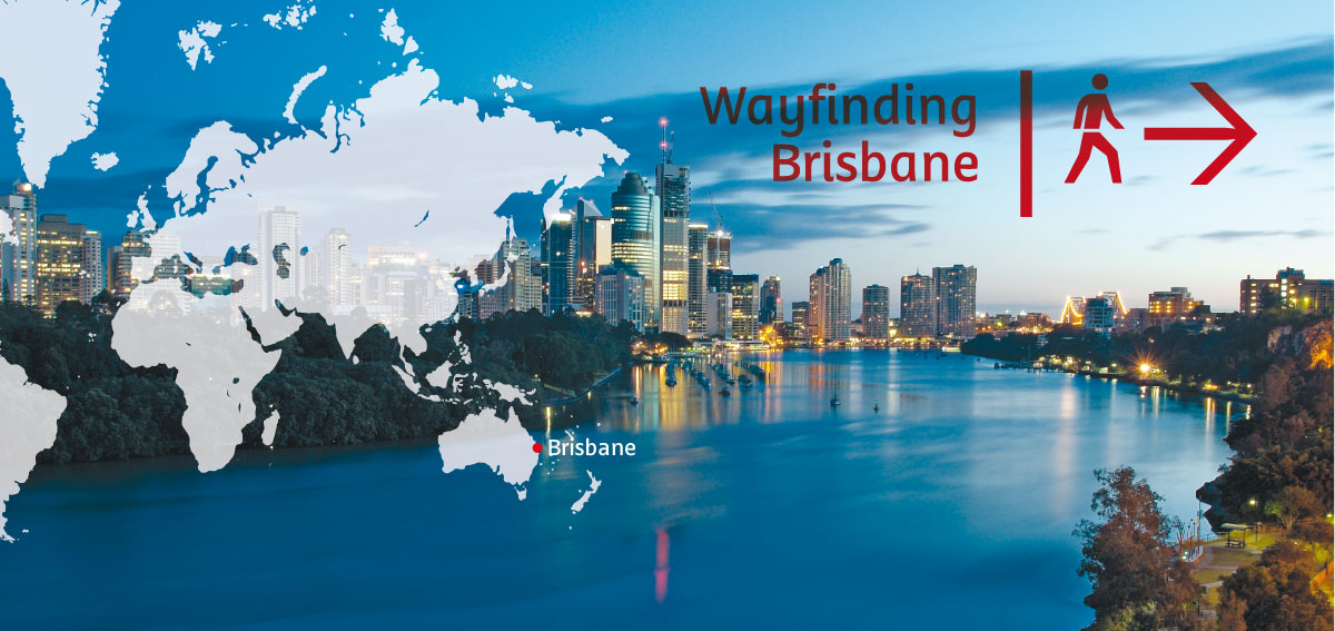
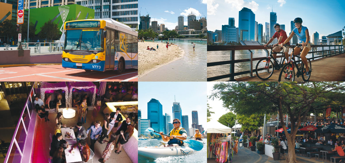
While Brisbane is a highly walkable city with a large amount of foot traffic, it has inconsistent type solutions for it's pedestrian wayfinding signage. This jumble of type styles can complicate getting about, and isn't visually appealing either to residents or visitors.
I saw my final project as an opportunity to design a typeface that could tidy up the various styles currently in use. I also wanted to give Brisbane an extra tool that could assist in differentiating it from other large Australian cities such as Sydney or Melbourne.
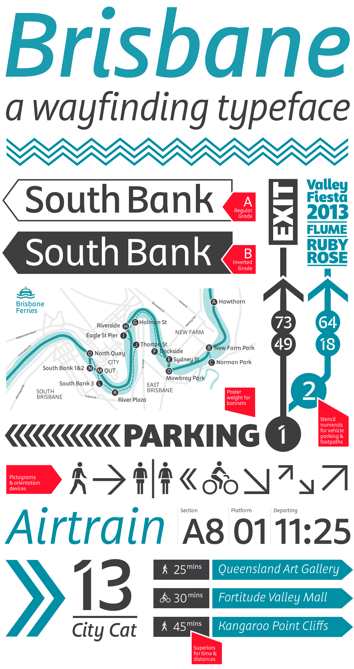
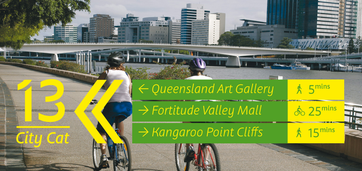
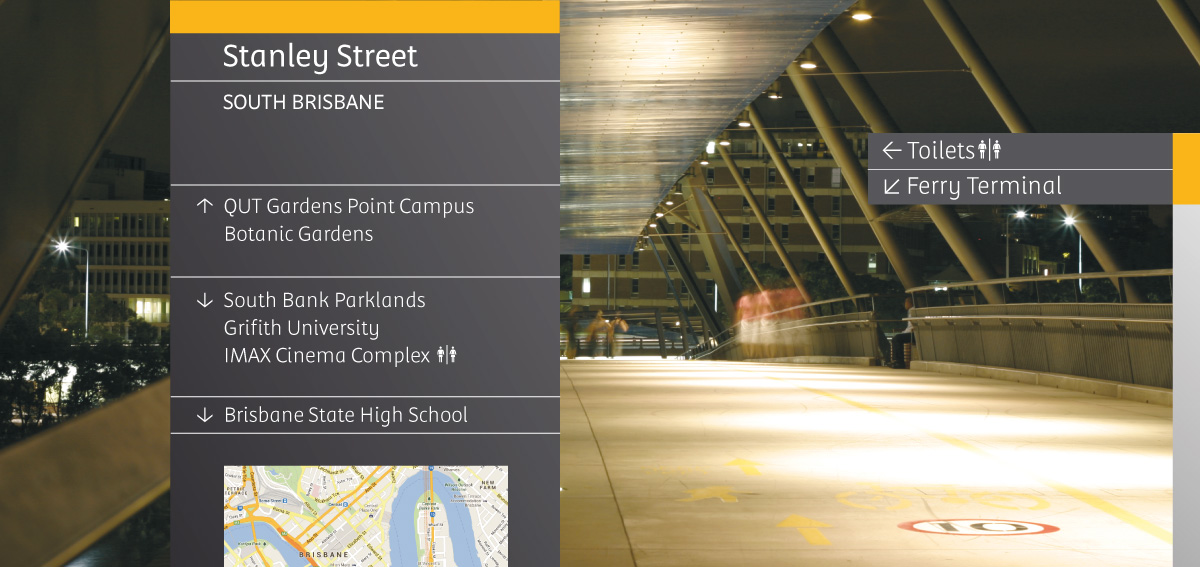
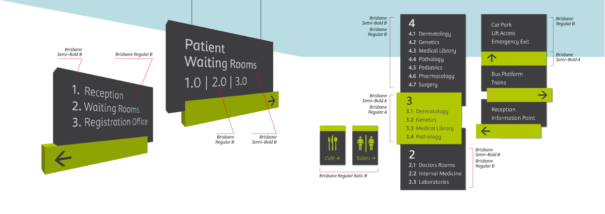
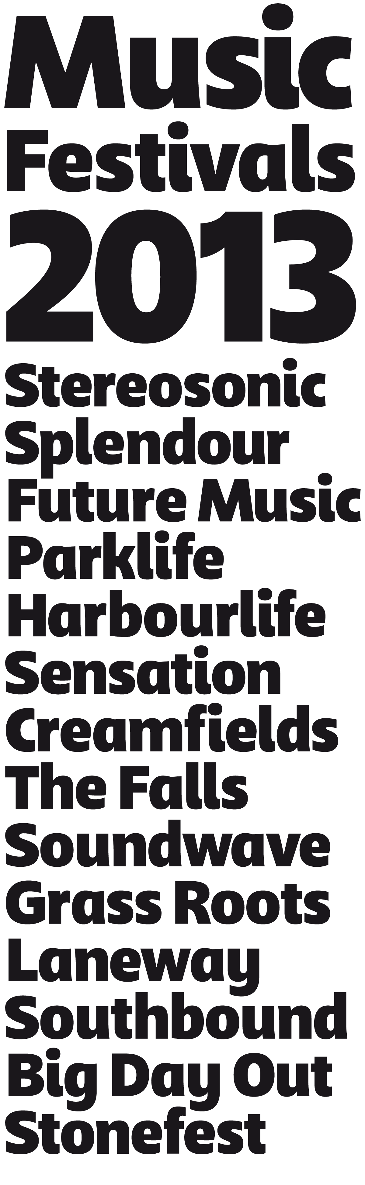
The final typeface can be used in various types of orientation systems including public transport, shopping malls, health facilities, historical landmarks, and the city's parks & gardens.
Defining Brisbane
Brisbane is a city on the east coast of Australia with a population of around 2.2 million in 2013. It is the capital city of Queensland, which is Australia’s second largest and third-most populous state.
Brisbane’s recorded history dates from 1799, when Matthew Flinders explored Moreton Bay on an expedition from Port Jackson (although the region had long been occupied by the Jagera and Turrbal aboriginal tribes). The town was conceived initially as a penal colony for British convicts sent from Sydney. However, its suitability for fishing, farming, timbering, and other occupations caused it to be opened to free settlement in 1838. The town became a municipality in 1859 and a consolidated metropolitan area in 1924.
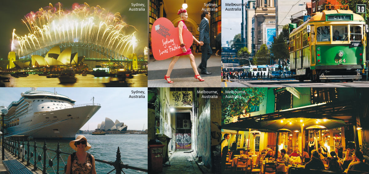
Brisbane shares the east coast of Australia with its more famous siblings, Sydney and Melbourne. The three cities often partake in a healthy rivalry, competing for the spotlight of being the most livable city in Australia.
There are some very distinct differences between these cities, but the characteristics which I believe give Brisbane its distinct flavour are: optimism, ingenuity, cleanliness, its eponymous river, and outdoor lifestyle; as well as the people of Brisbane who are relaxed, unpretentious, and self assured.
BRISBANE IS: optimistic, enterprising, a river city, an outdoor lifestyle, relaxed, unpretentious, self assured and clean.
BRISBANE IS NOT: excessive, in the spotlight, touristy, glitsy, hipster, european, grungy, mysterious
Identifying the typeface attributes
After identifying for myself the differences between Brisbane and the other two cities, I translated these defining factors into a list of stylistic and functional attributes.
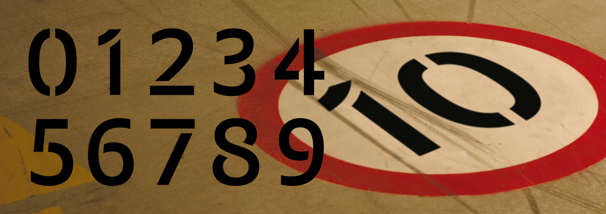
Functional requirements: Narrow, large x-height, low cap height, open counters, distinctive forms.
Stylistic attributes: Open, regular-low contrast, translation contrast model, sans serif, sturdy curves, relaxed single story ‘a’ and ‘g’.
It’s not: Brushy or soft, traditional or serif, high contrast or angular.
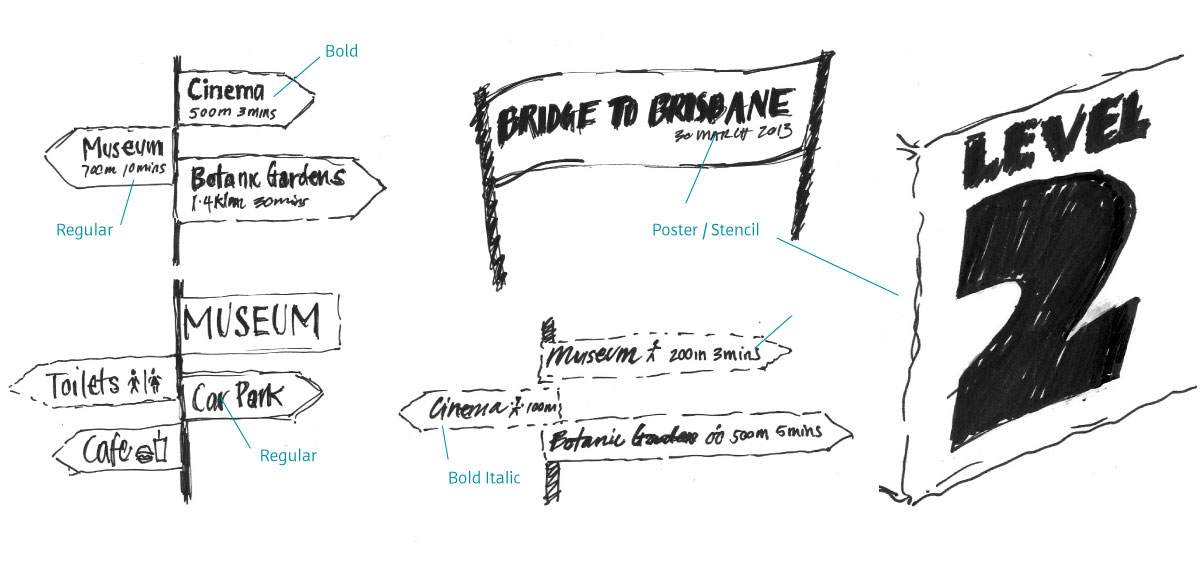
Proposed styles: Regular+italic, bold+italic, poster or stencil, pictograms, inverted versions.
Family planning
My proposed typeface family members included five masters and four interpolations.
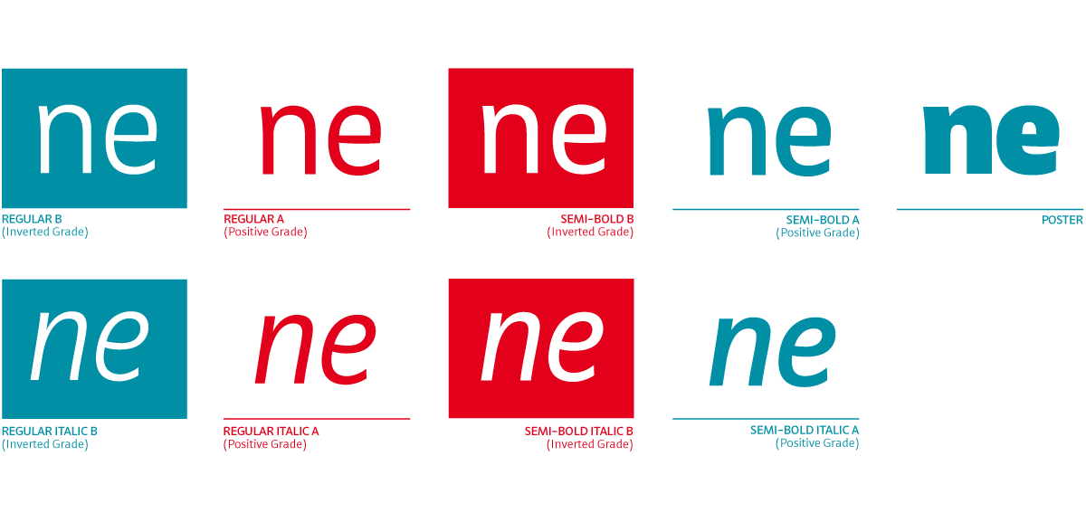
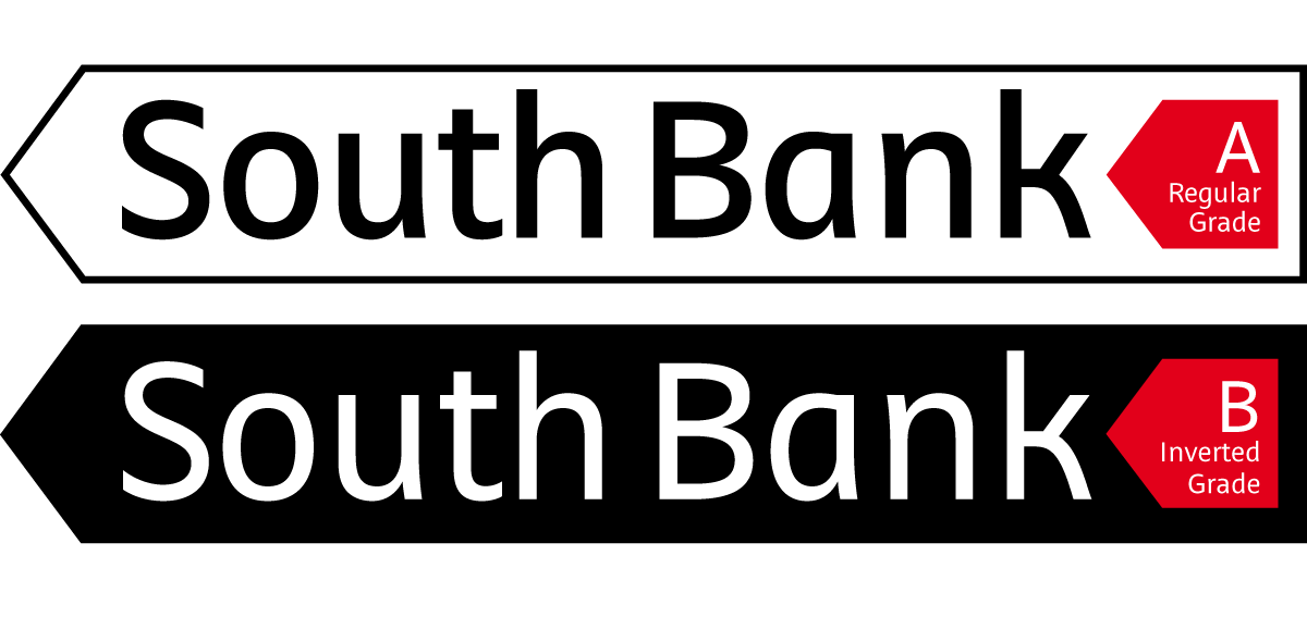
A = Positive Grade, for use on light coloured backgrounds.
B = Inverted Grade, for use on dark coloured backgrounds.
The inverted grades
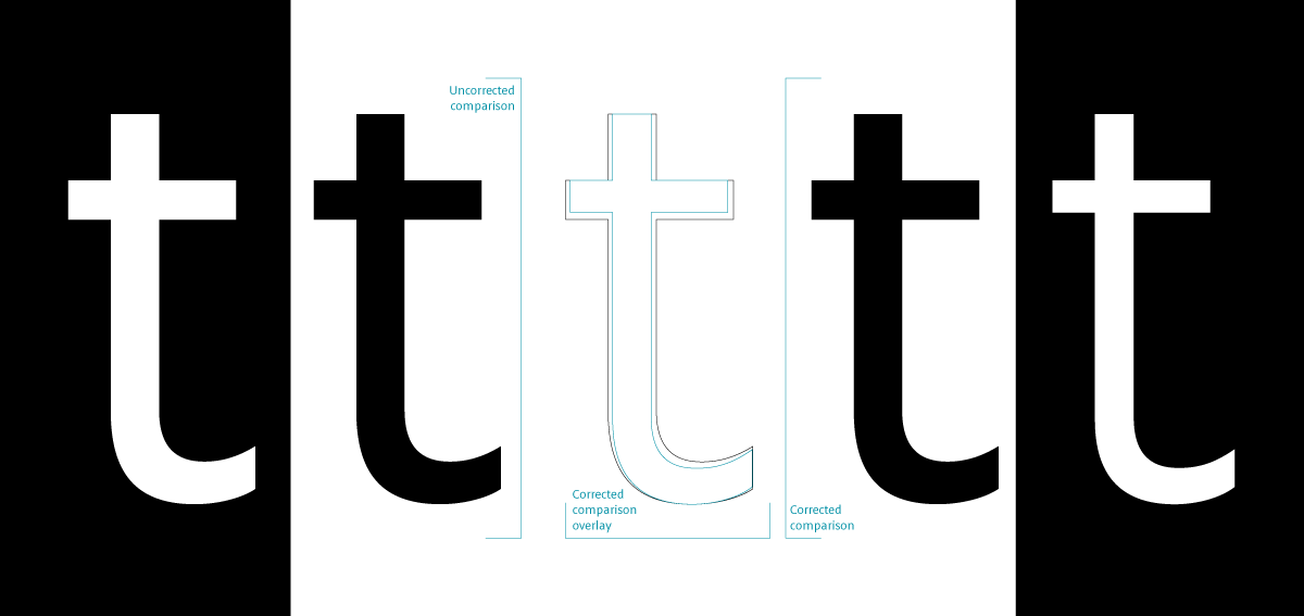
One of the technical requirements I identified was the need for weights specifically designed for inverted use, i.e. white text on dark coloured surfaces.
When white text is placed on dark backgrounds, the light refracting from the white area optically expands, making the text look bigger than its black counterpart. In order to make them appear the same, I’ve created additional grades that have been optically tested to match. You can see two examples here. By placing your hand over one eye the corrected example appears optically the same.
Concepts
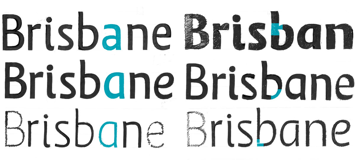
In the initial stages of my project I explored many different options by sketching. Shown here are some of my early sketches exploring different contrast levels, weights and character forms.
Typeface attributes
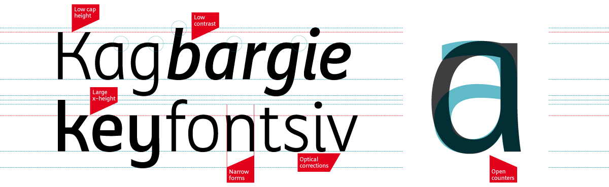
Brisbane has a mix of stylistic and technical attributes. A sans serif design was chosen to keep character forms as uncomplicated as possible and to portray the relaxed personality of the city of Brisbane.
Stylistic features include a relaxed ‘y’ and ‘k’, as well as a single story ‘a’ and ‘g’. The flat top on the stem of the ‘a’ and ‘g’ morphs into a pointed feature in the italic.
A large x-height coupled with a low cap height and narrow character width allows for maximum legibility when setting text tightly within limited vertical and horizontal spaces.
Many characters have been optically corrected to remove heavy spots and joins. A slight taper is used in diagonal shapes to lighten the joins with tight angles.
Both the ‘a’ and ‘g’ have been made single story. This is not only to give them relaxed personalities, but also to avoid the complex shapes of the double story versions which can be difficult to read at distances.
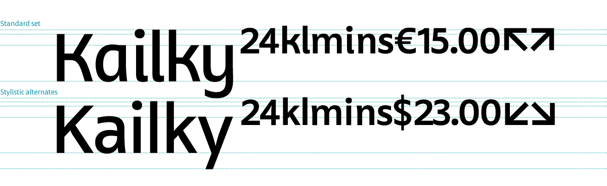
Stylistic alternates & superiors
A set of stylistic alternates have been included to give the designer more control over the amount of personality suitable for the orientation system they are working on. The alternates can be changed as a set or as individual glyphs.
Superiors have been created to allow for setting times and distances. Included are lowercase characters, numerals, arrows, currency symbols and basic punctuation. The superiors also include stylistic alternates.
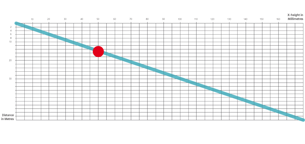
Proofing system
As a part of my proofing system I developed this graph to test my typeface at different distances. My testing for the optical grades was done at around 15 metres with an x-height of 50mm in average daylight.
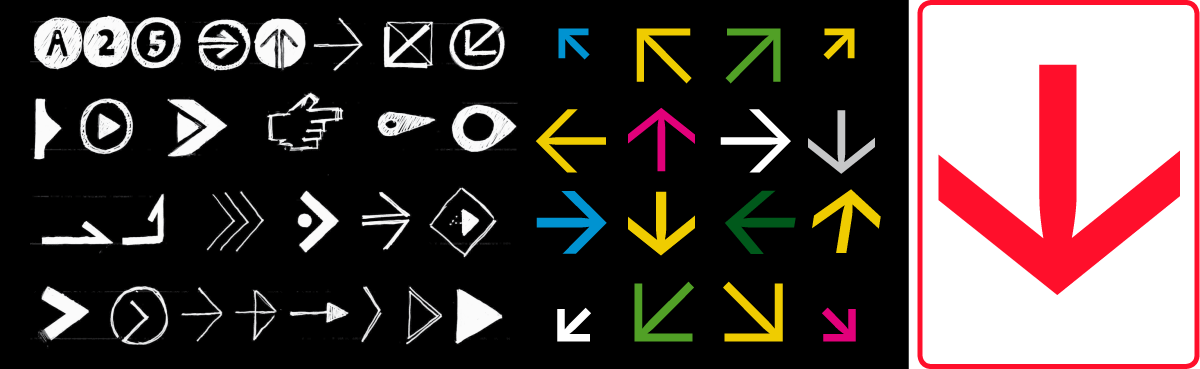
Orientation devices
In my concept stage I produced sketches for different orientation devices. Shown here are the arrows that are currently included in each style and weight of Brisbane.
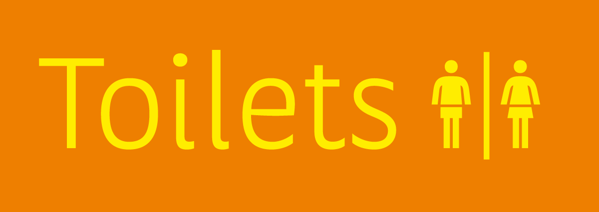
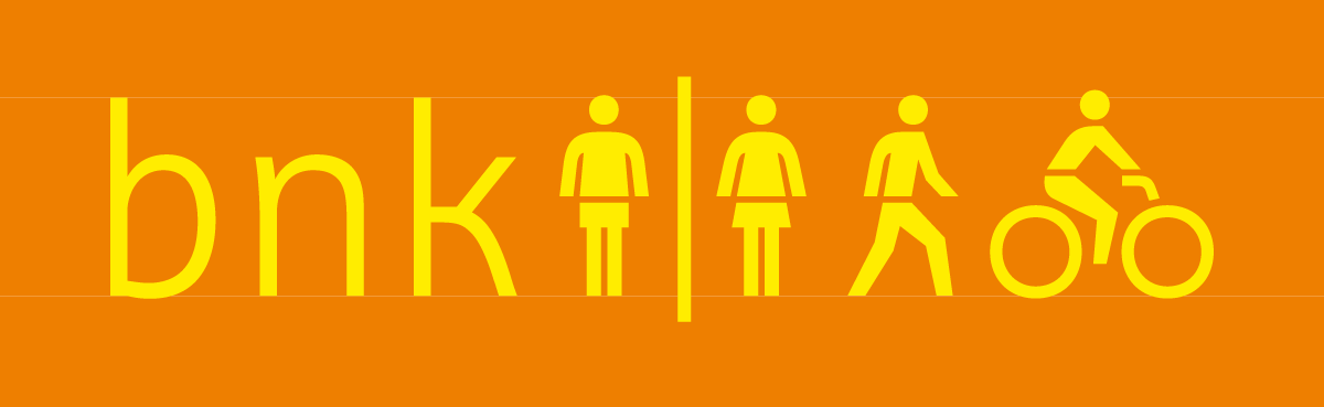
Pictograms
The pictograms below are the three that I believe to be most essential, and are the first I chose to include in Brisbane to date. They have been specifically designed to harmonise with Brisbane’s informal character forms.
Characterset
Shown below are the current five masters for Brisbane. An additional optical grade (B) exists for each character set for use on dark backgrounds.