Explorations
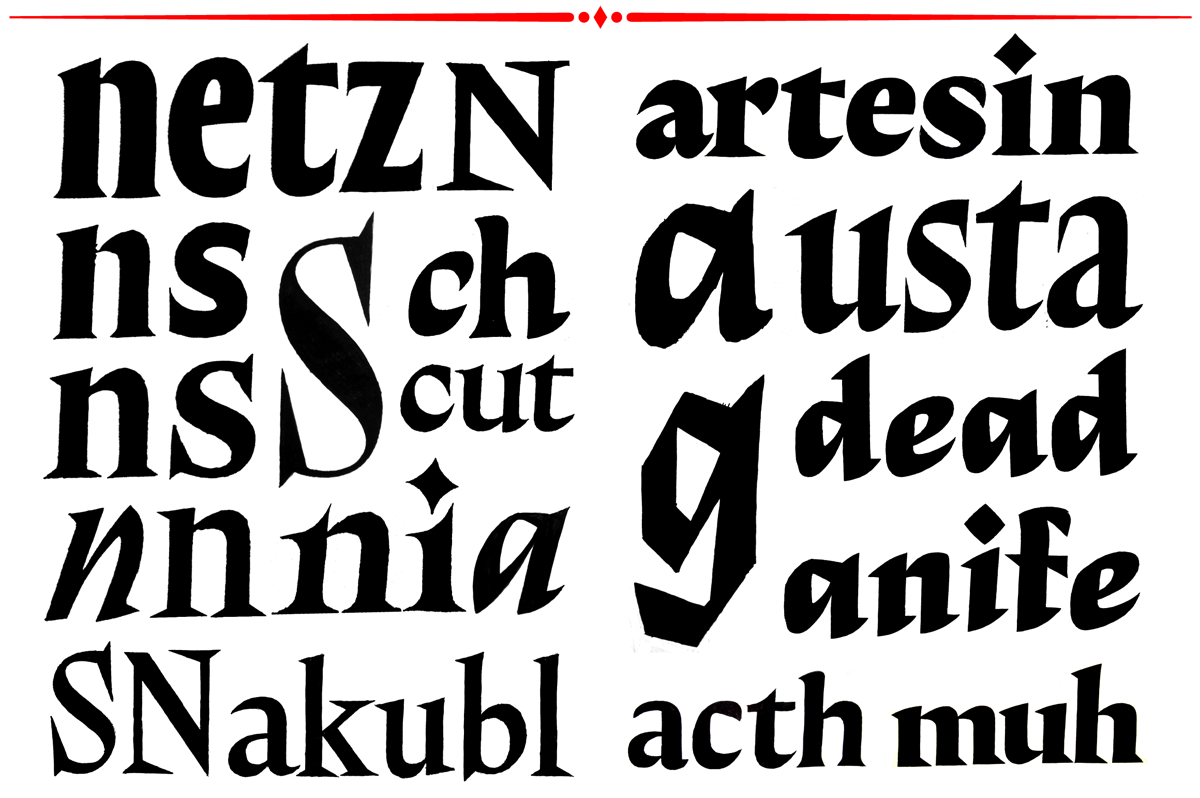
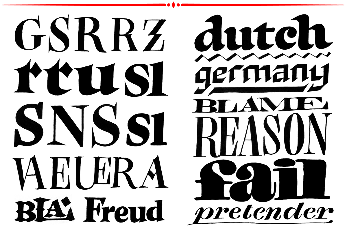
Looking back at the starting point of the process I realized that the assignments of the first semester helped me a lot to decide about what kind of typeface I wanted to design for the final project. The results already showed me a broad spectrum of ways I could approach it, from an aesthetical point of view. Looking at the results it was clear to me that I don’t want to design a brushy or a stencil typeface for example, not because I don’t like them in general, but I wanted something for a broader use, something more straight forward, contemporary, which could relate to magazine design. Another important point was that I wanted to choose a project which helps me develop my skills related to designing text typefaces. Because I’ve never designed a proper serif typeface, this project was an opportunity for me personally to explore a new field and to learn as much as I can.
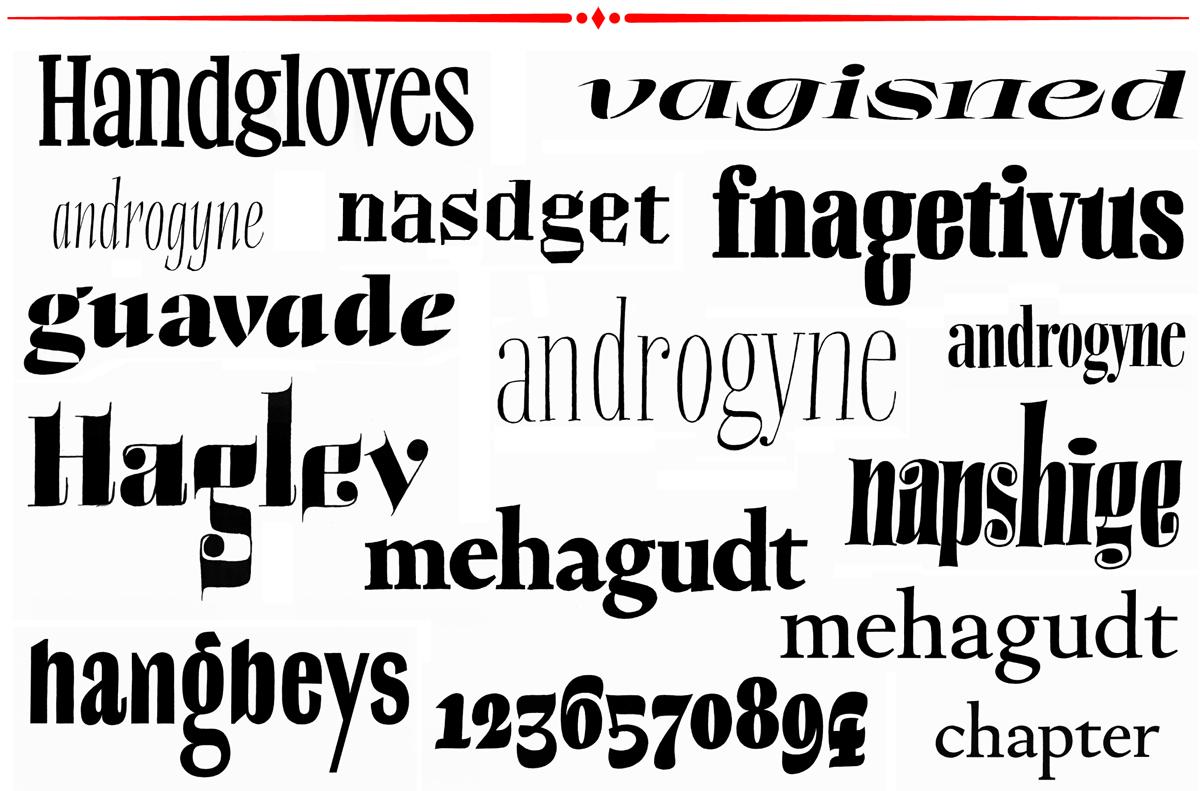
Some of my handdrawn results of the first semester assignments by Erik van Blokland, Peter Biľak and Peter Verheul.
Refinements
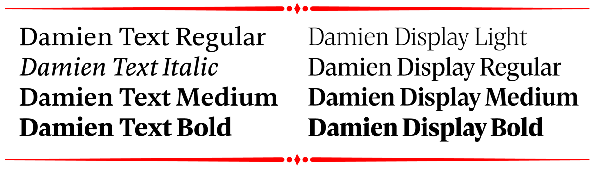
The first sketches show how the weights and styles would relate within the typeface family consisting of eight masters. Considering the time I had for the final project I decided to reduce the masters to five. This seemed more realistic and would end up with one italic for the text weights, which provides a basic set of text styles consisting of roman, italic and bold.
On the right: the text styles with a roman, a bold and a corresponding italic. On the left: the two display masters, light and bold.
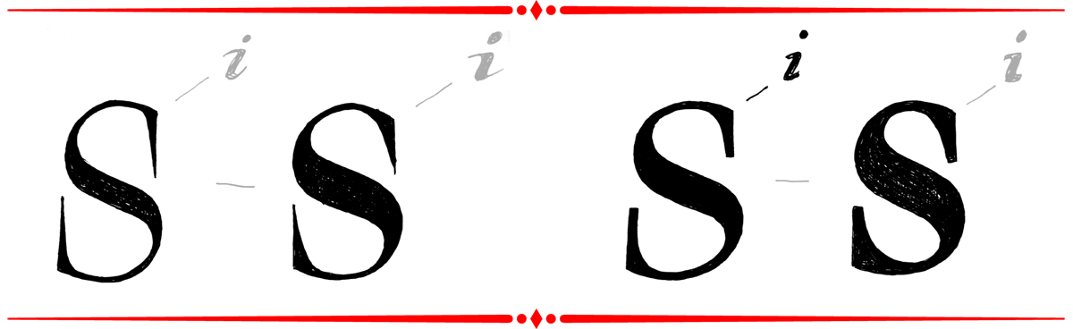
At the beginning, my drawings were based on the expansion model. A few steps later when going more into detail I realised that some of the letter shapes tended more to broadnib construction. I thought it would be good for my personal learning process and more adventurous to try and push it more into a translation contrast. The deeper I went into the designing process I realised that it was a mixture of both models, which also can be found in typefaces of Fleischmann.(1)
(1) Great Primer Roman No. 68, 1739 cut by J.M. Fleischmann, as an example how contrast varies through the typeface. Lettershapes like a and n follow more precisely the broad nib pen model, the letter shape of ‘o’ is clearly a pointed pen construction and ‘e’ is a mixture of both models.
After the first attempts of refining the basic ideas of the family planning, I began the design process with drawing the bold headline version, because this seemed to me the most expressive style of the family and also the one with the highest contrast.
Various sketches and drawings to visualize the design direction.
References
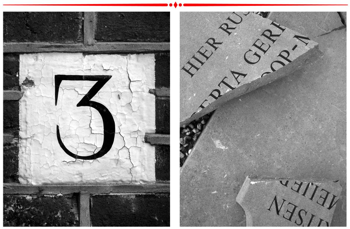
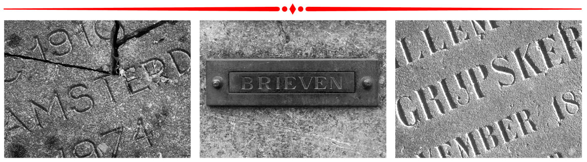
Because I like to collect images of type in the city for reference and inspiration I started to document interesting printed specimens but also signage, housenumber and gravestones in The Hague. I went to the graveyards for example or biked and walked through the streets.
Some examples of the collected materials
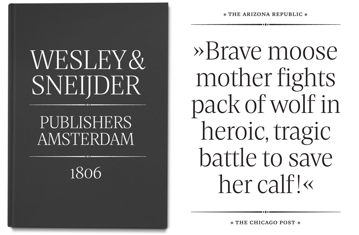
Text versus display
The design process basically started with some basic shapes like n, a, e and s. I worked with only a few letters first to adjust proportions, weight or spacing and then I added new shapes. First I tended to a more narrower design in order to save space when setting type. I spend a lot of time finding the proportions and rhythm which felt harmonious to me. At the end it turned out that basing the text styles more on classical proportions made the text weights more elegant. Because the serifs for the text weights had to be less sharp I tried to incorporate the pointyness by straight forward shapes and by aiming for a relatively high contrast in these styles. Within the process I decided to develop the text and the display weights side by side without making use of interpolation, because this approach would help to optimized as much as possible for their usage, even if the styles would differ slightly.
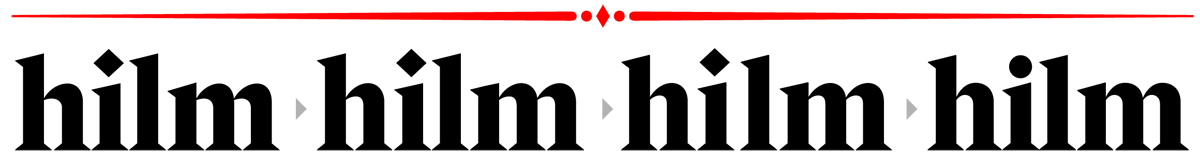
Evolution of some basic letter shapes with vertical strokes. On the left, one of the earlier versions had a strong emphasis on the horizontal parts of m, n, h and others which added a lot of weight to the shape. Here also the problem of the triangular serifs becomes obvious: the more a lettershape gets condensed the closer the serifs get to each other. Finding the right balance between width, spacing, serif length and thickness was a tedious task.
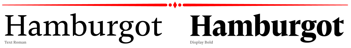
Text Roman and Display Bold in comparison.
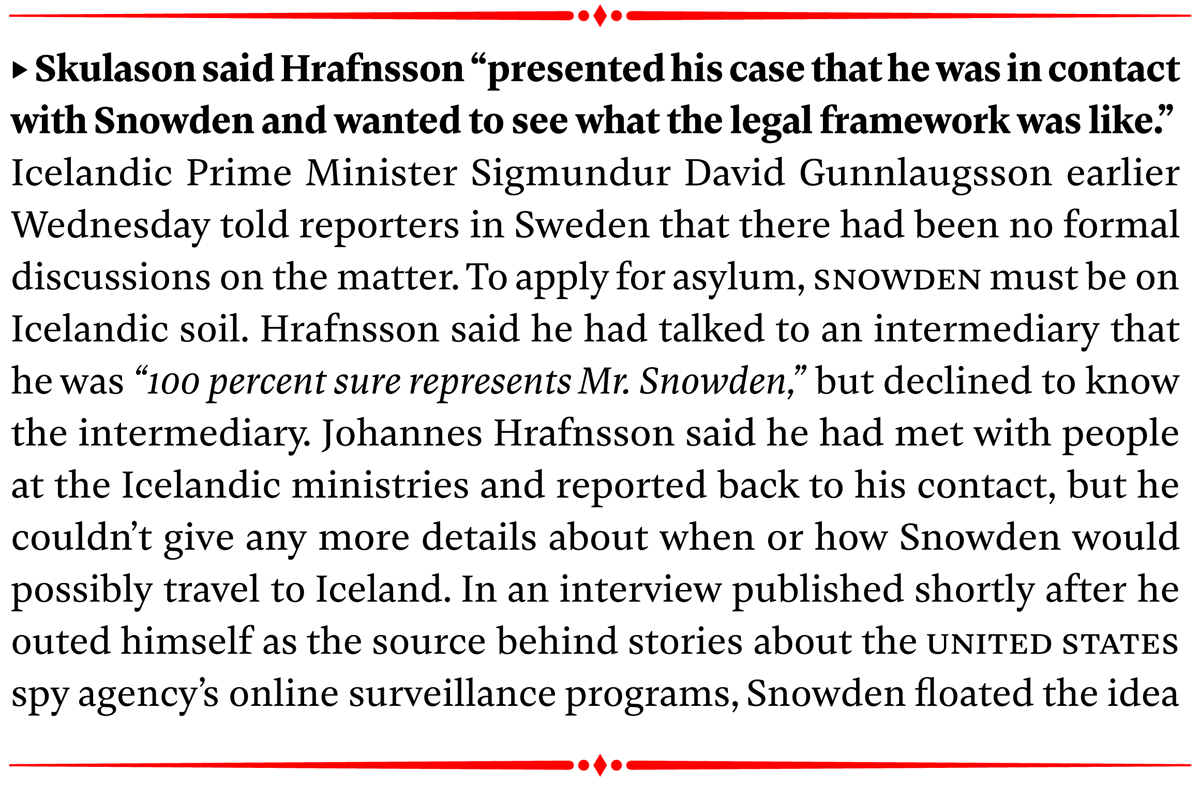
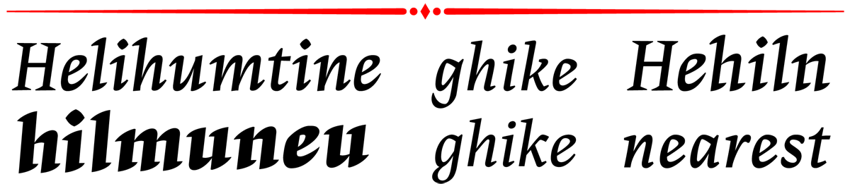
The Italic style turned out not to be designed in a calligraphic way, like written in a continuous fluent movement – strokes are interrupted. The stroke endings have a sharp cut and therefore it gives the italic a slightly more straight forward feel but still lively enough to be distinguished well from the roman.
Some of the drawings for the italic in order to find the design direction.
Experiments
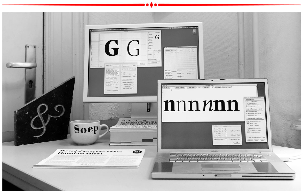
Being motivated by the Python classes of Just van Rossum in the first semester I played a lot with code in order to practice and strengthen my programming skills. I developed many tiny tools in order to automize certain parts of my personal design workflow. These scripts are still in an unfinished state.
My workspace at the Type and Media Department.