The idea
Chimera is the result of my experiment with the reversed broad-nib model. The project started during TypeCooker classes where I opened myself to new ways of sketching. Sketching in a big size, using white-out helped me to feel the letterforms better, to draw precisely and at the same time not to worry about the mistakes I made. Drawing with a marker made me pay attention to the shape, drawing with a tip-ex made me look closer and allowed to correct the counter-shape.
One of the works I did for a Thursday TypeCooker class with Erik van Blokland became the very early start of my graduation project.(1)
(1) TypeCooker sketch with a reversed contrast that I made in the first semester. Here is the recipe: [width]: extra condensed [weight]: medium [construction]: italic [stroke endings]: wedge shaped serif [ascender]: longer than normal [descender]: shorter than normal [contrast type]: between expansion and transitional [contrast amount]: inverted contrast [stems]: convex [intended application]: smooth offset printing [intended size]: most sizes [special]: inktraps for inside corners (white).
After I did this sketch, I tried to make an alphabet from it. It took a while to make shapes actually work digitally.(2) It was very hard and sometimes even impossible to bring the same feeling as I had in lettering into a digital format. Sketches usually have their own pleasant appearance, which comes from the technique, from the hand-made feeling and from imperfection as well.
(2) First digital version of the typeface from the 1st semester.
I got addicted to those strange impossible shapes. It was really exciting to work on them. Although I did not solve every shape, I made a big step for the moment and it was a nice exercise for the future.
Later, in the end of January there came a moment when we needed to make our decision. At that time I was still constantly thinking about this impossible style and challenge that I could experience working on it. In the end that became a reason for me to select it as a direction and to take it as an idea for the final project.
The name
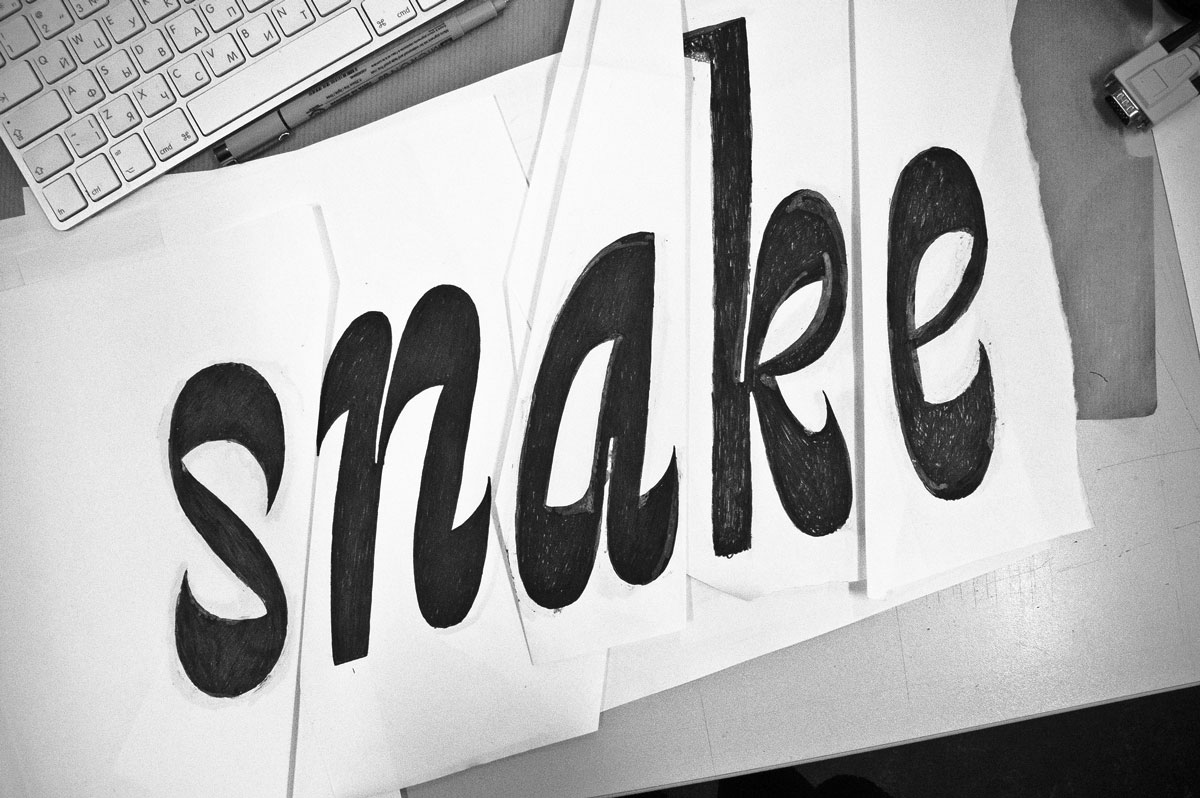
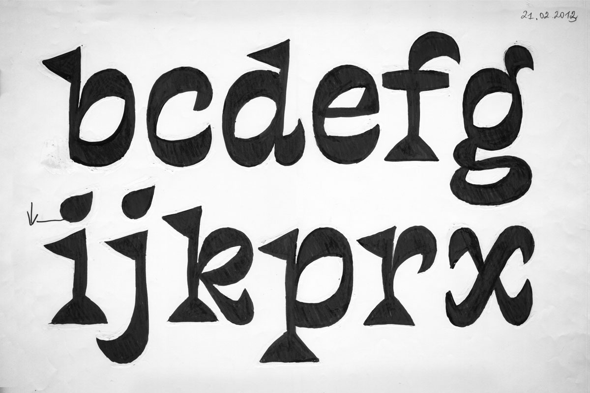
As this typeface is not ordinary, it was important for me to find an appropriate name that would fit the character and even emphasize the typeface’s personality. For a long time it was called snake, as it was the word from my first sketch.(1) But I never considered it to be the name of the typeface.
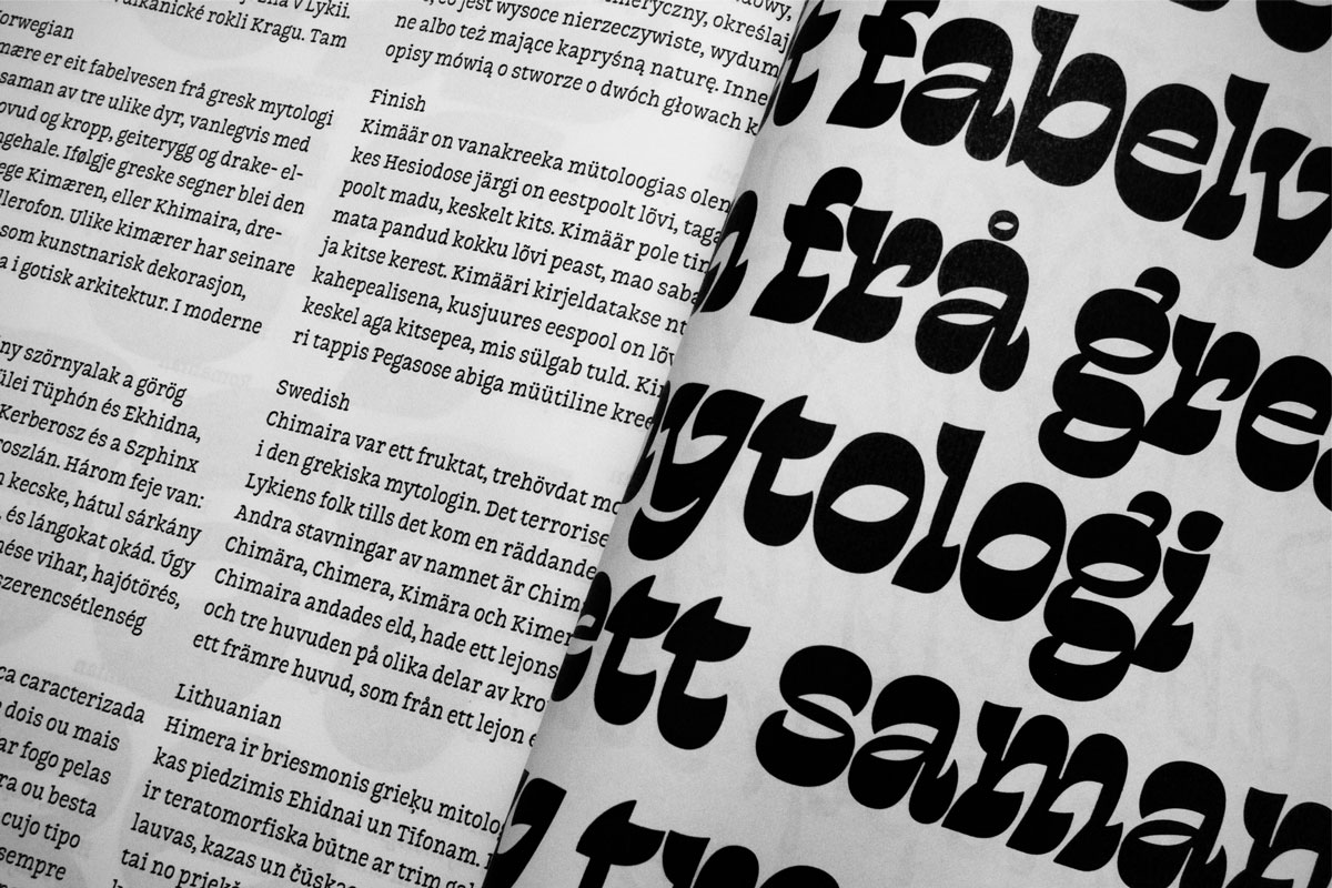
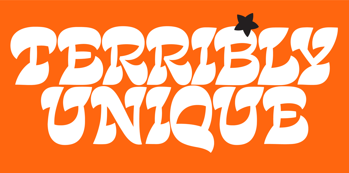
I spent some time searching for possible names and stopped on Chimera. According to Greek mythology Chimera is a monstrous fire-breathing creature, composed of the parts of three animals — a lion, a snake and a goat. And I suppose that this crazy mix has a parallel with the way my typeface actually looks.
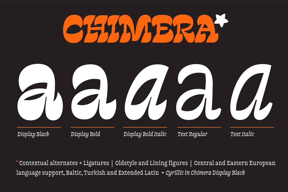
Family structure
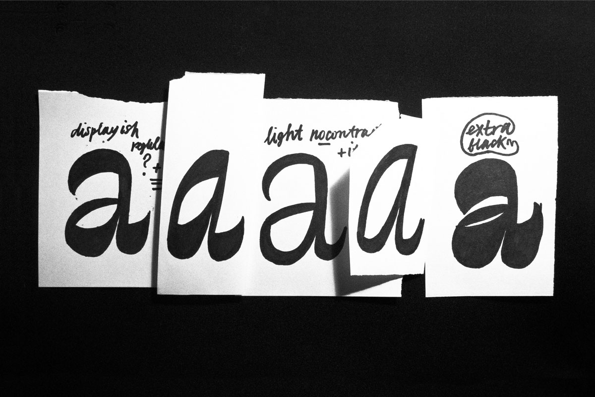
I started the project by trying to imagine a structure of a type family. Of course, at that moment I was mainly excited by the character of the shapes I started with — a condensed black italic. But my goal was to see the possible variety and how the styles can be related to each other. At the same time I was trying to quickly see whether the whole idea can actually work as a family with both romans and italics.
One of the first family planning of the project. Five display styles: from Light to Bold with Italics companions and Black for Poster usage.
It was obvious to me from the beginning that my sketching-based way of working will bring me a lot more troubles. At the same time I realised that this process will be extremely important to keep freedom, to quickly explore different possibilities, to avoid being stuck with ordinary predictable letterforms and to explore more than what digital format allows me to do.
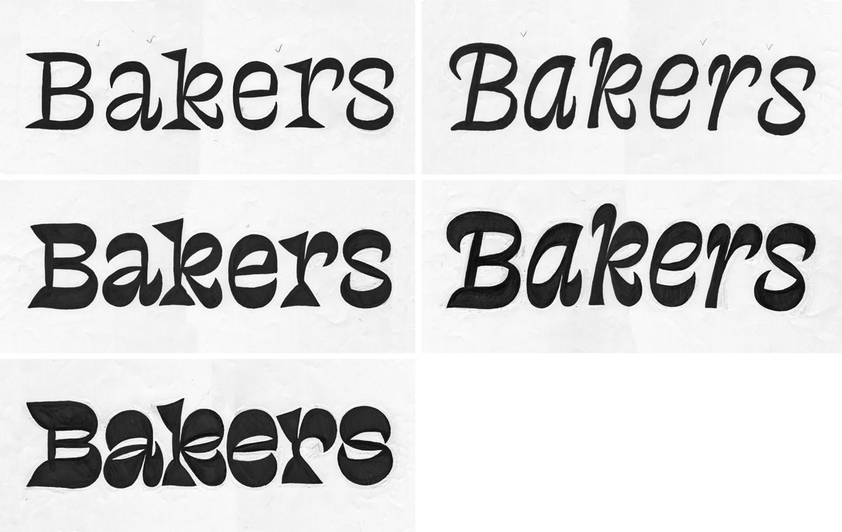
Next extended styles overview.
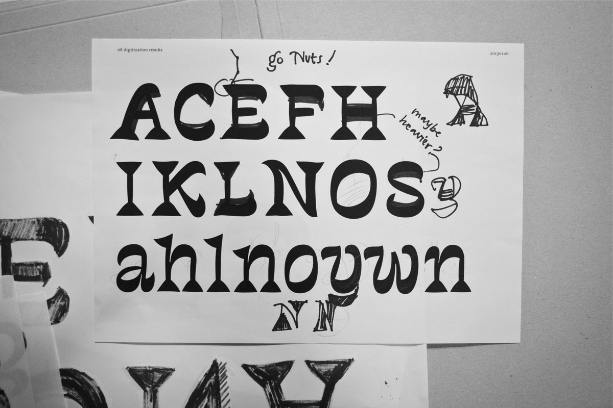
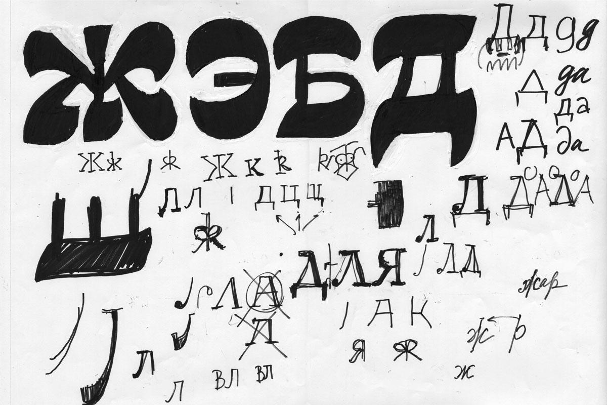
Looking at those sketches of words you can see that a lot needed to be standardized (be more even and consistent). You can also imagine that digital shapes would need a lot of attention as well.(3) I did not want to avoid that difficulties, I wanted even to force them, to learn not from what is technically more simple and can give me fast results, but to learn how my hand (sketching) works and how that experience can lead me to different shapes, also how to transform drawings made on paper into digital curves.
(3) This is how the first rough digitization looked like. It highlighted a lot of problems. Everything appeared different digitally. I realized that working digitally did not help me that time, so I left the computer and went back to working by hand.
Process and workflow
The approach to this kind of a project is completely different to what is done in the process of development of a text typeface, where familiar forms and general view are much more important. I’ve invented almost every shape and I did not even had any close references to look at. To try and test things, my main instruments were my black marker, white-out and a block of paper, which allowed me to test a variety of choices in a short time. Sketching, balancing forms, working to find the best solution, constantly changing everything, adding chaos, then calming it down. It was a constant process of going back and forth the media, looking for the very best solutions. Sketch — digital — print — sketch — digital — and over again. Trying out different particular letter variations in a set of others to see whether it followed the typeface’s rhythm. ‘Isn’t it too strange?’ — ‘Can it be read as a letter?’ — These tests were my everyday exercise. Sometimes I was spending several days intensly researching one particular letter and then going back to see that one of the older versions was better, or that the truth was somewhere in-between. Sometimes the solution for the shape looked almost unrecognizable as a letter without a context. I also played with a contrast and in certain situations allowed myself to make exceptions. As long as something followed my idea and rhythm I considered it acceptable.
Problems. Digitizing
During the whole process a lot of more and less radical changes were made. A lot of more and less timeconsuming problems were solved.
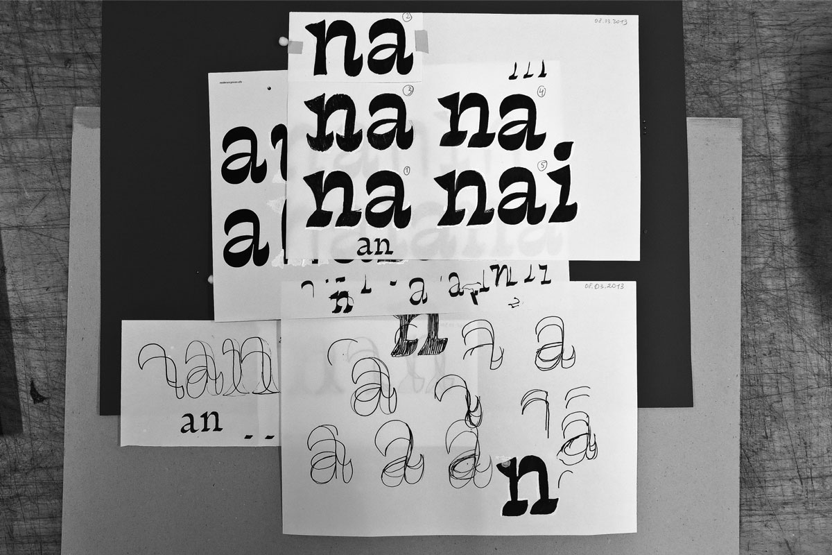
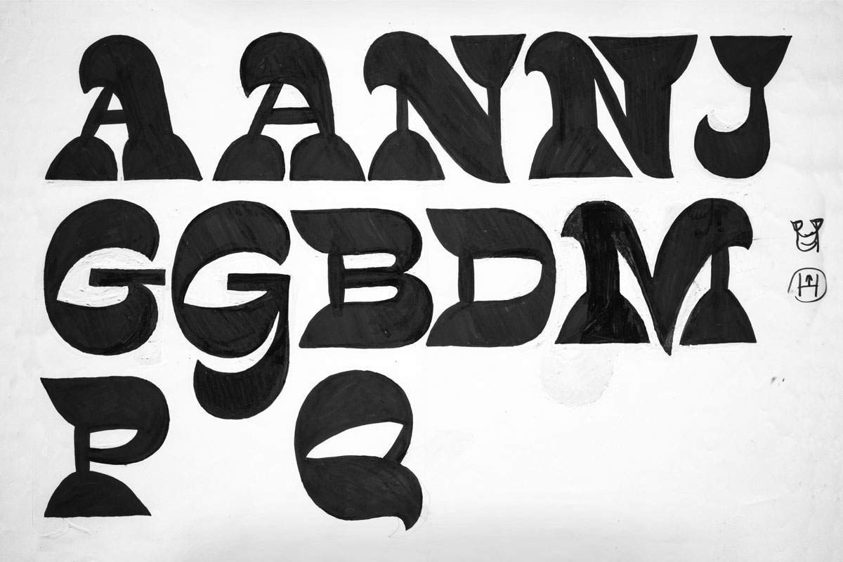
An obviously wrong direction was keeping triangular serifs.(3) I was postponing this conclusion. But after one of the presentations I finally realized that triangles need to be changed. I took some time and paper to look for other solutions.(4) My goal was to find a clear and simple solution that would organically fit my idea and would also be flexible enough to be applied to a variety of shapes.
(4) I picked up [a] as a shape that I liked, [n] as a basic one for which solution should have been found and [i] as a shape with a single stem (such letters as [i] [l] are hard to solve in this style as they cause a lot of white space around). With those three letters I started experimenting on paper, not rejecting even the very stupid ideas.
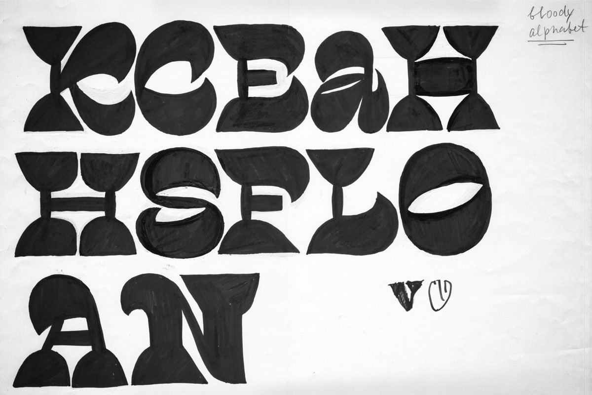
I was exploring the styles as fast as I can, sketching more and more to see how the shapes would look within the whole alphabet.
Exploring the very black helped a lot in terms of development of the other styles. As the contrast was very extreme, the shapes needed a lot of simplification, some of them lost their serifs, some serifs just radically changed in proportions (at that point I still kept the serifs triangular).
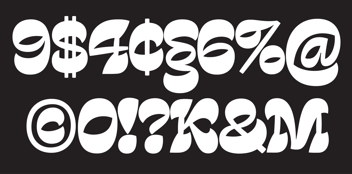
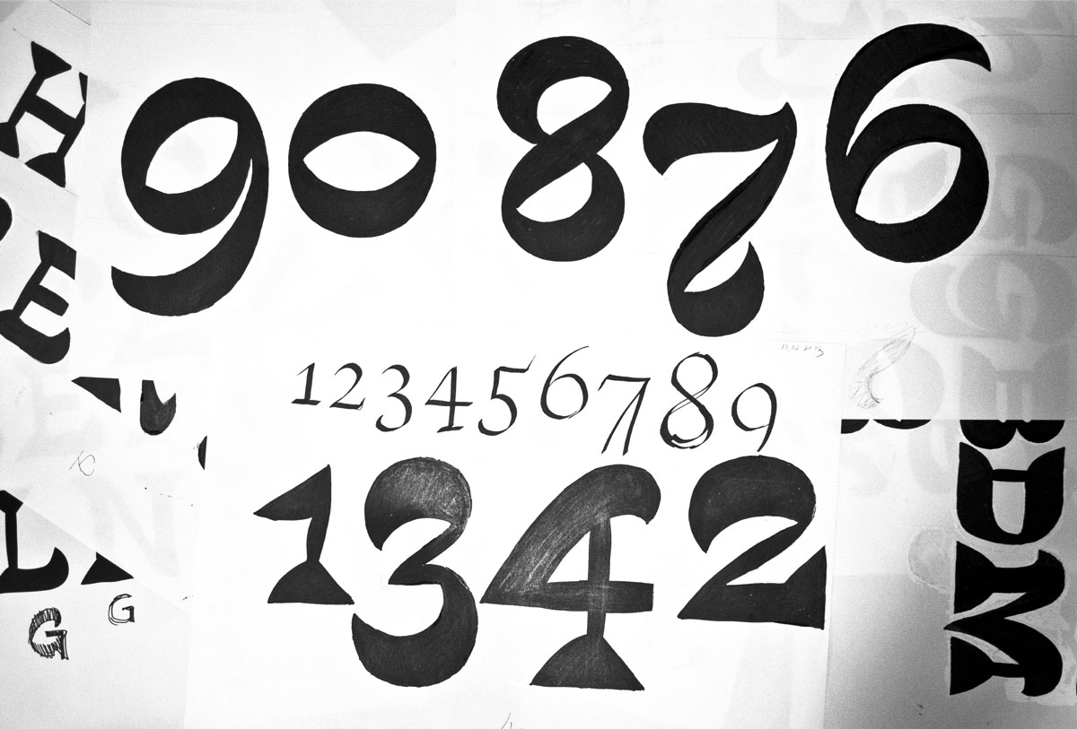
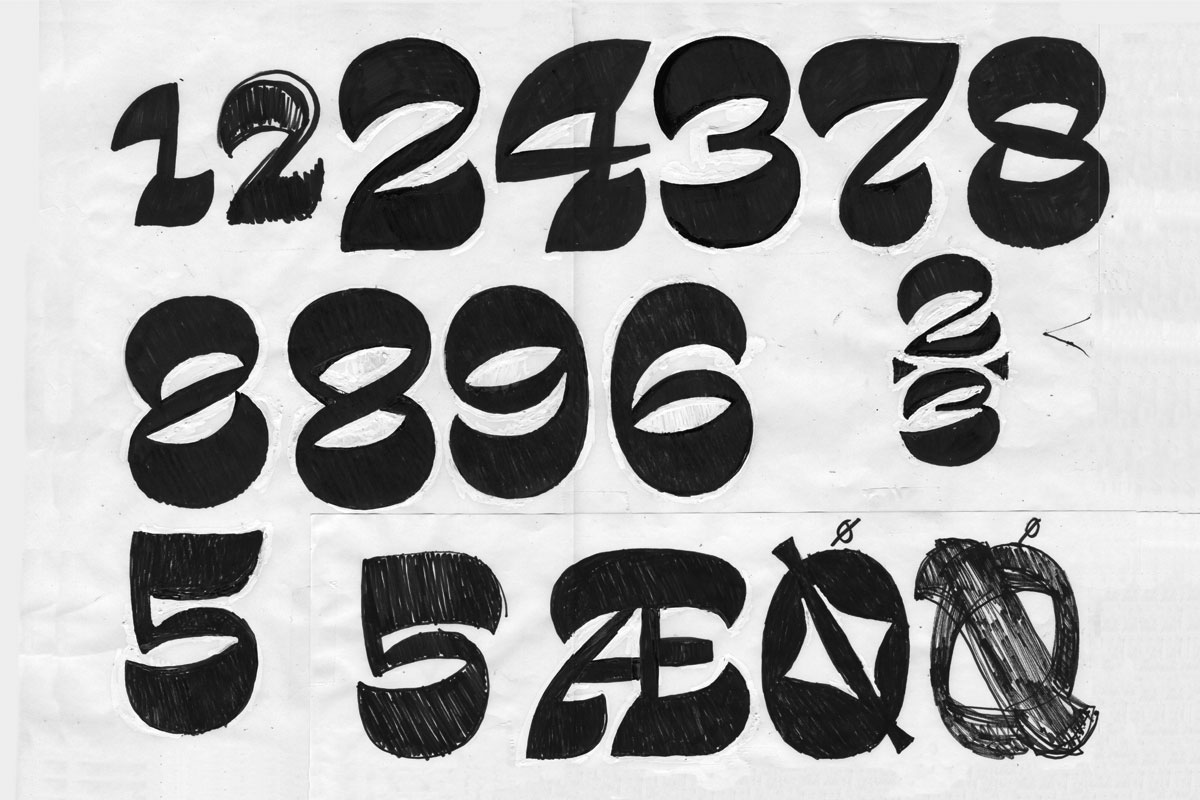
One of the exercises I used in the beginning was writing a normal contrast letter with a broad-nib pen first to be sure about how the contrast is normally developed. Then directly sketching the inverted one on the side. When drawing figures, I started with the same trick.
An early sketch of the figures.
Figures for Display Black
All the shapes required a lot more attention. In each style every situation was unique. But as I did not use any interpolation between the styles, I was able to find individual solutions to certain shapes. This way it was possible to make design decisions that complement the styles more.
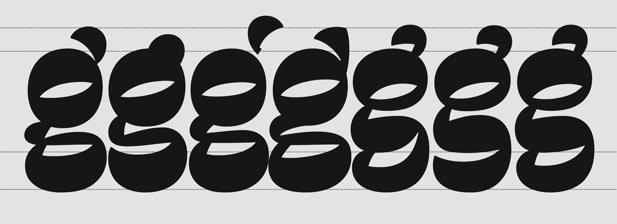
It could take several weeks to find a reasonable solution for certain shapes. [d] and [g] were one of the main problems of Display Black style.
It was a big surprise that one of the very spontaneous and ridiculous decisions that I’ve tried more as a joke suddenly worked and solved not only all the connections problems, but the problem of the overall rhythm within the whole character set as well.
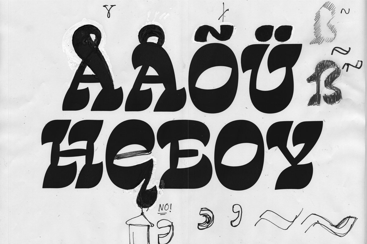
Extending the character set and designing the accents was the same process as any other, it requested creativity and imagination.(5) As I wanted the accents also to follow the crazy invertedness, I had to find the way to make them still recognisable within this style. It was particularly hard in Display styles.
(5)
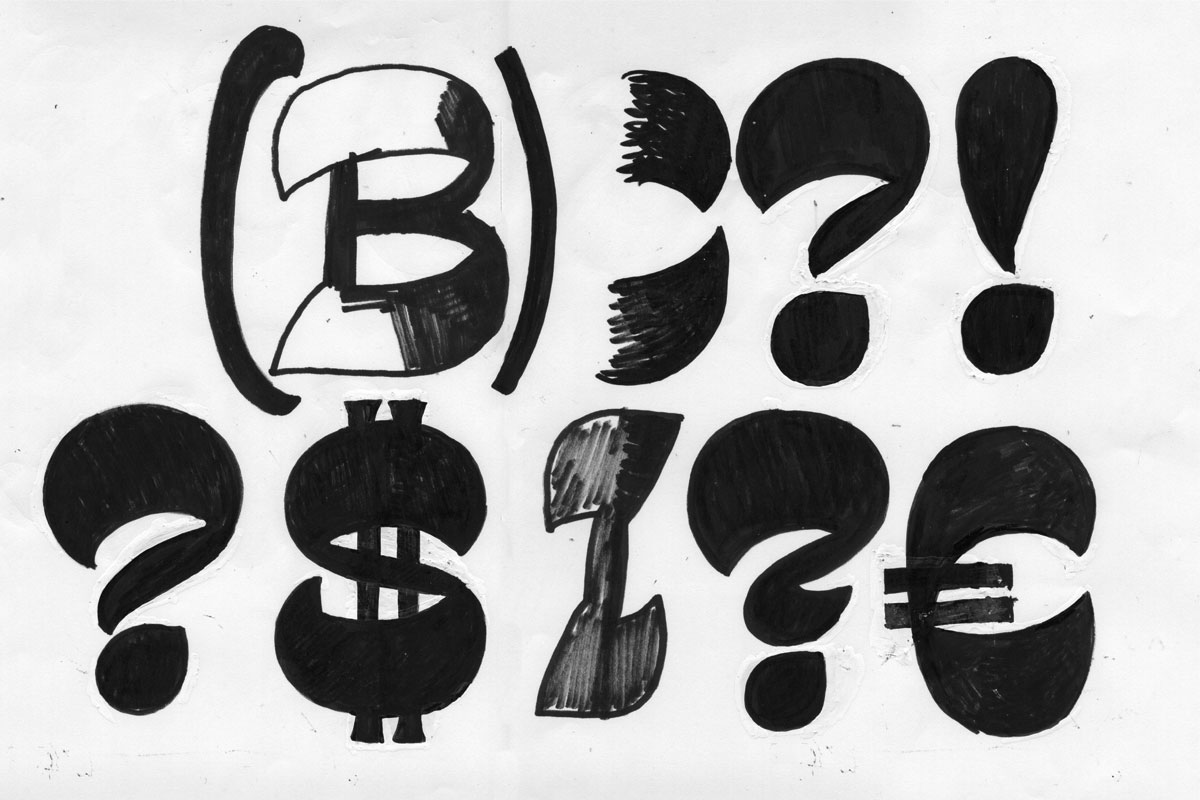
There was a lot to develop apart from letters. And I put a lot of effort into that. I really wanted them to be done on the same level as the letters, not to be just ordinary companions. I wanted them to look like they were made with the same passion and the same treatment. Of course it was a big joy to draw how they could look with a reversed contrast.(6) Punctuation and mathematical symbols, currency signs and many additional glyphs were developed in order to clearly fit the alphabet.
(6)
There was another process that I did not talk about yet. Actual judging of the typeface, its color, proportions, etc. That was an experience not only for me, but for my teachers as well. The reversed contrast appears strange to the eye and seems to be wrong all the time. From one point of view it can be seen as an excuse to be able to do whatever you want, but in fact it is not really so. I have been constantly working on making the strange and unfamiliar shapes consistent in their weirdness, that was the only way to make the typeface work.
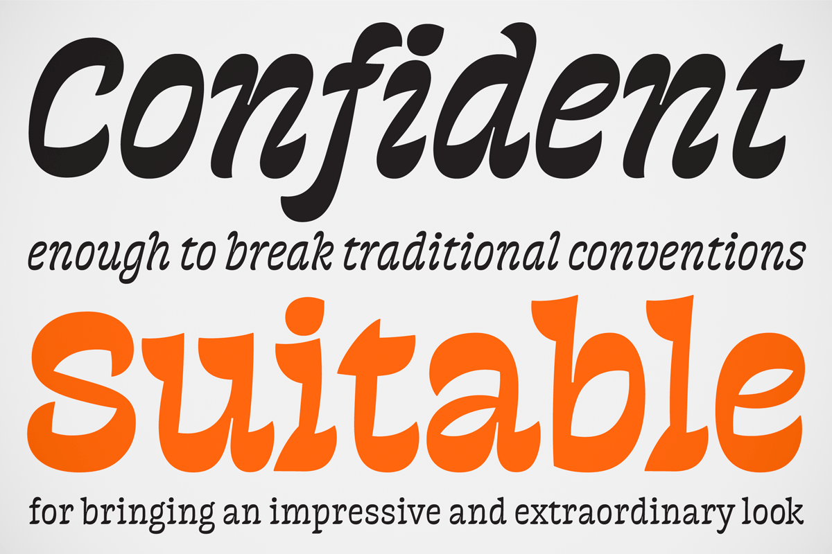
Text styles development
Initially the project was intended for display use. But I was always curious about the possibility of creating a text companion, that would keep the same concept, but would be adjusted to perform in smaller sizes. Starting with the Display Light style, I immediatedly understood that treatment of this style has to be different. From that moment I started making slow steps in getting rid of certain disturbing elements: cutting sharp details, defining ink traps, simplifying the serifs, working on the stems as they appeared slanted. So that Display Light became Text Regular at the end.
Explore — produce
From the beginning of the project I’ve been experimenting a lot and I did not want to give up. I’ve been constantly testing different ideas for the same shapes in order to find the one that would fit the best. Being always in doubt and unsatisfied helped me to see the overview of the possibilities, not just selecting the common construction or whatever appeals to me at first. Another experiment I did was keeping the variety of sizes and shapes of, for example, serifs. It may seem strange, but this inconsistency for me was a way not to copy the same form from letter to letter. Doing that helped me not to be stuck with a particular form, still being in the design process, looking for the better shape.
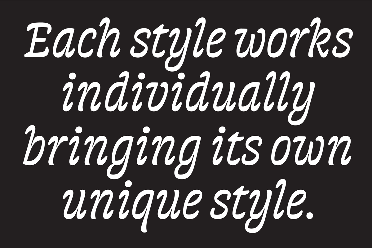
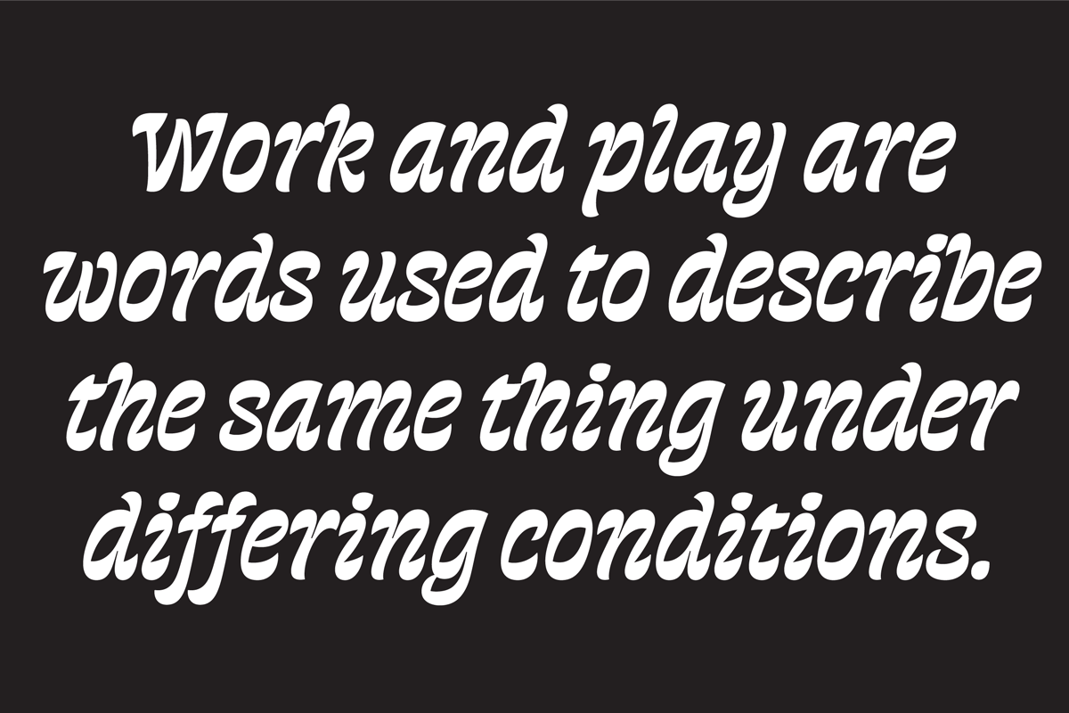
As the project always needed to go further I was combining my sketching process with the process of actual development, expanding the character set, working on different styles at the same time. Although all the styles in the family are based on the same concept and share certain characteristics, they are not meant to be used together. Each one works individually, bringing its own unique style. However text styles can work as companions to any of the display ones.
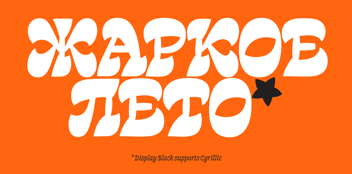
Cyrillics
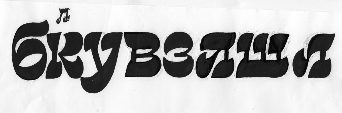
Even though I made a decision not to work on a multiscript project, it was very hard for me as a native Cyrillic designer to completely avoid drawing any Cyrillics. I decided to keep them on the side. I started drawing them very early and it hepled me with the development of Latin, as Cyrillics are less tool-based and need more exceptions and a bigger variety of shape variations.
Results and achievements
The way to the final result was long and thorny. Frankly speaking I can’t believe how I could continue working on this idea when I look at my very first sketches. Going so far from the original idea, going through the whole development part of the process, what I have in an output still has a lot of that strange flavour and has not lost its character. It still feels strange and implausible.
It is important for me that I managed to include that much sketching in my design process. And that was not sketching for sketching’s sake and not sketching for fun (although I had a lot of fun during the process). By going this way I can prove to anybody and, what is more important, to myself that sketching is a powerful instrument, not a waste of time and not an artist’s exercise.
In the end I developed several completely different styles based on the same idea. I find it great! I can’t believe that all of that gradually came from that ‘snake sketch’, although you can still see its influence.
I want to complete and finish this type family and add proper Cyrillics to each style. That will be another challenge, probably another pile of sketches and an unestimated amount of time.