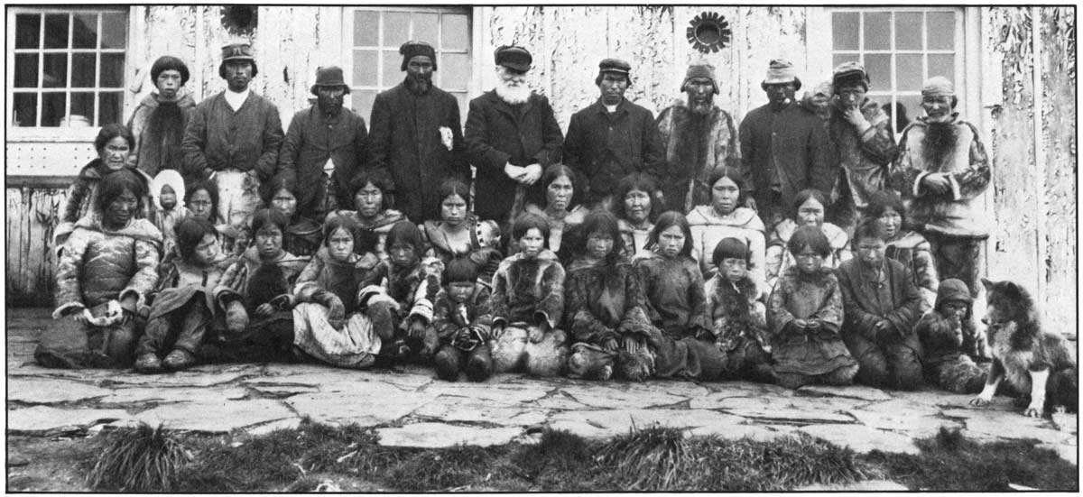
The Origins
The Cree syllabic system,(1) the one that inspired the syllabics used for Inuktitut, was invented by the English Missionary James Evans around 1840. Motivation for the creation of the new script came from the problems he encountered trying to get the native Americans to write and read their own language as well as english using the roman alphabet. The aboriginal North-American languages were almost always exclusively oral.
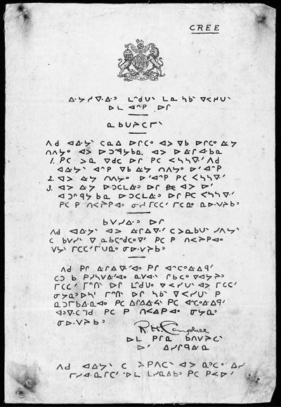
(1) Early example of Cree syllabics. Photo source: collectionscanada.gc.ca
As an amateur linguist, James Evans used his knowledge of the Devanagari script, used in British India, as well as his acquaintance with the Pitman shorthand and the Moon Alphabet for the blind in order to develop the Cree syllabics. The results were really good. The new script, a syllabary (more precisely an abugida, a syllabary where every character represents a different consonant and where the vowels are written through variations of the base consonants), made the learning of writing and reading much easier for his students.
Even though the scrip itself was created, using it to print material was not an easy task. The Hudson Bay Company, which at that point held a monopoly on foreign commerce to western Canada, refused to import a printing press, believing that native literacy was something to be discouraged. Mr. Evans, now posted in Norway House,(2) decided to build his own press and cast his own type. He had to resort to using lead he could scrape off tea cabinets for casting and had to print using a modified hide press. The first matrices, used to cast the lead type, were simple blocks of wood that were carved with a simple metal point.
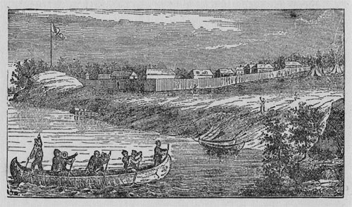
(2) The Norway House mission. photo source: McLean, John. James Evans; Inventor of the Syllabic System of the Cree Language. Toronto, 1890.
Even though there have been previous attempts to write Inuktitut using the syllabics script developped by Evans, the person responsible for it’s first noticeable spread in the Inuit culture is the Anglican missionary Edmund Peck.(3) He was hired in 1876 to work in their mission at Great Whale River. Mr. Peck later moved to a mission on Blacklead Island, where he will accomplish most of his work. He is responsible for the teaching of syllabics to multiple Inuit communities as well as the translation of a lot of reading material. He died in Ottawa in 1924, just after completing an Inuktitut-English dictionary.
(3) Edmund Peck on Blacklead Island. Photo source: Inuktitut Magazine, spring 1985
The System
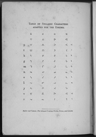
(4) Inuktitut syllabic table from 1904. Some later diagraphs are missing but the rotation-reflection system is clearly understandable. Photo source: Lewis, Arthur. The Life & Work of E. J. Peck Among the Eskimos. New York, 1904.
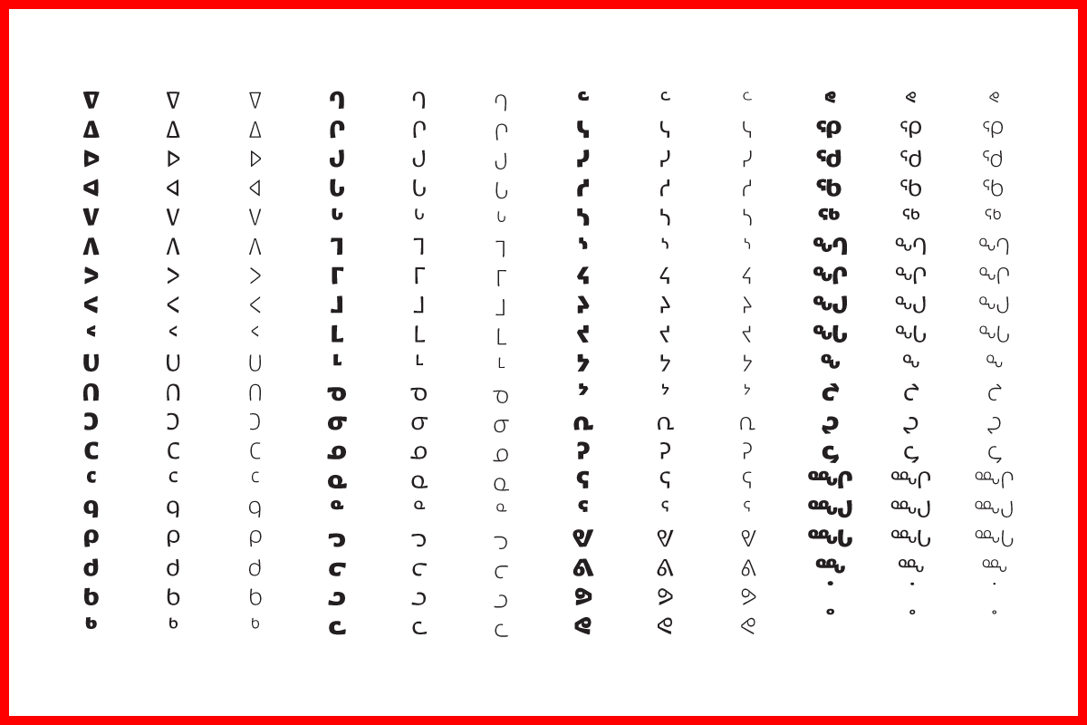
The syllabics system used for Inuktitut (4) works as follows : There is a set of base consonants (p, t, k, g, m, n, s, l, j, v, r, q, ng, nng and lh) on which transformations are applied, usually rotation or reflection of the base glyph, to indicate which vowel (i, u, a and ai) is applied to it in order to form the syllable. There is, alongside these syllables, a system of vowel-less consonants that are used in a similar way you would use superior numbers. In addition to these, diacritics can be used on top of the syllables. In Inuktitut, a dot accent is used to indicate a long vowel.
Since there are more consonants in Inuktitut than in the original Cree language the syllabics were created for, a couple of new symbols and diagraphs were introduced.
The Uses
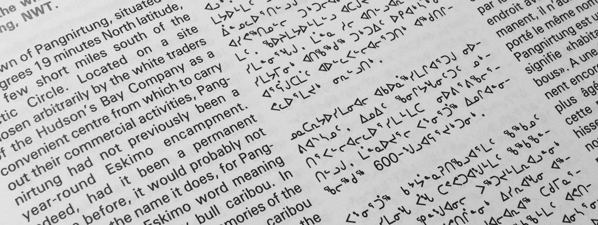
The Canadian Aboriginal Syllabics have official status in both Nunavut and Nunavik, the northmost part of Québec.(5) This means, amongst others, that the government issued documents must now be provided in both romanized Inuktitut and syllabics Inuktitut. The script is also taught in schools across these regions.
The fact that Unicode supports the Canadian Aboriginal Syllabics is probably one of the main reasons of it’s popularity at the moment. The Inuits see the syllabics, even though they were invented by European missionaries, as an important part of their cultural identity. Therefore, if the technology is there to permit their use, a lot of Inuktitut users will choose them to write down their language instead of the latin alphabet. There seems to be a really strong attachment to this exclusively Canadian script and it’s use in the future may only increase with the arrival of a better choice and quality of typefaces supporting it.
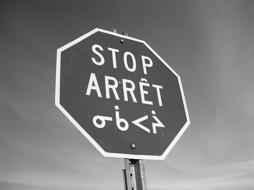
(5) Stop sign in Nunavik. Three official languages and two different scripts on the same sign. Photo source: flickriver.com/photos/alanahmontreal
Ideas and Inspiration
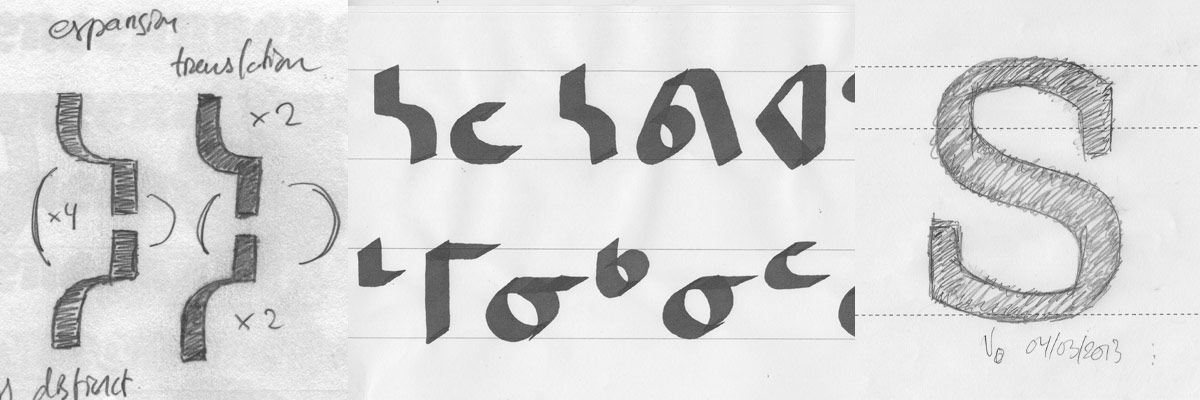
By looking at the actual use of the script, the way it was matched with latin script, and the usually unsatisfactory way both of them match and work together,(6) I started thinking of ways to make both of them share a more similar color and feel.
(6) With the usual Canadian syllabics typefaces, the color of the roman and the syllabics differ a lot. The counters of the syllabics range from enormous areas of white all the way down to a point like counter that gets easily clogged up or misinterpreted. Photo source: Inuktitut Magazine, spring 1985
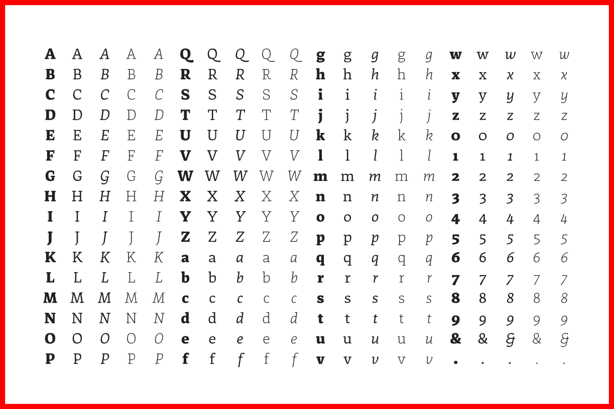
The syllabics are usually matched with a sans serif latin typeface. This association is quite possibly the case because of the origin of the syllabics themselves. The usual mono linear sans-serif aspect of the syllabics, invented for a series of languages with no written tradition, has hardly ever been questioned. The style was defined at the moment of creation, with the tools available at that time and place, without ever adopting a new flavor or look due to different writing tools. But what if there is something to gain from it? What if, like it is the case with latin typography, a certain amount of contrast, following a certain system, could actually help the recognition and therefore legibility of these symbols? And what if the proportions of the letters were changed, horizontally as well as vertically, to try and obtain a colour of type that actually comes closer to the latin lowercase?
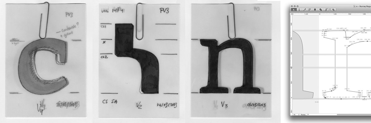
Some of the different stages of the project in the making.
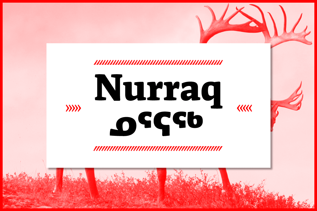
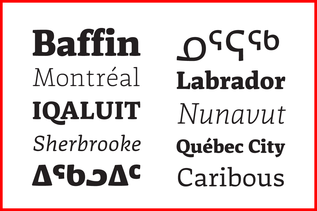
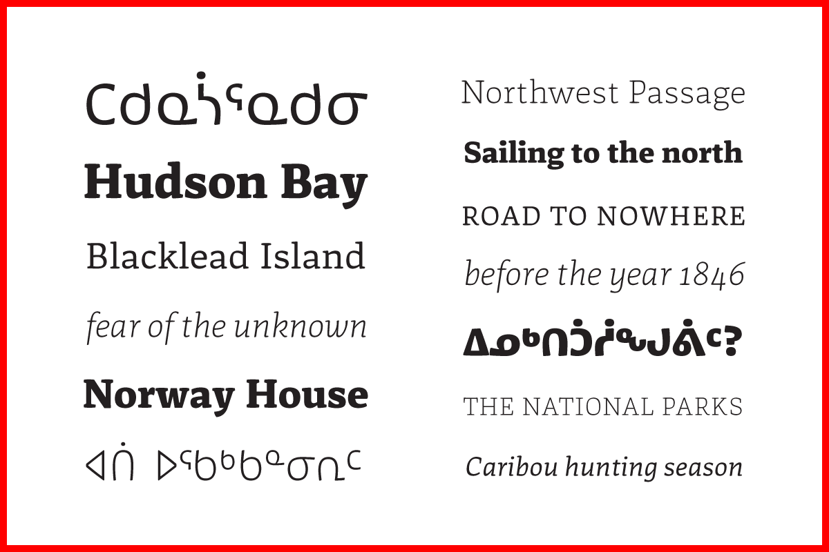
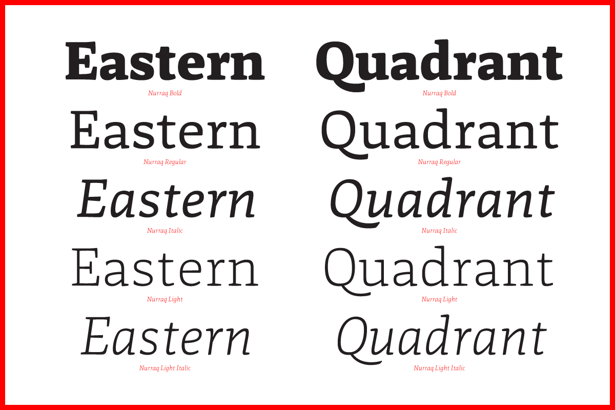
After a lot of work and experimentations, I came up with my own answers to these questions. Nurraq is the result. Each of it’s scripts influences the next one in creating a more uniform text color and a better matching set of letterforms by the use of a similar contrast and new proportions.