Starting point
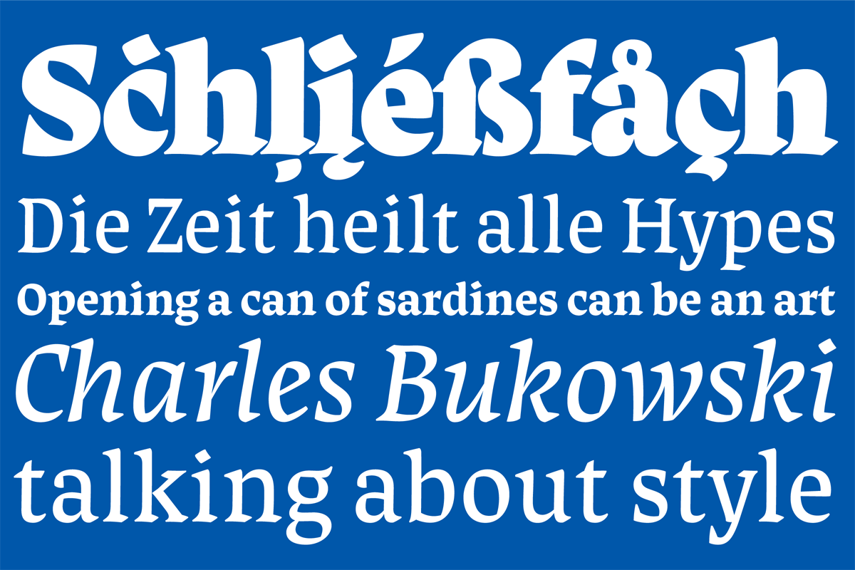
Curtis started with the idea of designing a display typeface that clearly shows its calligraphic roots. A typeface strongly based on broad nib calligraphy with display styles that work in poster sizes and text styles that work in small text sizes.
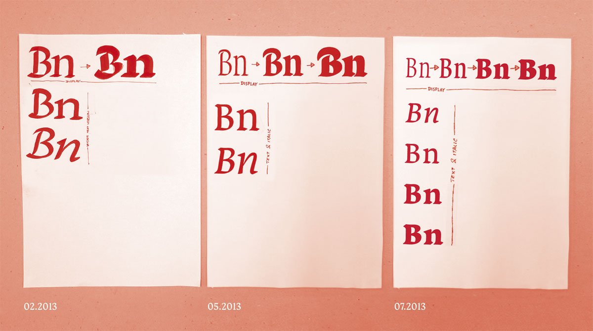
The image above shows the planning and the structure of the typefamily in late february (left), mid may (middle) and early july (right).
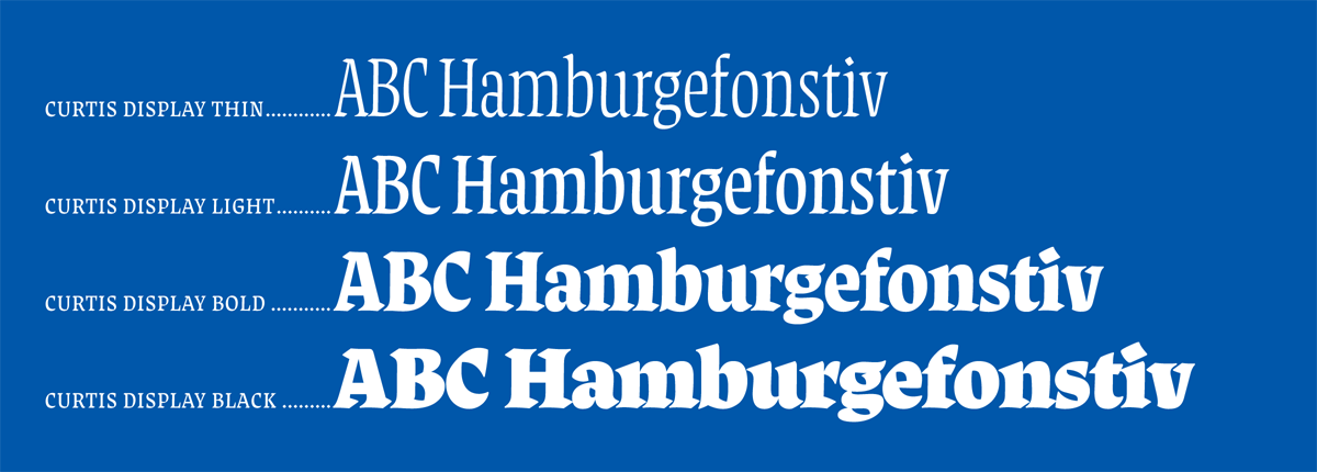
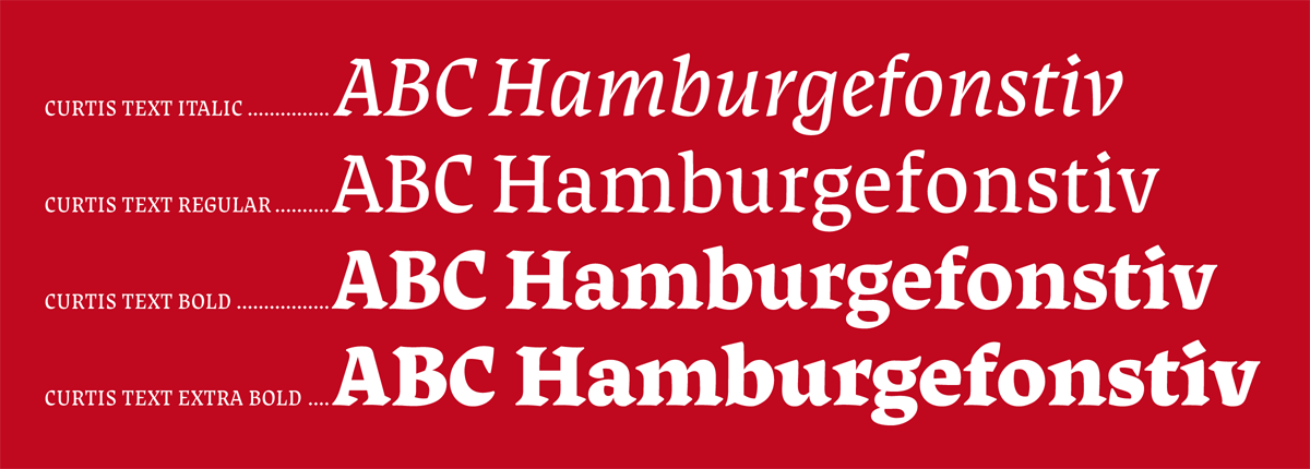
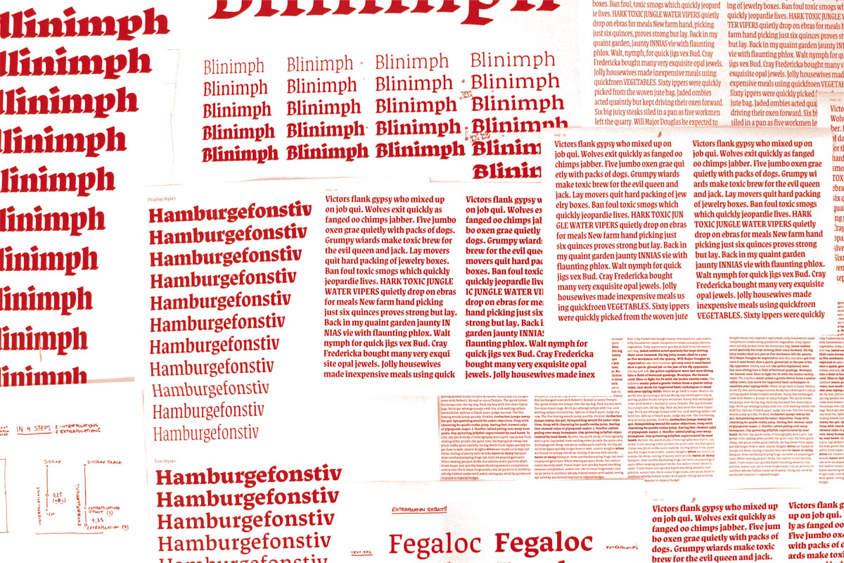
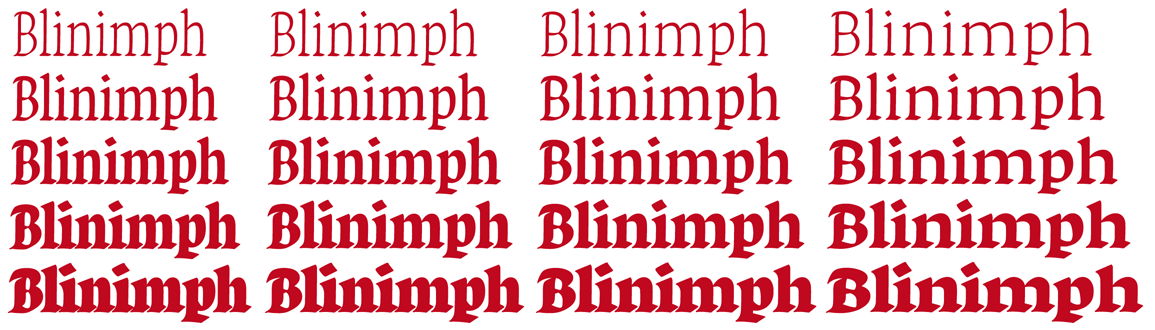
The sketch from february (left one in image above) shows my first plan for the structure of the type family. I wanted to design a display regular, a display bold and a text regular + text italic. The planning changed over time and I added a display thin as I figured it would be interesting in terms of usage. The display styles were intended for poster typesetting, so I went for distinctively different styles where the display light has its own characteristics. I also added a text bold and a text extra bold for emphasis.
Staying true to the tool
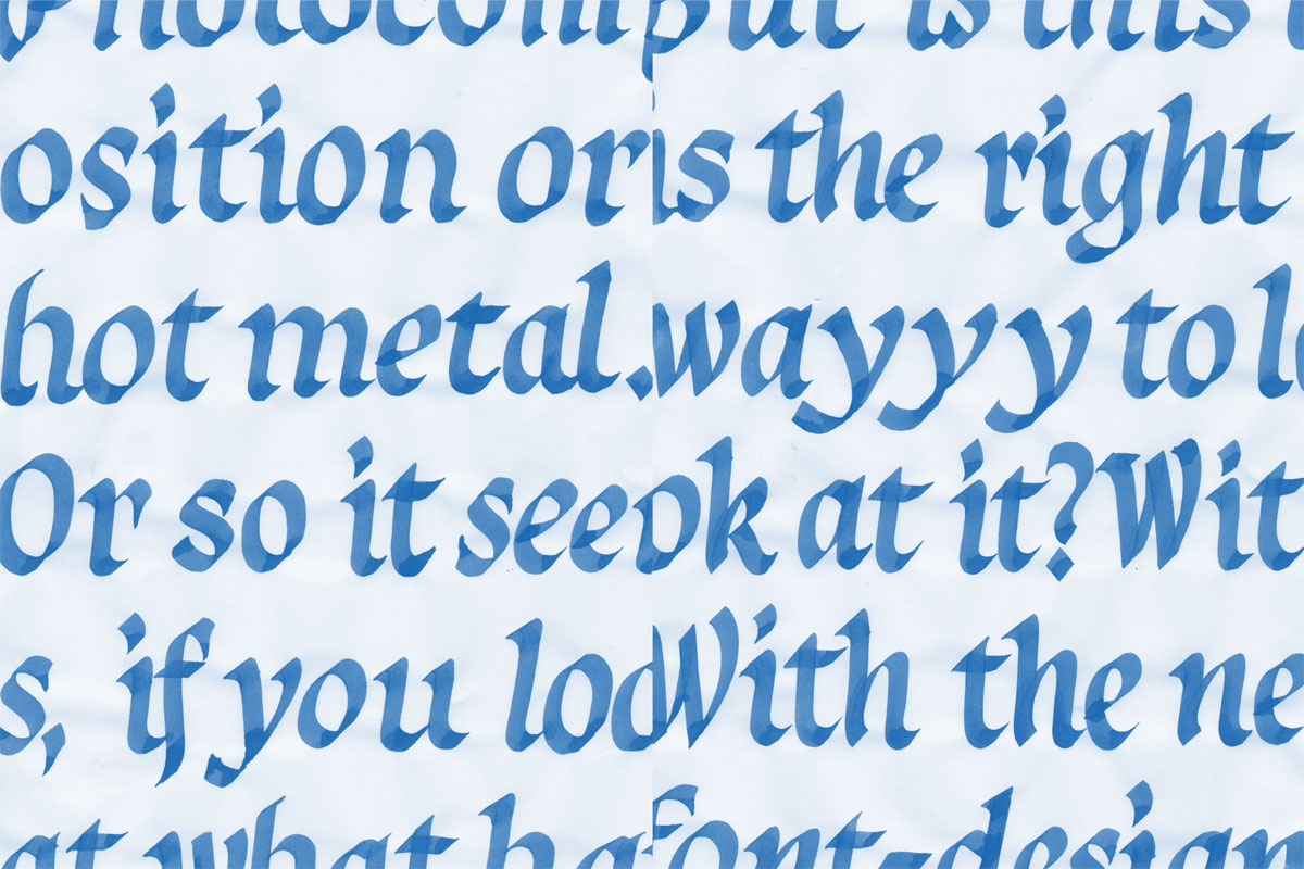
Designing a typeface that tries to be true to a calligraphic tool gives a lot of guidance on how to make your aesthetical decisions. For example the contrast and the stroke endings can be determined by the tool and the way it is used. In this way the broad nib served as useful guidance when making decisions concerning details and as an essential way to solve problems regarding the construction of the letters. Following the tool too strictly resulted in certain letters becoming heavy. To fix this problem optical adjustments had to be done.
Defining & refining
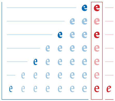
When I started planning and working on Curtis, I had an idea about the contrast, the construction and the aesthetics in general. The weight and width of my first digital file were related to my calligraphy. As soon as I started thinking about a possible family structure I went to the extremes in width and weight. I creating a quick overview done with a two axes, four master interpolation design space. After that I developed the exact weights and widths of the styles I wanted to include in the type family. The two axes were width and weight, so the four masters had to be a light condensed, light extended, extra bold condensed and extra bold extended. From this design space I could already tell which direction I wanted to go and where to place the display and the text styles.
Diagram visualizing the relationship of the Display styles in blue and the Text styles in red. The horizontal axes is width and the vertical is weight.
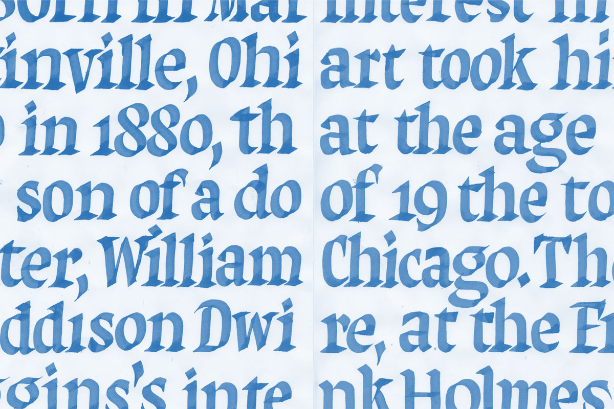
The display styles go from a light compressed to a Black weight that is slightly condensed on a single axis design space. This means that the styles are getting significantly wider as they gain weight. The results are distinctively different with contrasting styles. The text styles share the narrow proportions of the display, but in a more toned down way. They are also more related to each other in terms of porportion and weight, due to their intended use in text. The family is completed by an italic that matches the text regular.
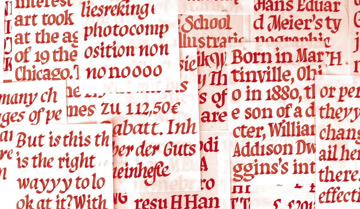
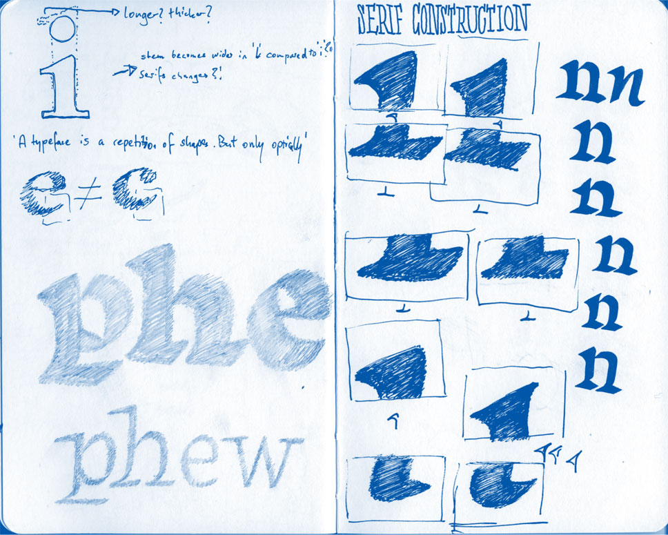
The image above shows the exploration of serif constructions.
Drawing was another important part of my design process. It helped me to come up with a suitable construction for the serifs. I sketched the outline as well as the stroke that would be the center line of the calligraphy. The center line helped me to quickly prototype serifs and get a better image of possible constructions. It was a helpful way of working as the drawing would serve as guidance to the calligraphy. When using the broad nib pen the drawings were a step in shaping the construction and way of writing the serifs.
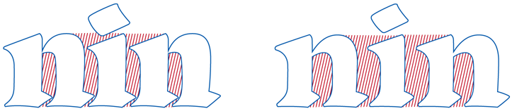
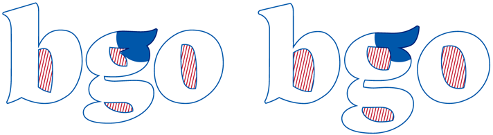
I wanted the display styles to be outspoken with clearly defined styles. In the text styles some of these outspoken details had to be reduced in order to work subtile in text sizes without interrupting the reading. The counter shapes had to be opened up and the general width and spacing had to be wider in the text styles. Also the contrast amount had to change, because the high contrast of the display styles caused to much disturbance in small sizes.