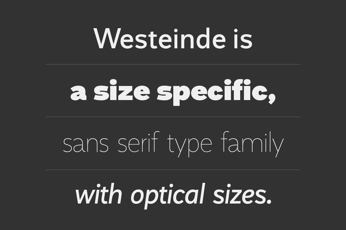
Introduction
I really like the pure, simple shapes and art, I already knew I wanted to design something clean. I Participated seven times in Szerencs Art camp, where my interest for the concrete design developed. So my first idea was designing a pure, low-contrast sans-serif typeface.
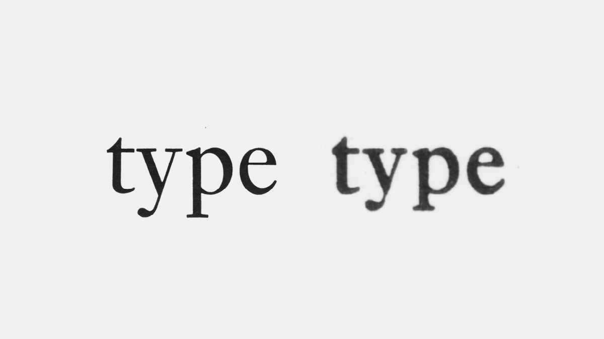
I always complained about the digitization of the old typefaces. When they set type with letterpress, they had a different design for each size. Fonts were designed specifically for the size, for which they were to be used.
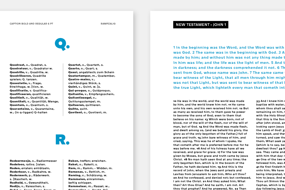
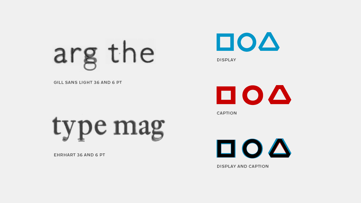
Monotype Ehrhart 36 and 6 point size
But when they started to adopt the typefaces from lead-type to photo-type setting, in most cases they adopted only one optical size, and used the typeface with the same design in both, 6 and 72 point size. (Respect for the exceptions, like TypoArt in East-Germany, they adopted all the optical sizes). So this thing was always in my mind, that in many cases we don’t use the right typeface.
Research
I did a historical research, compared the old letterpressed typefaces with optical sizes. I was curious how did they design such a nice typeface, that is legible in small size and performs well in large sizes. The research work started in the Stichting Lettergieten, where I could find some really nice original Monotype Specimen pages.
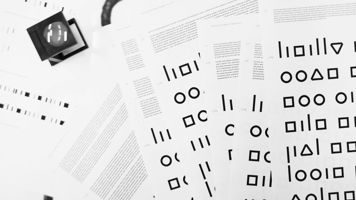
I did my own technical research too. I was curious how we can design two extreme optical sizes, where the shapes look the same in small and big size too. At first I wanted to figure out, what the differences in these styles can be, and how should I change the design. I used basic geometric shapes, what are representing the construction of the letters.
Technical research with basic shapes in Display and Caption optical sizes.
I compared the results of the historical examples and my testings. In the “good old days” they used slightly wider and bolder shapes, shorter ascenders and descenders and looser spacing for the Caption size. My results are almost the same, I would use even wider and bolder shapes, enlarge the small counters, open the apertures more, adjust joins, and set looser spacing for the Caption size.
Comparison of the researches
Sketching
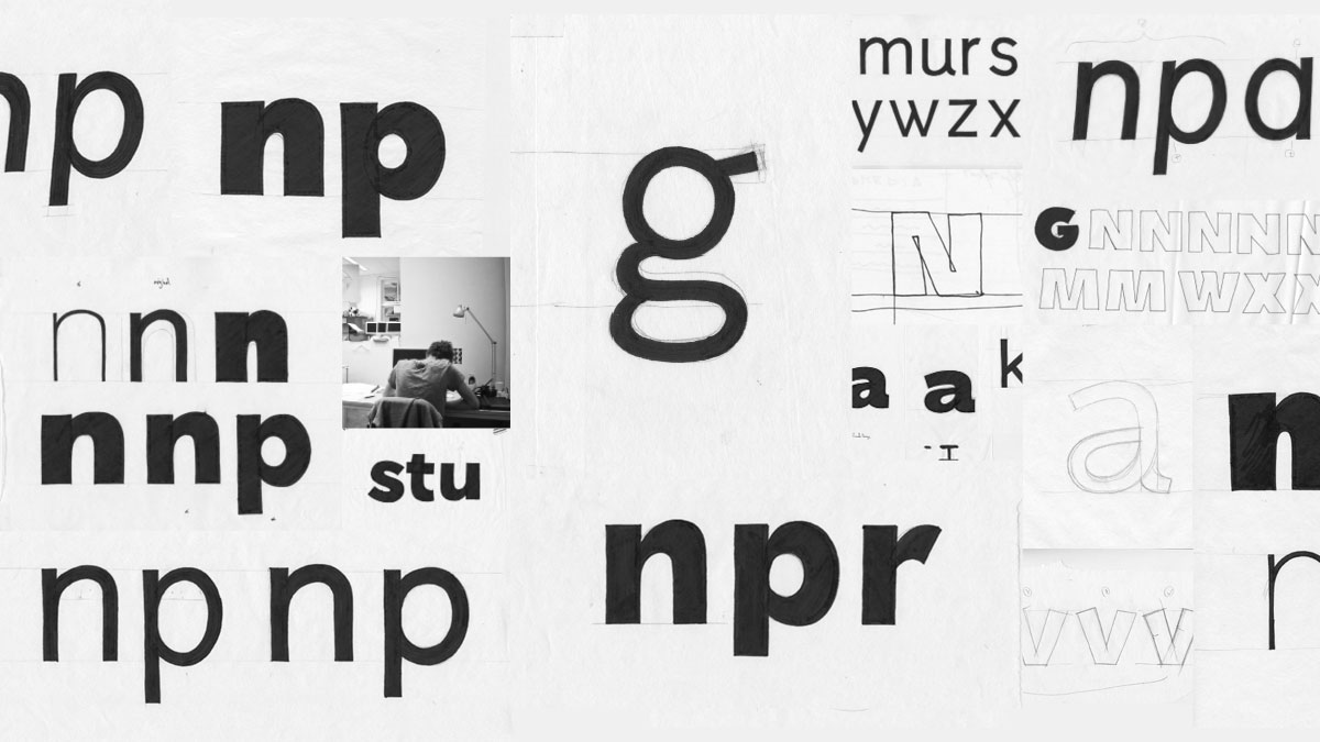
As usually I started with some rough drawings. I sketched the basic ideas and shape connections, what I had in my mind.
I wanted to design a really clean and pure sans serif type face. That’s why I decided to use a pointed pen contrast type, because this basically use continuous stokes and fluent shapes. I sketched the purest design that was in my head.
I already started to thinking in a family, with several weights. At the end the basic idea changed a bit, I went to the non-robotic, more unique way. I sketched together the Caption and Display size, with several weights.
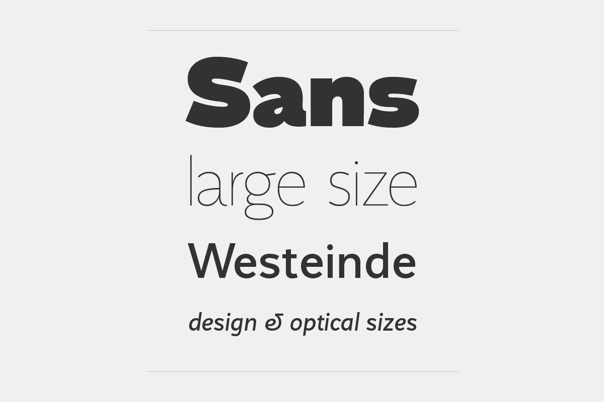
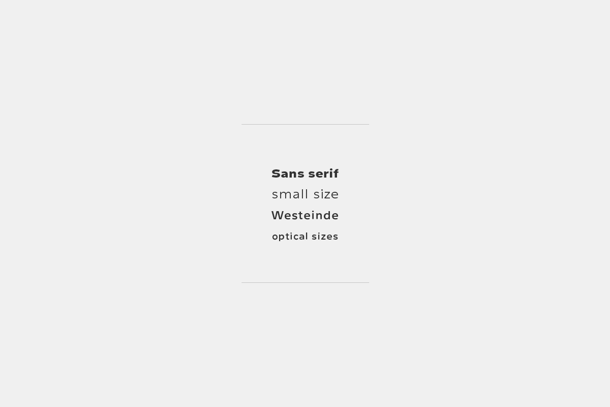
Designing optical sizes
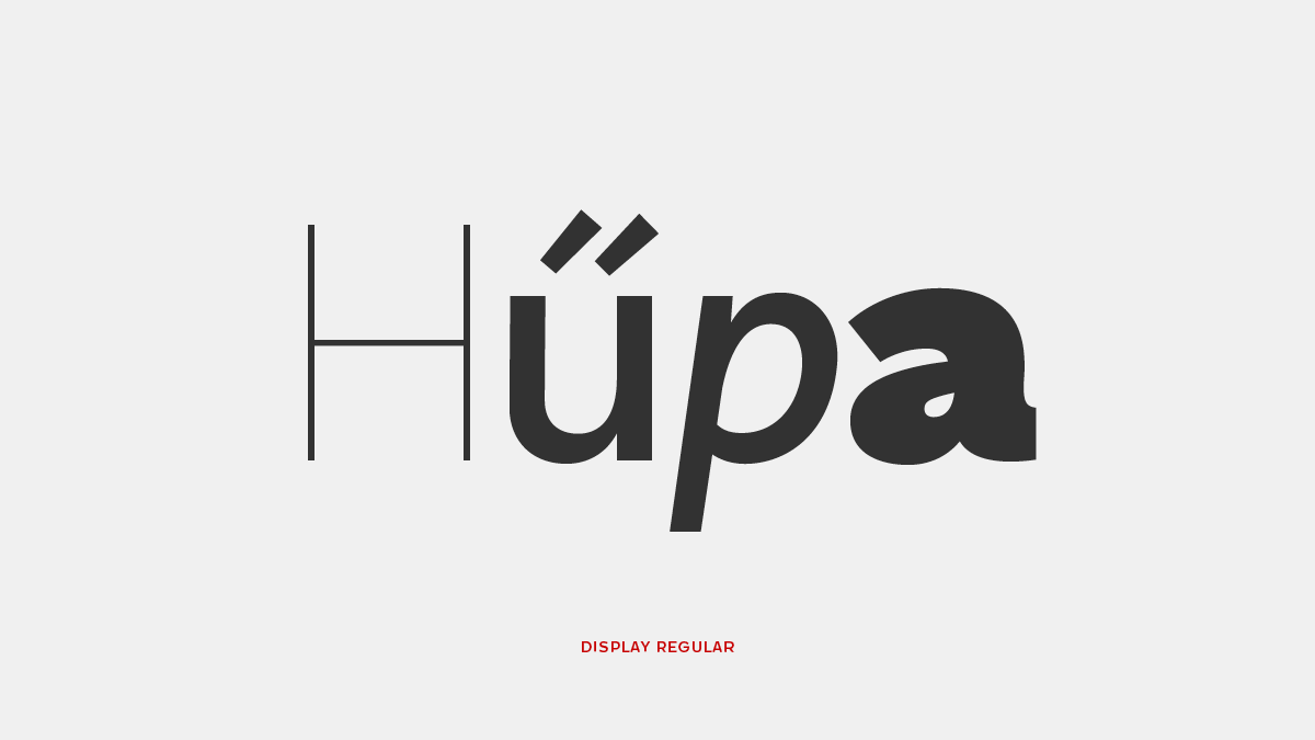
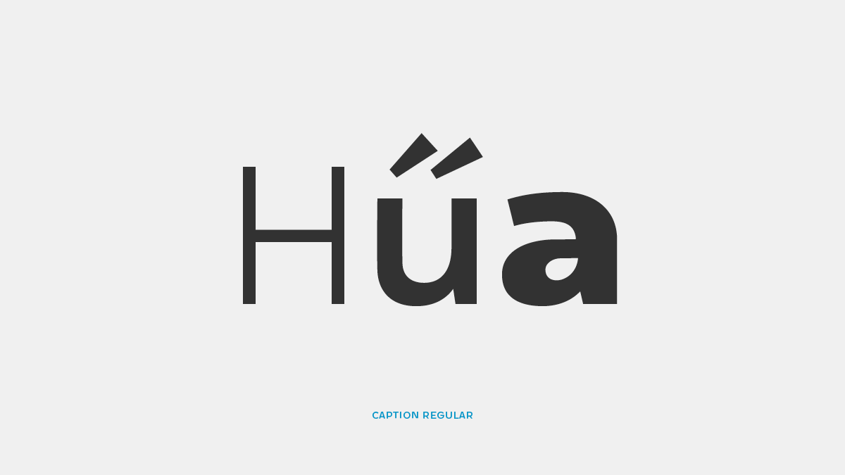
From the beginning I designed the Display Regular together with the Caption. At first I had to apply the main differences, what I already found out in my researches.
At first I sketched the Display version, and I adopted this design, for the small size. It was easier, because I had to simplify the details, and suppress the features. And I already knew, what values I should change and how. Paying attention to my results of the historical and technical research, I started to design the Caption.
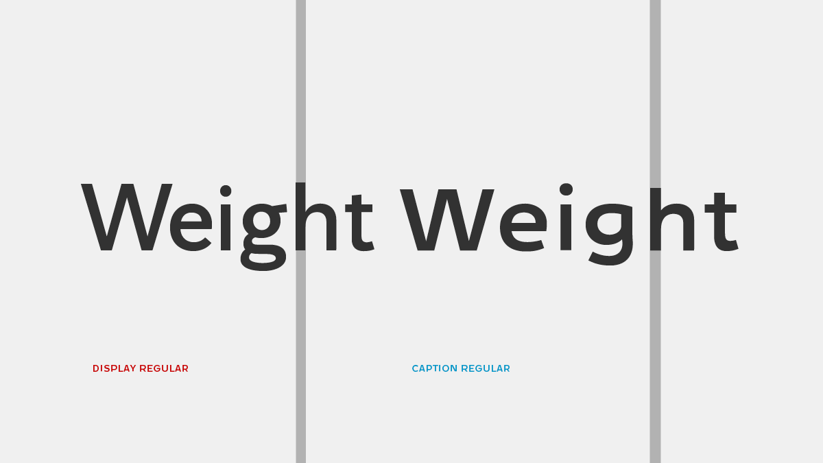
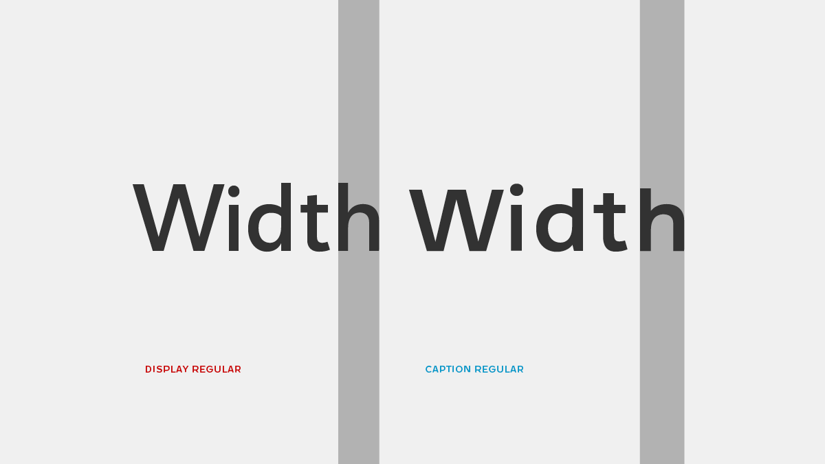
Weight & Width
In small size I need more black for the stems. Because black is a total absence of light, whereas white is an effective complete over-loading of the eye. And the light goes into the dark areas, but not proportionately. That’s why the overall weight needs to be increased in small sizes in order to maintain the overall perceived tone on the paper.
Weight
Because the shapes look narrower in small size, I had to design wider letters. And I also had to persevere the balance between the white and black.
Width
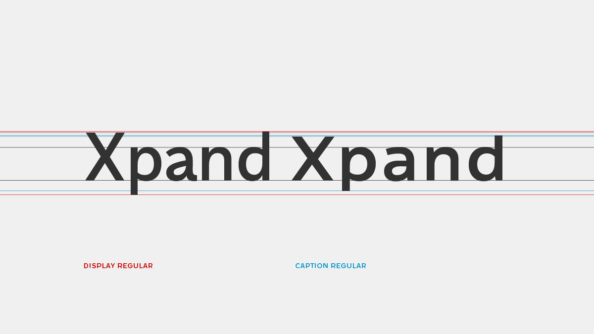
Vertical Proportions
I used the same x-height for the Display and Caption size, and the ascenders and descenders are much shorter for the small size. This is almost the same effect, when I increase the x-height. I designed lower capitals, than the ascenders for the both optical sizes, to keep the balance between the lowercase and capital letters. Usually, we set type in really small size to save space. The short extenders allow tighter leading, with which we can also save space in the vertical direction.
Vertical Proportions
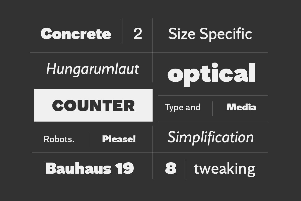
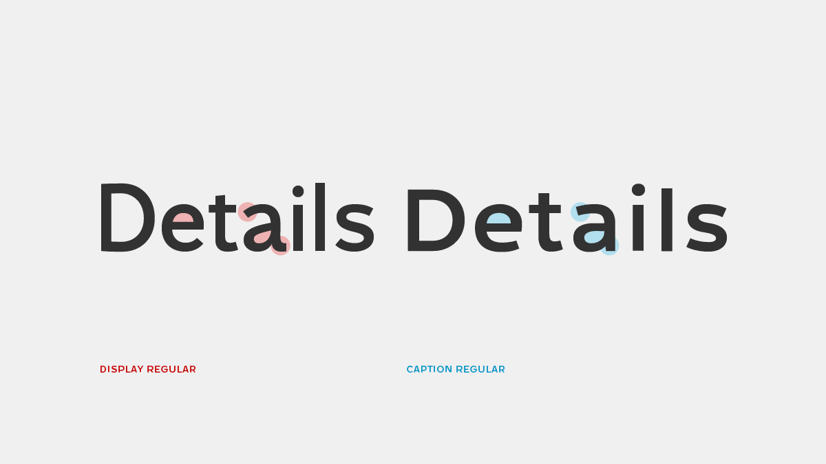
Counters, features and joins
The main effect of the afore described adjustments of vertical and horizontal proportions is the increase of the lowercase counter size in smaller sizes. In addition to this, the letters can be made more recognizable by opening up their aperture.
Simplifying the shapes in smaller sizes is really important. In this design simplification implies not only tweaking the details but also changing the general structure. This typeface has low contrast. To keep this structure, the strokes of the letters have to be thinned, where they meet at a narrow angle. «The way lines running together make spots is a thing that will surprise you» Paul Renner (1939) For the Caption size I had to use more optical corrections, because in small size the shapes behave differently.
Counter shapes, features and simplification, optical corrections
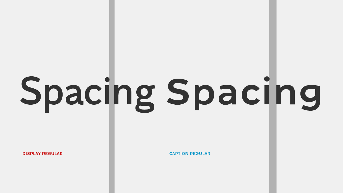
Differences in spacing
I designed looser spacing for the Caption, because in this optical size the shapes need more white space in and out, to avoid the crowding of the letters. This is also useful to keep the balance between the white and black, because the characters are already wider and bolder.
Spacing
Thinking in a family
I designed the whole family at the same time, because, when I changed something in a style, I had to change the others as well. It was difficult to control every weight in the same time. I designed the Caption size from the Display and developed them together from the beginning. At first they were really similar, but I decided to design a more recognizable Caption style, and more different shapes. For this size I had to solve a lot of problems that I didn’t have when I designed the Display size. One of them is the connection of the strokes with narrow angle. In these solutions the stems became bigger and heavier, specially in small size. So I had to compensate this connection.
Display family overview
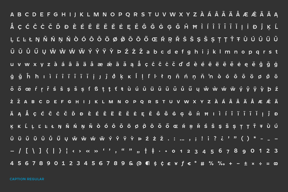
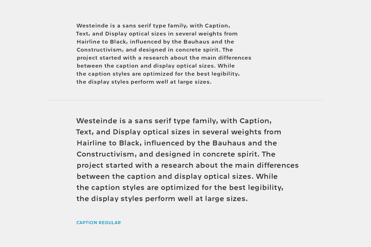
Caption family overview
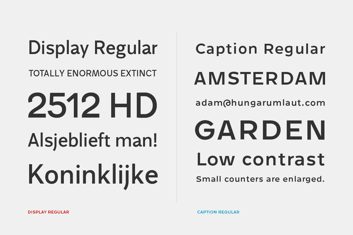
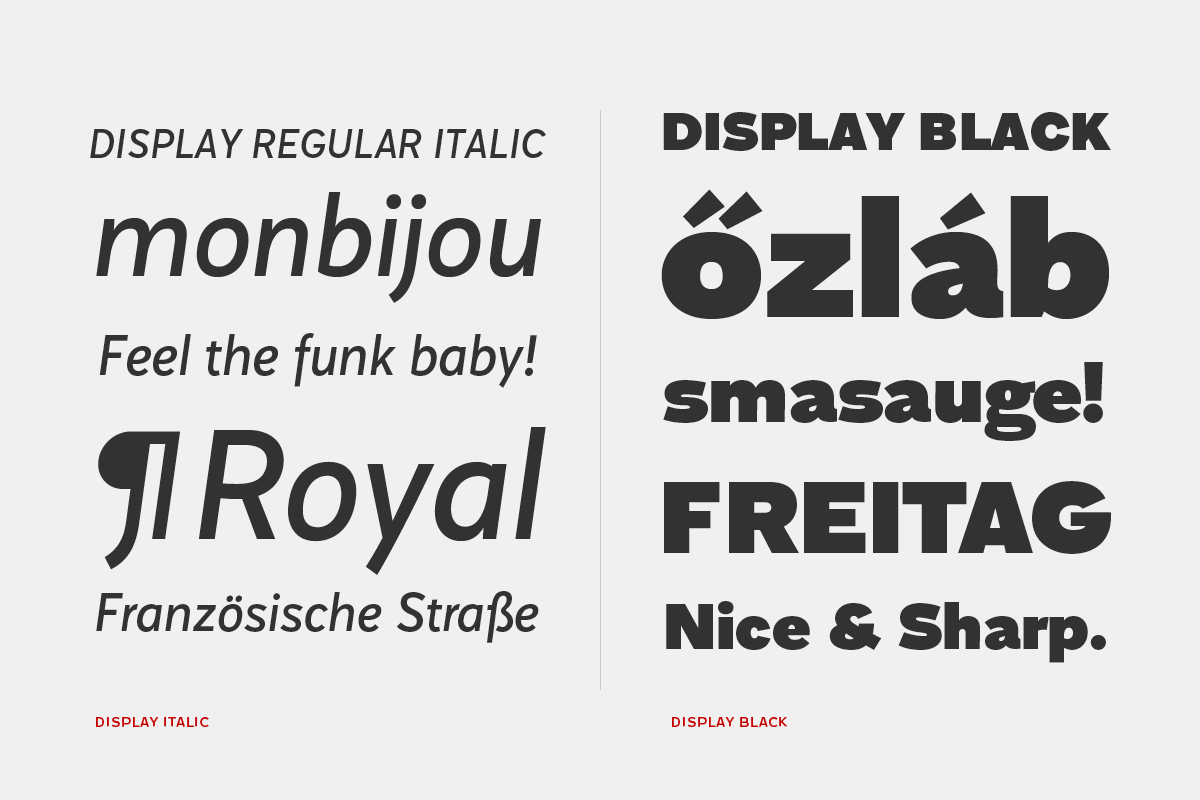
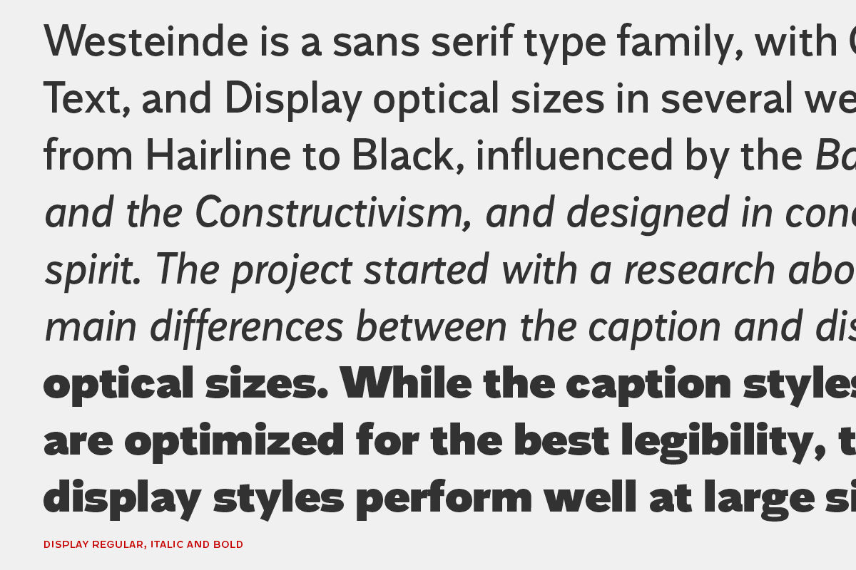
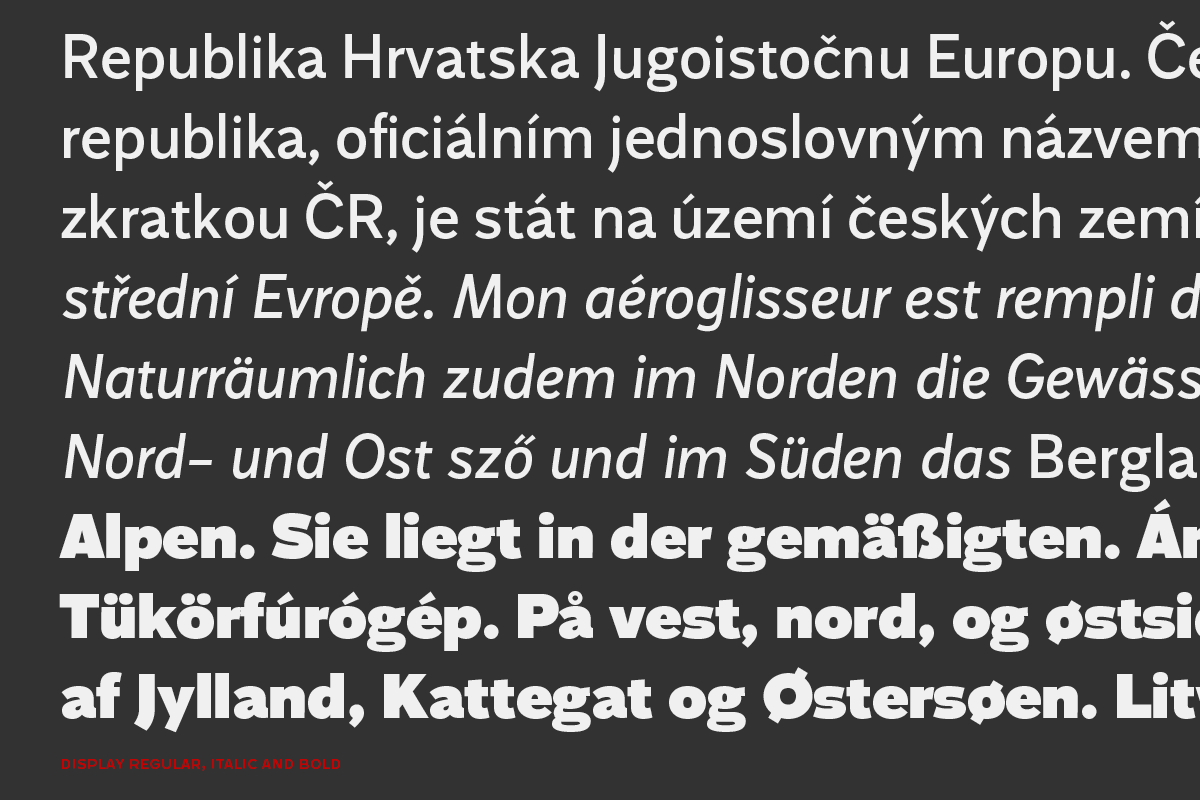
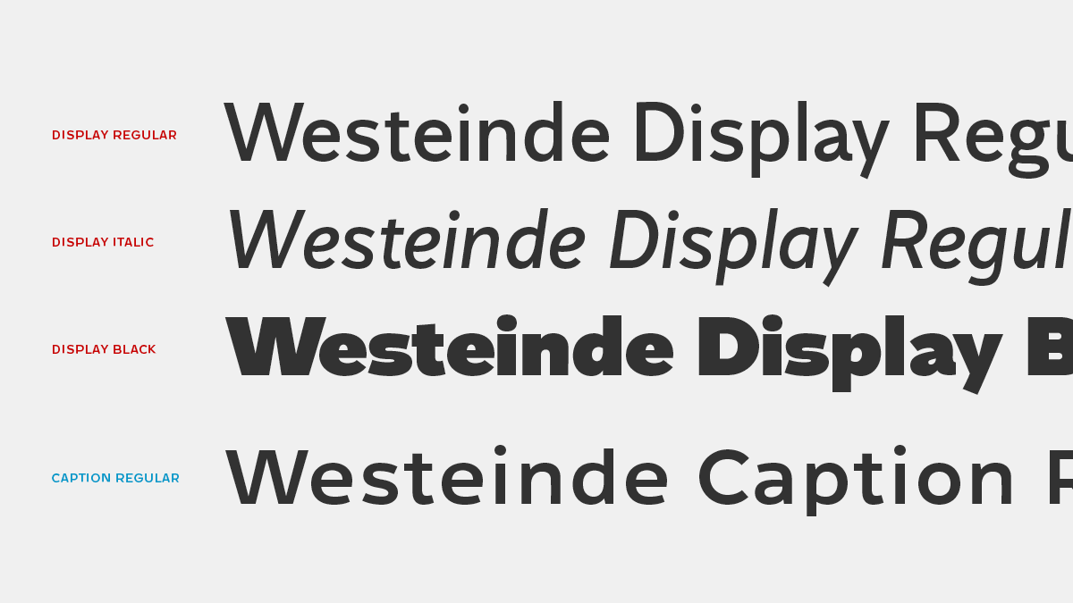
At the end I finished the Display Regular, Italic, and Black styles, and the Caption Regular. I decided to finish these four, because I wanted to show the most various styles, regular for big and small size, italic and black, they are really different, with the same amount of challenge.
Style overview
I am happy because, choosing this project, I had to solve a lot of problems, like designing a typeface for really small size, or drawing the blackest shapes. The most challenging part was designing the difference between the Display and Caption optical size, because a naked sans serif typeface is almost ready for using in big and small size too, but there is this tiny word: almost. I feel I could perform well, what I sketched at the beginning, and found the way to design a nice size specific typeface.