The Idea
The idea of designing the typeface dedicated to use on maps came to me naturally as I have always had an interest in visually complicated matters. Maps, no matter what kind, are definitely complex and structured sources of information and — unlike books, they use the type in a completely different way.
The surface, space and density are the key concerns one have to deal with simultaneously. The understanding of juxtaposition of text (words) and the background (cartographic matter, colours, patterns, lines) is crucial for starting a map oriented type.
Research
There is no settled way to do the research properly. My way was to start with visiting the libraries, especially the Royal Library in the Hague and Plantin-Moretus Museum in Antwerp, where I could touch with my bare hands and see with my own eyes examples of maps dating from the XVIII and XIX century. Experiencing the real matter brings a different level of understanding and a sort of intimacy into the design process. It makes the designer feel more familiar and comfortable with the project.
Another step that I took was a trip to Sevilla in late February (during the spring break) where I could see the tomb of Christopher Columbus (inspiring), whose overseas travels opened a new chapter in cartographic development. Furthermore, featured at Plaza de España tiledwork maps and historical scenes for each Spanish province — all designed by the leading Iberoamerican architect — Sevillan Aníbal González,(2) brought a fresh perspective into my understanding of maps integrated with the space.
This little bit of understanding of subject was essential for me to define some steps in my own type design process.
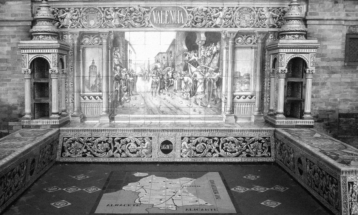
(2) tilework maps, Plaza de España, Sevilla, Spain
Inspirations
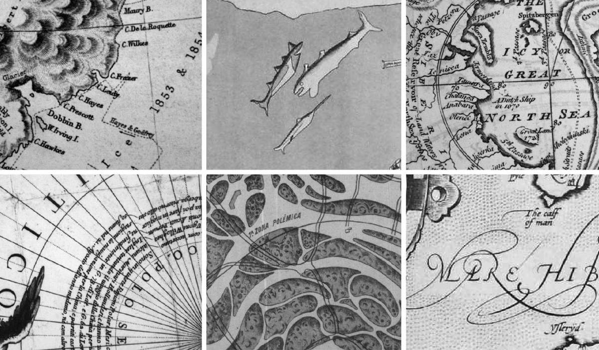
I have been always a big fan of handmade quality and its — sometimes awkward — uniqueness. Therefore, I have started collecting the pictures of the maps printed from hand-engraved copperplates on which every single letter was different. On this maps type and illustration were integrated at a totally different level that on maps nowadays. They worked much more complementary whereas now, the illustration is most often another layer of data.(3)
(3) richness and variety achieved by the handmade craftsmanship were of the great importance to define the final character of Mala type family
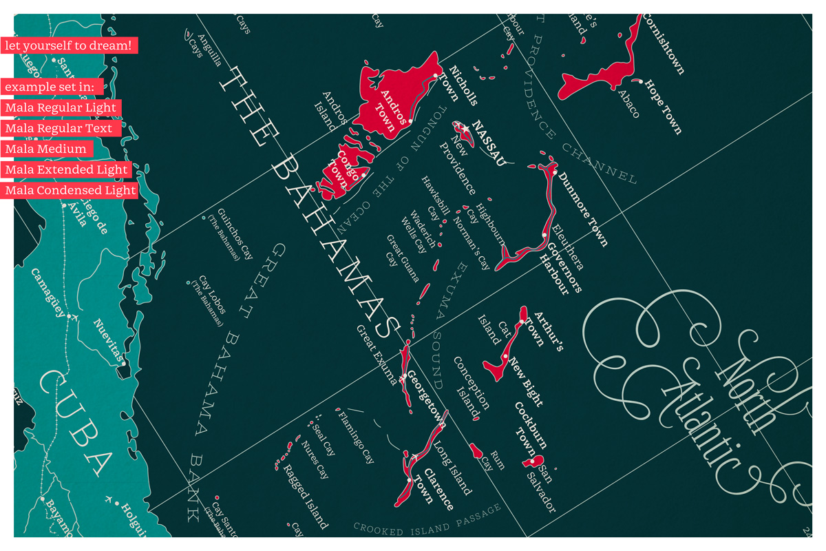
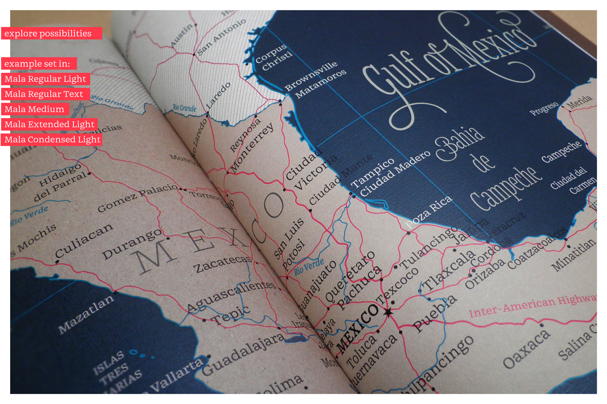
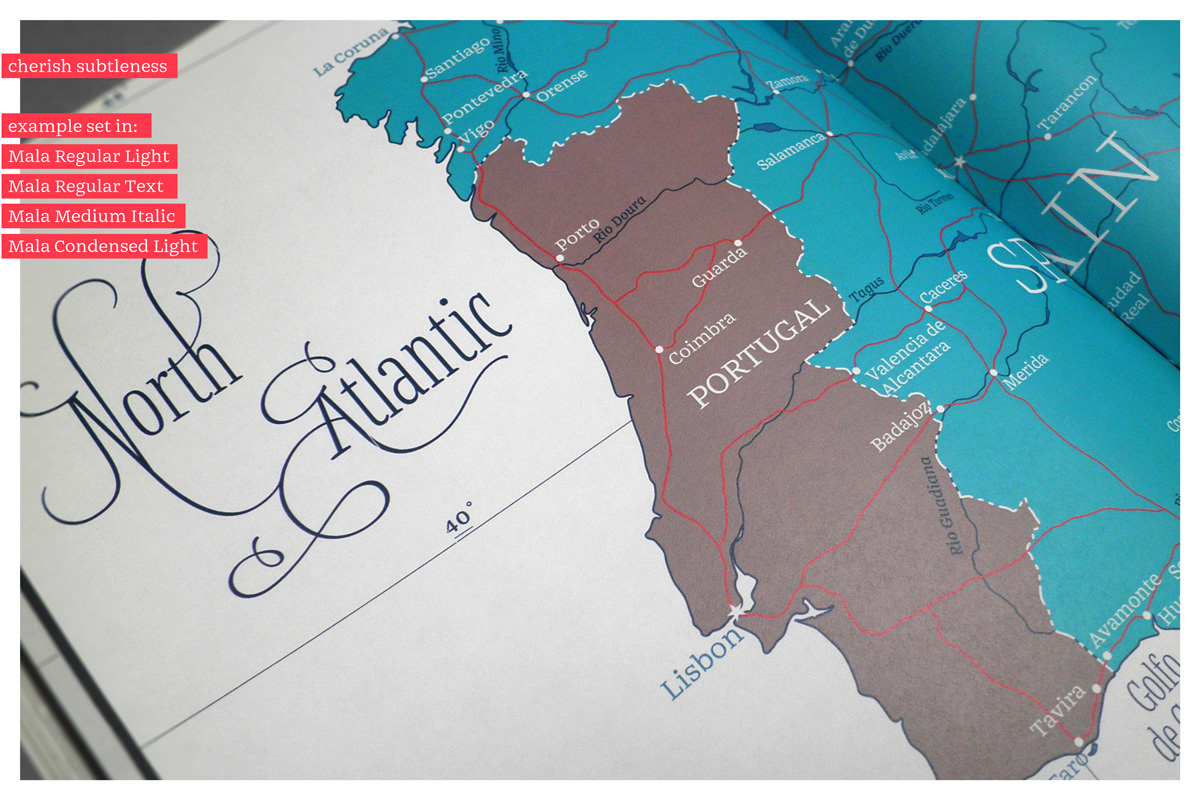
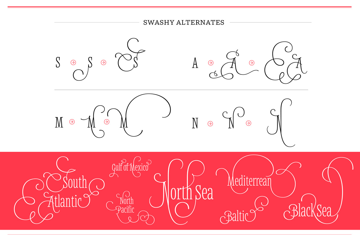
Handmade means more freedom. Freedom in the term of typography on the map may be translated into the variety of different styles as well as into the variety of alternative characters withing one style. One of the most beautiful features of the early printed maps that I wanted to bring back into the digital typeface were swashy characters. For this particular usage their role is fully justified not only for the aesthetic reasons (nice and curly look) but also because they fill up large areas (e.g. the surface of the ocean).
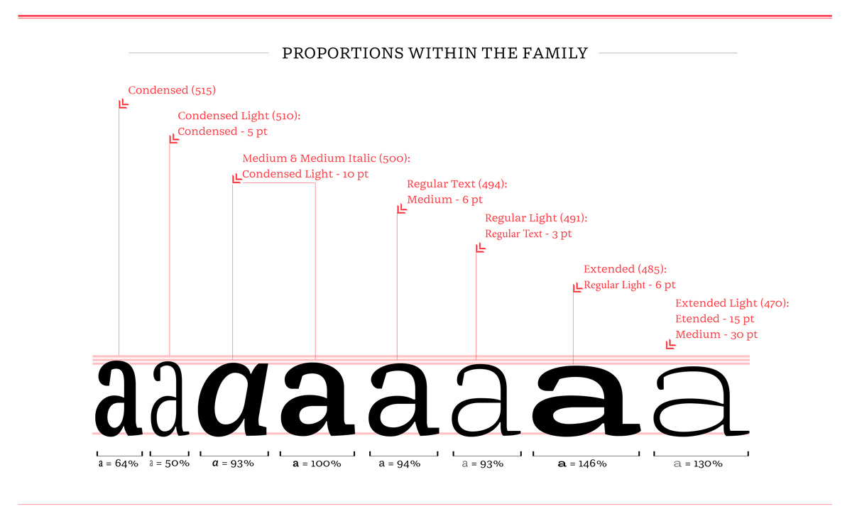
Execution: family planning
After a lot of interpolation trials I have finally managed to define my weights and the relation between them.
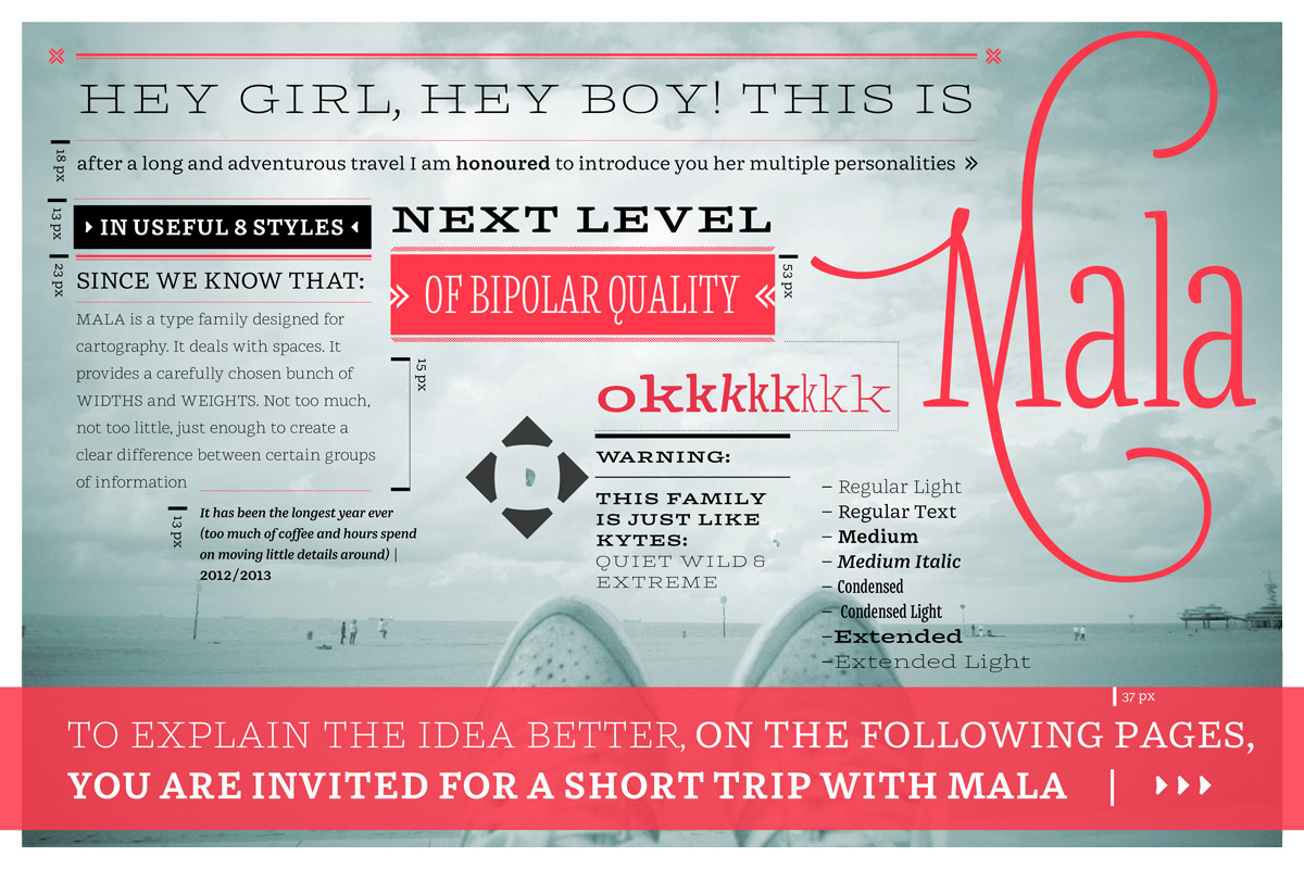
The plan proposed following members of the family:
- Regular
- Regular Italic (ideally)
- Condensed
- Condensed Light
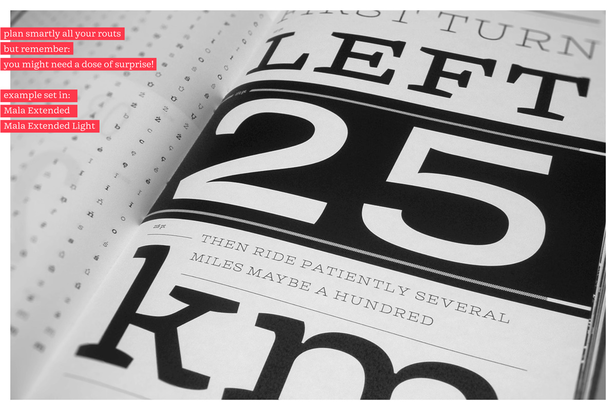
- Extended
- Extended Light
Later, during the design process I have decided to add another members, which I found really useful and that decision led to following structure of the family:
- Regular Light
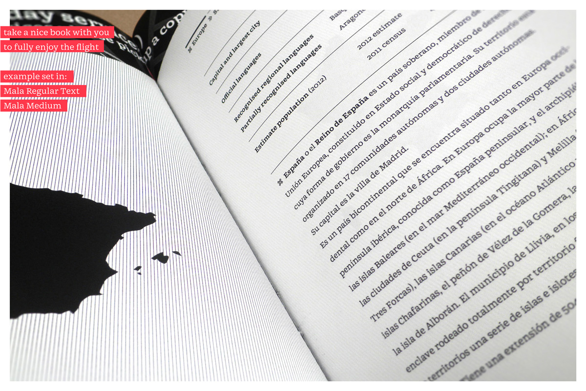
- Regular Text
- Medium
- Medium Italic (ideally)
- Condensed Medium
- Condensed Light
- Extended Medium
- Extended Light
Right away, I have started designing all of my extreme masters. I believed that dealing with extreme widths simultaneously would led me to find the best solution for all of them.(4)
(4) early stage of the family; since the very beginning I have tried to handle all of the styles at simultaneously to provide the best solution for all of the extremes
Testing
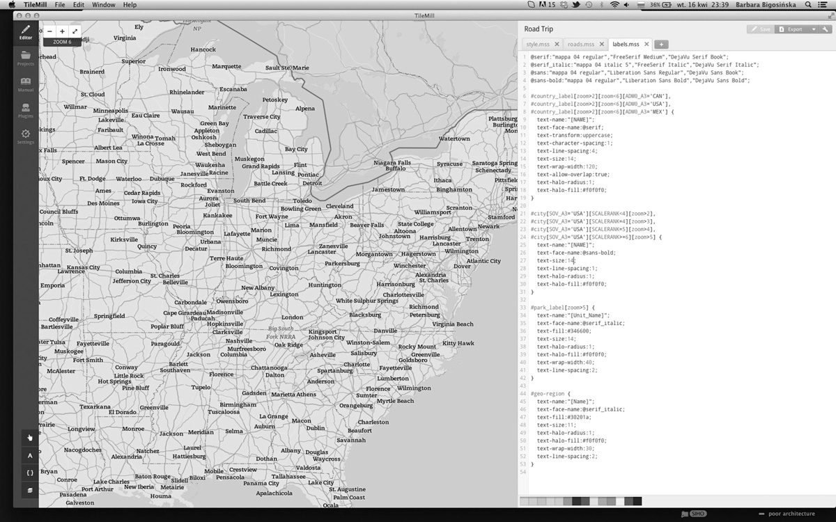
Testing was an essential part of my entire process. To evaluate my design decisions I used application TileMill which allowed me to apply my typeface into existing maps. Another step was designing and redesigning existing maps in Adobe Illustrator, where I had total control of the typeface and its application.(5)
(5) TileMill is an open source application dedicated to map design. It allows to edit the style of map with all its elements in exactly the same way as css, one can also upload typeface and freely test it within a great variety of available maps
Joggling with all of the masters
The method of working I have introduced was based on working with all of extremes parallel so that to maintain as much of the sustainability within the family as possible and observe the relations between them on one surface.(6)
(6) At first, all of the dimensions adjustments were based on observations of printed material. After a while I have started to measure the family and notice an evident consequence
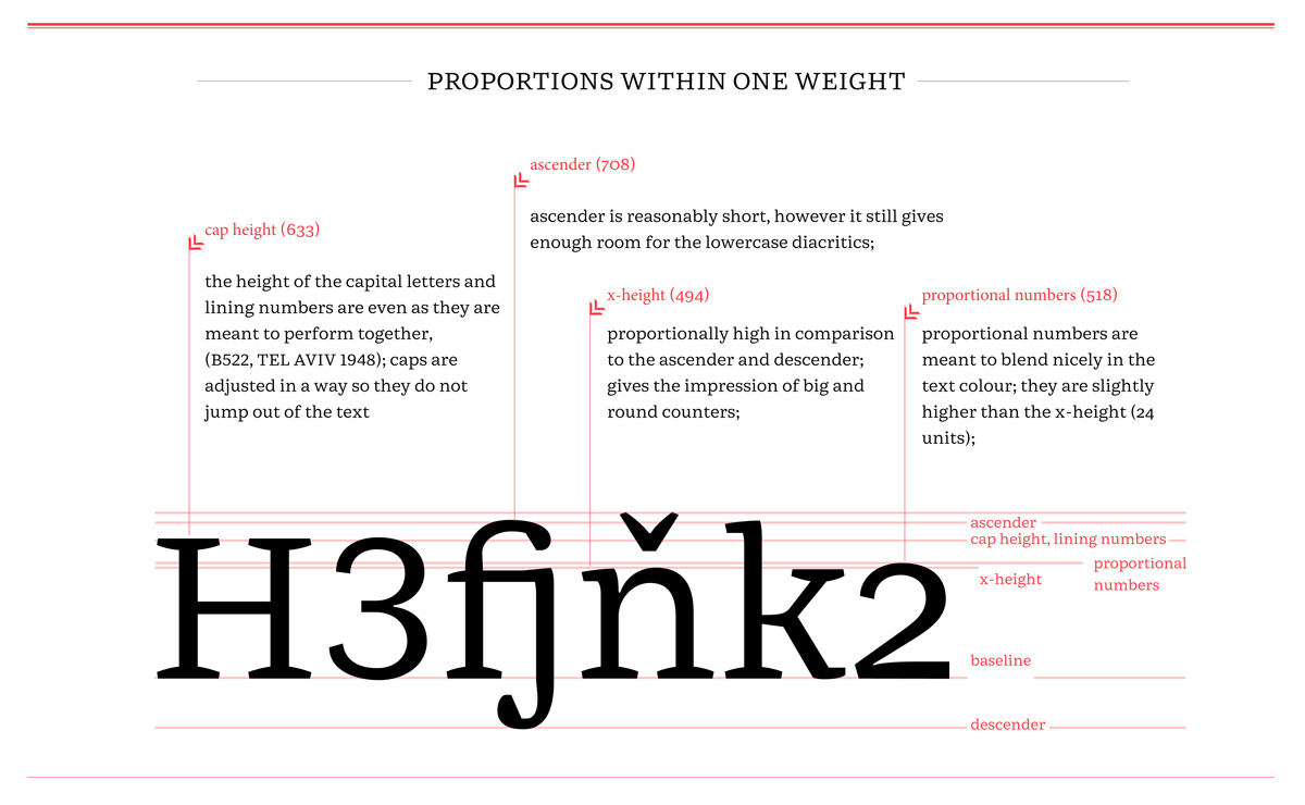
Dimensions within one master
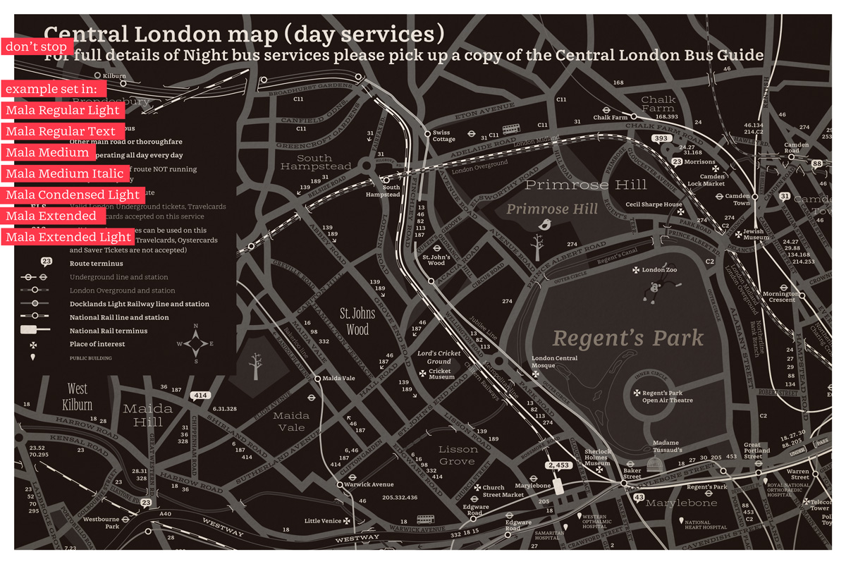
All of the styles have their particular dimensions. The illustration below shows the basic vertical and horizontal characteristic on the example of Mala Regular Text.(7)
(7) featured here text weight is reasonably light what is a result of its generous proportions and relatively big counters
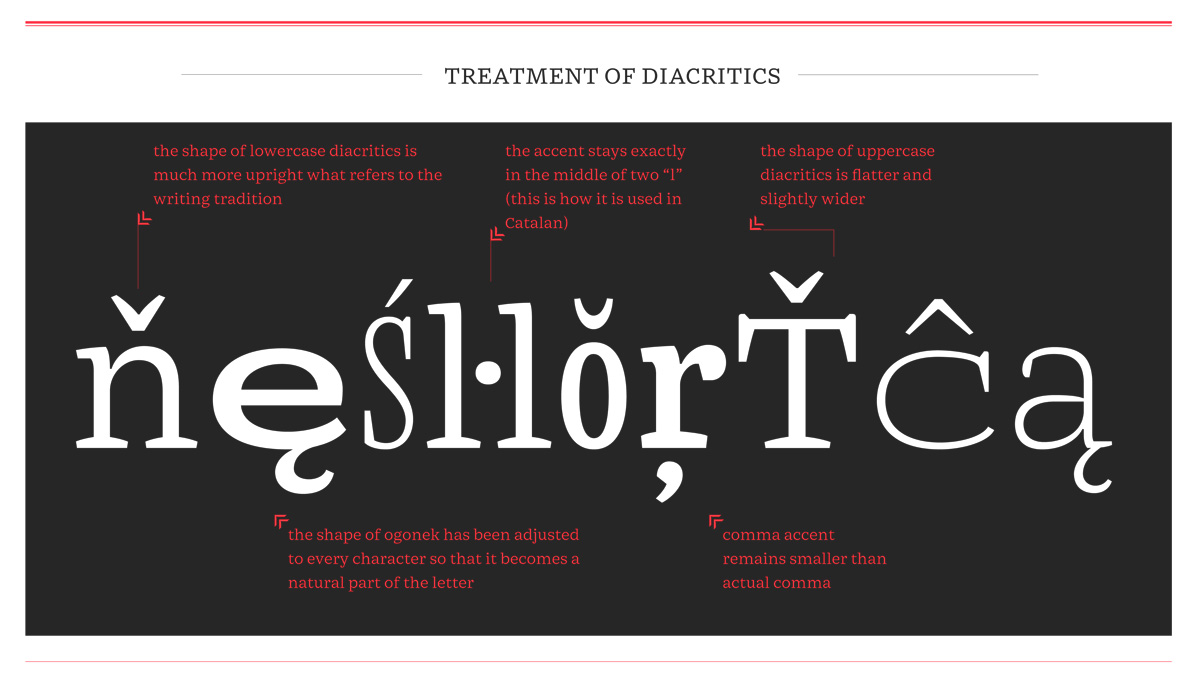
More than one language
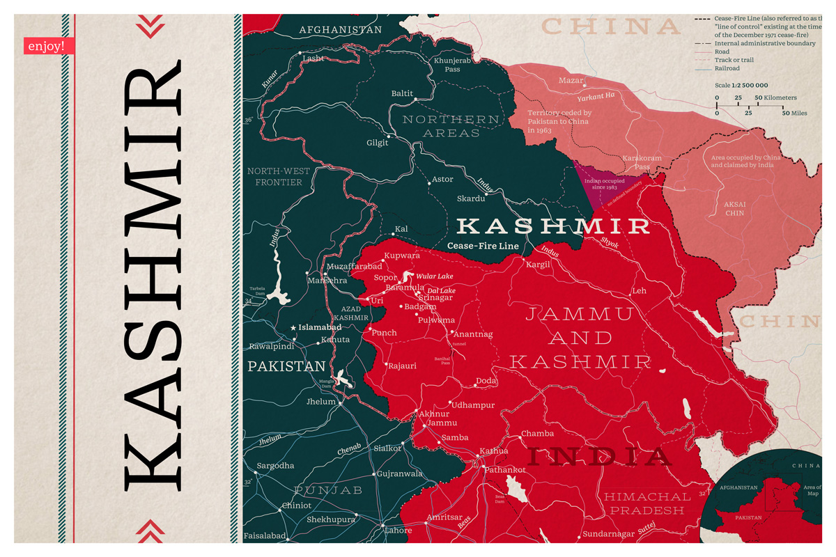
The family supports a wide range languages within the Latin Script. In the most of styles diacritics are treated fairly generous so that to perform efficiently on the possibly troublesome map backgrounds (such as patterns). At the same time diacritics designed for the Mala Regular Text are more subtle as the function of this weight is to serve the text.(8)
(8) the striking differences between extremes led to quiet individual treatment of accents in every style
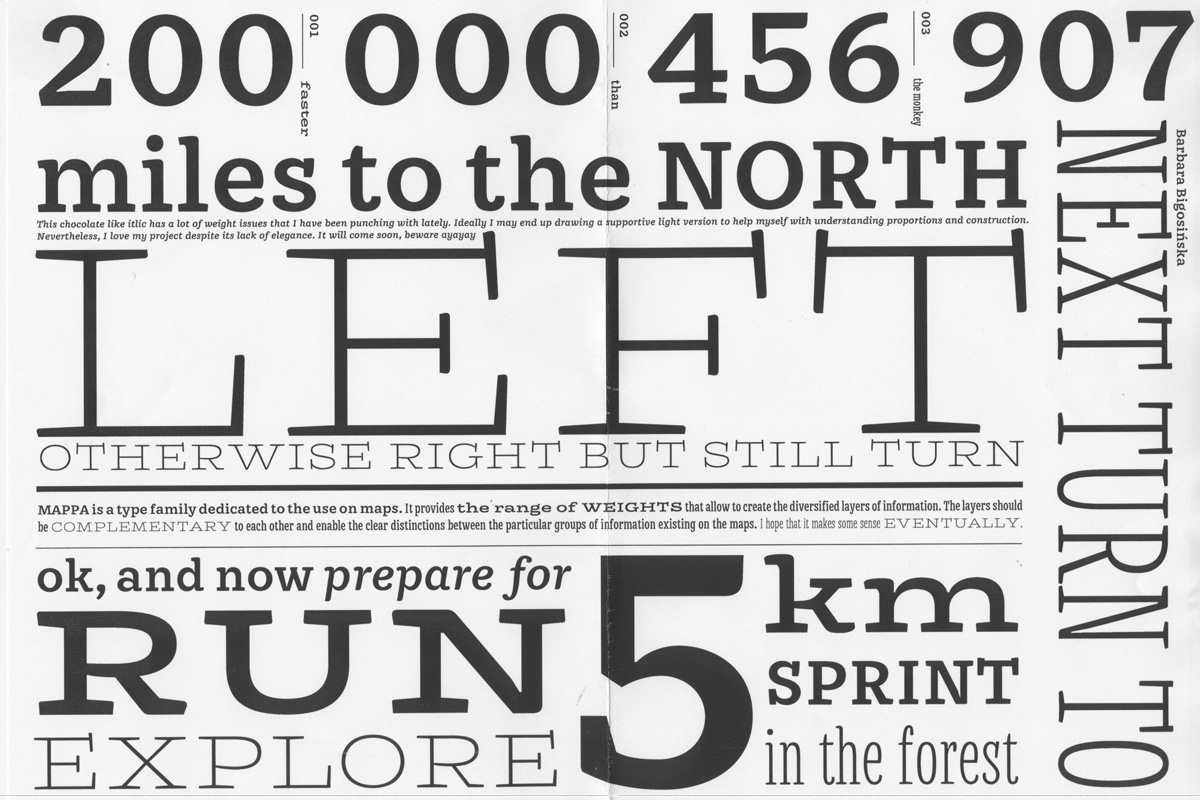
Features
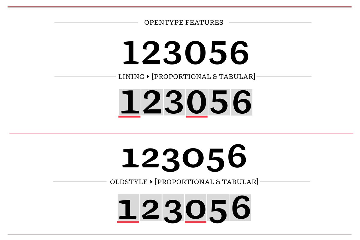
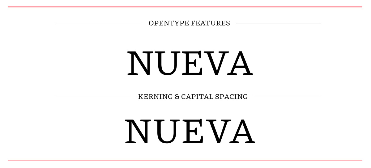
Mala provides numeral support: both proportional and lining figures in proportional and oldstyle sets.(9) Furthermore, the family is kerned and supports capital spacing.(10) Additional taste is provided by extra swashy alternates that bring back the spirit of crafted maps from the past centuries.(11)
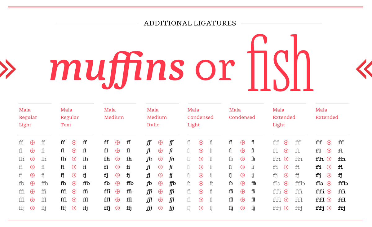
The basic principle of the family was to avoid the necessity of ligatures (this explains narrow treatment of e.g. “f” and “j”), however in the end those were added in case the typeface would be used for different purposes than intended.(12)
(9) numeral support features
(10) family is supported by the minimised amount of kerning pairs and additional capital spacing feature which allows for setting text in all capitals with a proper spacing
(11) swashes are not only a sweet cherry on a pie but they also have their function which determine their shapes: they are meant to fill broad spaces, such as oceans or seas
(12) basic ligature support