Introduction
Being in a design university environment raises a lot of expectations from you, as a student. You are not bound by real-world standards anymore, so you have the unique opportunity to do something different, to cross some boundaries, to let the creativity roam free; at least in theory. In practice, at TypeMedia, you are in a new country, with new colleagues and flatmates. You have temporarily left everything behind to devote yourself to learning type design and making the best out of your one-year master. This is an investment in your future, so you don’t want to disappoint your mentors, you don’t want to disappoint your industry, and more importantly, you don’t want to disappoint yourself.
When I was in graphic design school, we learned one clear thing: without a concept, there is nothing. This was right up my alley, because I had always been a thinker. My approach to any project is to try and find some clear idea first; this usually means a problem to solve, a statement to make, something to prove. Only then can I channel my ideas clearly.
There are many problems to solve in typography and type design, ones that have been attempted by many people. What I was going to learn is that there are no clear solutions, that there is no science. Everyone makes their own rules in the end.
The Idea
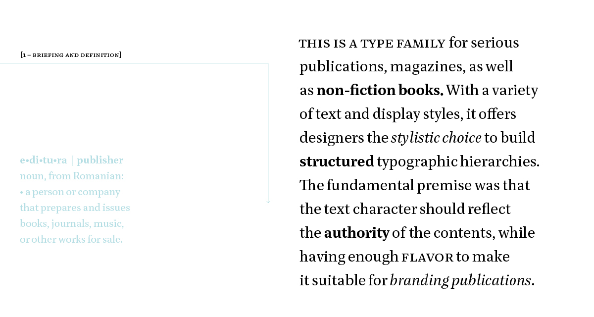
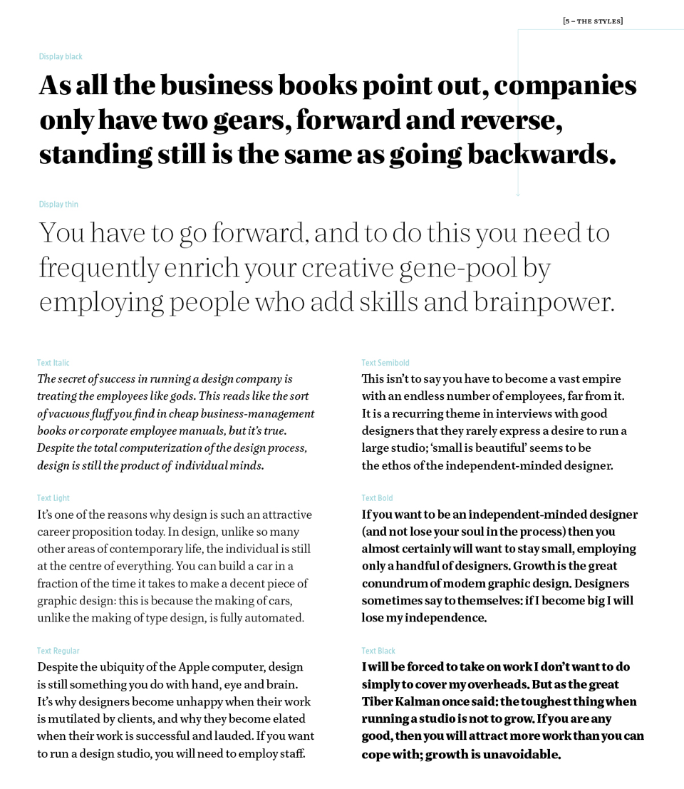
The brief was to create a type family for magazines, serious publications, and any type of nonfiction books. The family should include enough styles to offer the designer stylistic choice in building functional typographic hierarchies. The glyph repertoire should be able to accommodate not only different languages, but also different types of notations (chemical formulas, math, bibliographies, etc). The character of the typeface would be sharp and controlled to reflect the seriousness of the contents, but at the same time it would have a degree of personality so as to make it suitable for branding publications. Although not the main goal, the design should be relatively screen-friendly, in a world where most magazines choose to have some sort of web-presence.
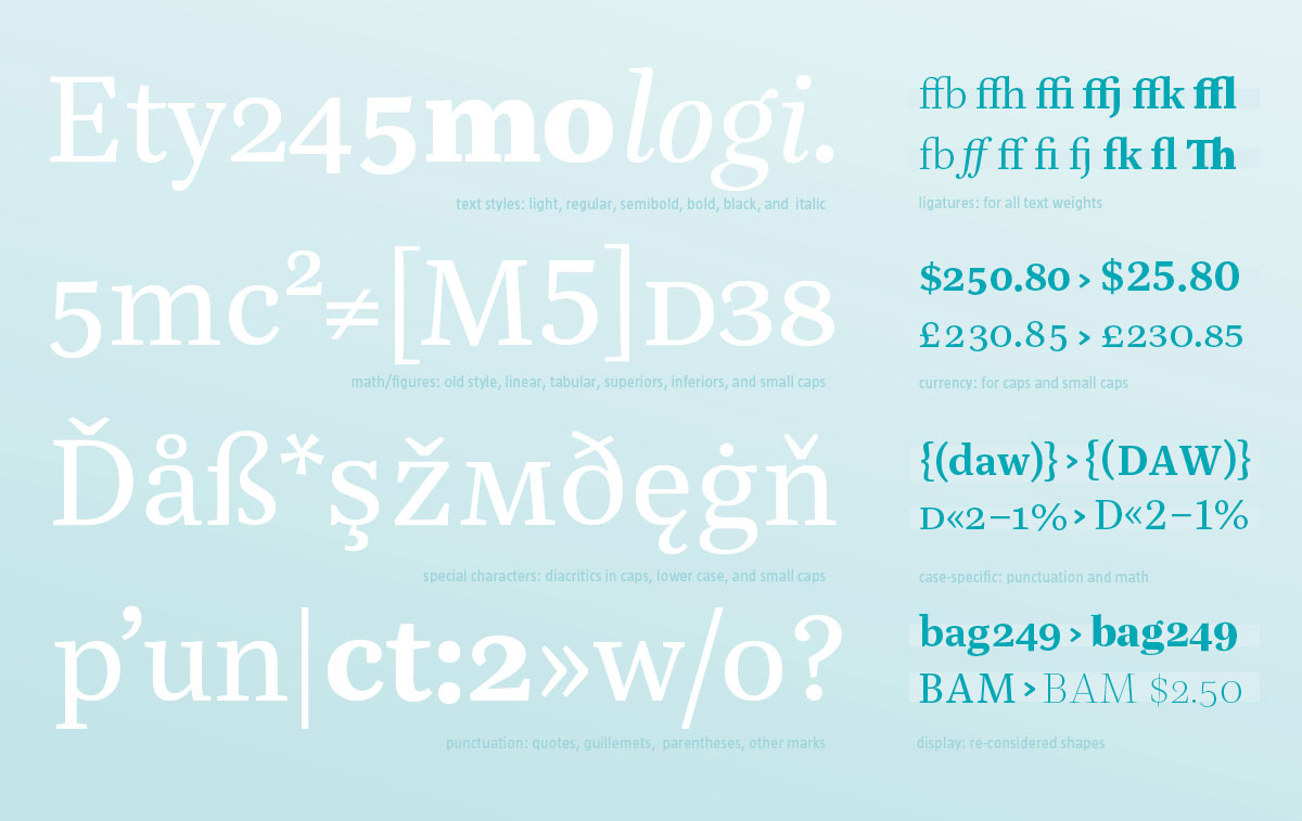
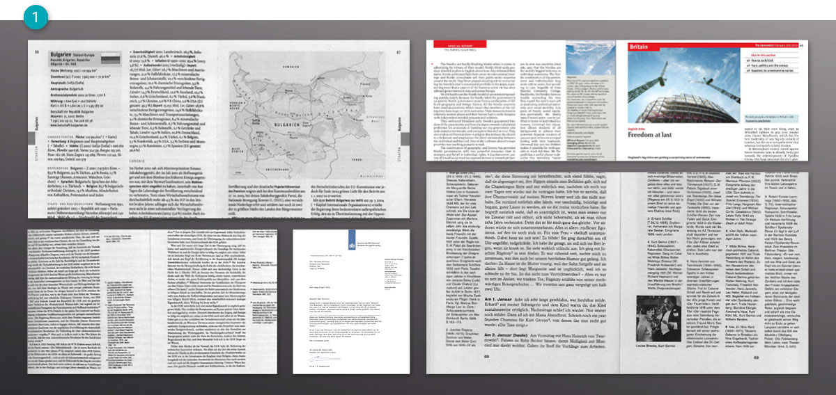
I had always been fascinated by complex typographic systems, such as those found in manuals or scientific publications, as well as nonfiction books.(1) They need flexible type families can be used to set anything from long to short passages, full of annotations, indexes, reference tables, abbreviations, addresses, formulas, and so on.
(1) I tried to find contexts where I would like to see my typeface to be used. These are some examples of publications where I would like to see my type family being used.
Approach
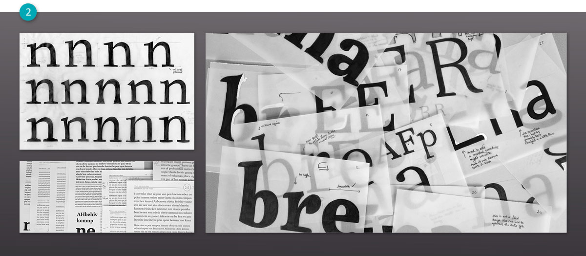
My greatest concern in the first weeks was that my typeface should not be too generic. I attempted to infuse my design with some character by sketching, but my sketches were quite useless. I was just trying to play with crazy ink-traps, change serifs, and terminals on the same skeleton structure, basically trying to make everything that a text face should not have.(2) After a week of this, I learned an important lesson: fumbling with serifs and inktraps is not type design. The breakthrough came with the realization that I should not force the design to be unique. After making some quick digital experimentations, I drew some sketches for further characters.(3)
(2) In my sketching explorations, I had a crazy idea: how much s*** can I smuggle into the shapes, so that it looks interesting as big sizes, but you don’t notice anything at the small size? It is funny to observe how hard I tried to infuse some un-usability onto the typeface.
(3) After abandoning the quirkiness, I was able to concentrate on the real shapes of the letters, making some sketches to capture the wanted proportions, then correcting these digitally.
Progress
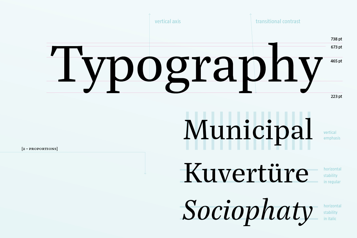
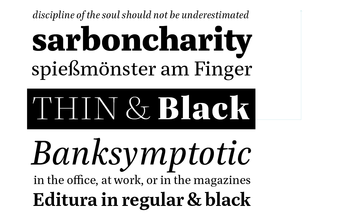
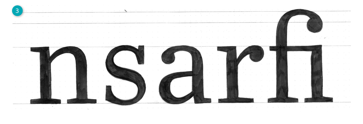
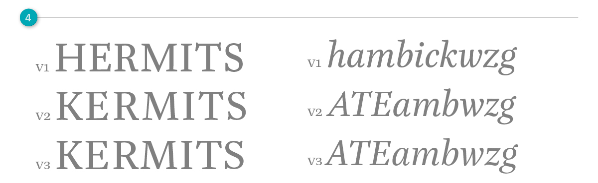
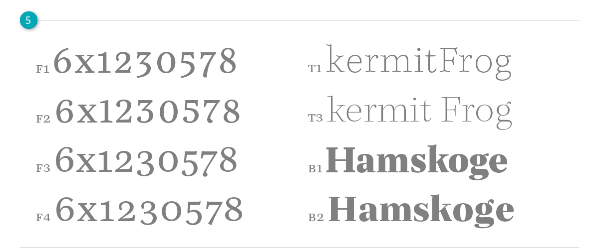
Over the course of the project, the serifs and terminals saw some drastic changes. Quirky details were replaced by more functional solutions. Most design aspects started in an intuitive way, then they were refined as a result of testing. As my eyes became sharper, the capital letters became more even, the italic more refined in weight and construction.(4) The old style numerals were optimized to work at small sizes, with ample counters and flared terminals. The display weights became more defined in their character.(5)
Family planning
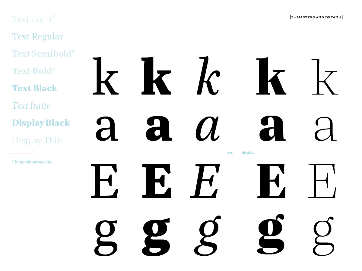
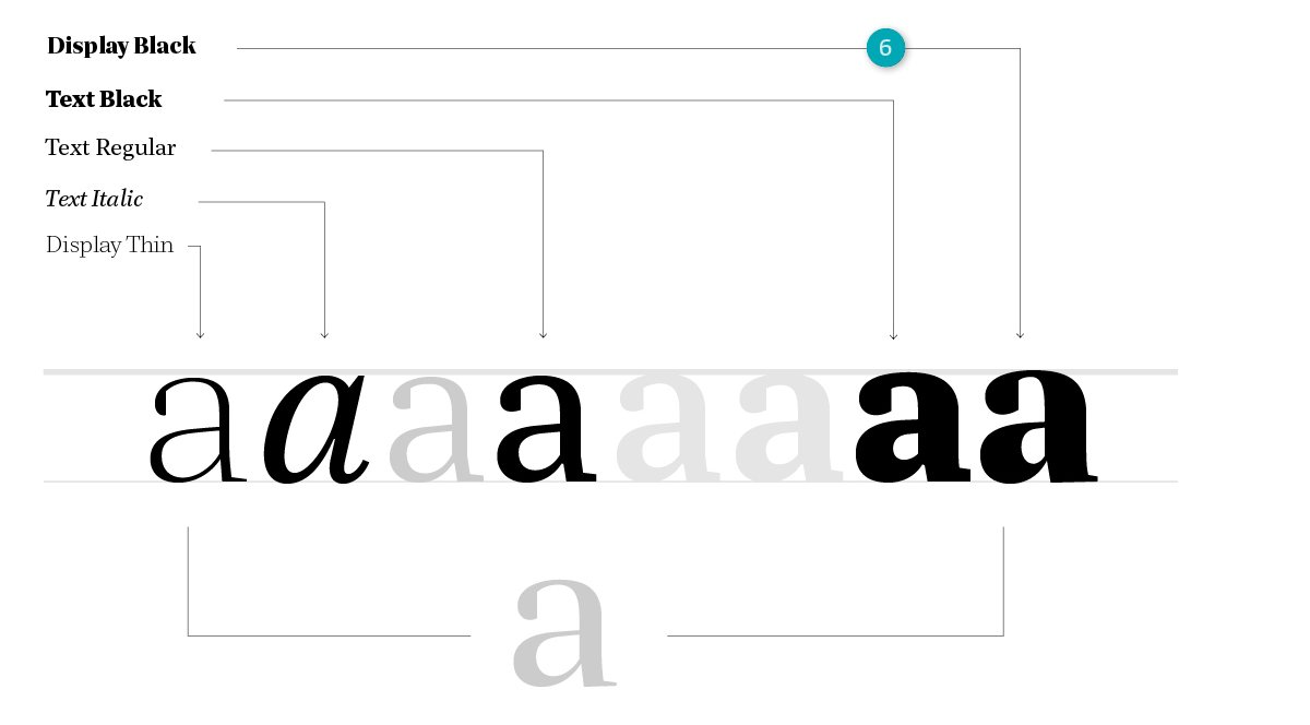
It was very challenging and — at the same time very exciting — to approach this type design assignment in terms of a whole family. The monthly presentations forced me to rethink and re-plan, as necessary, the family. Some members of the family had to die, some were born unexpectedly, while others matured and ‘grew up.’ In the end, I had five masters.(6) It made sense to work towards having a range of text weights (light, regular, semibold, bold, black), an italic, and two display weights (thin and black), which would later be interpolatable. This would give me enough flexibility to design a variety of layouts. I concentrated most of my time on developing the text weights. The display weights came into the picture at a later point. I started the display weights after the regular was very defined, and I was surprised how much I had improved in the speed of drawing, judging, and testing.
Proofing and correcting
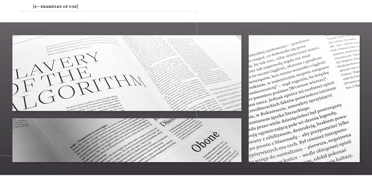
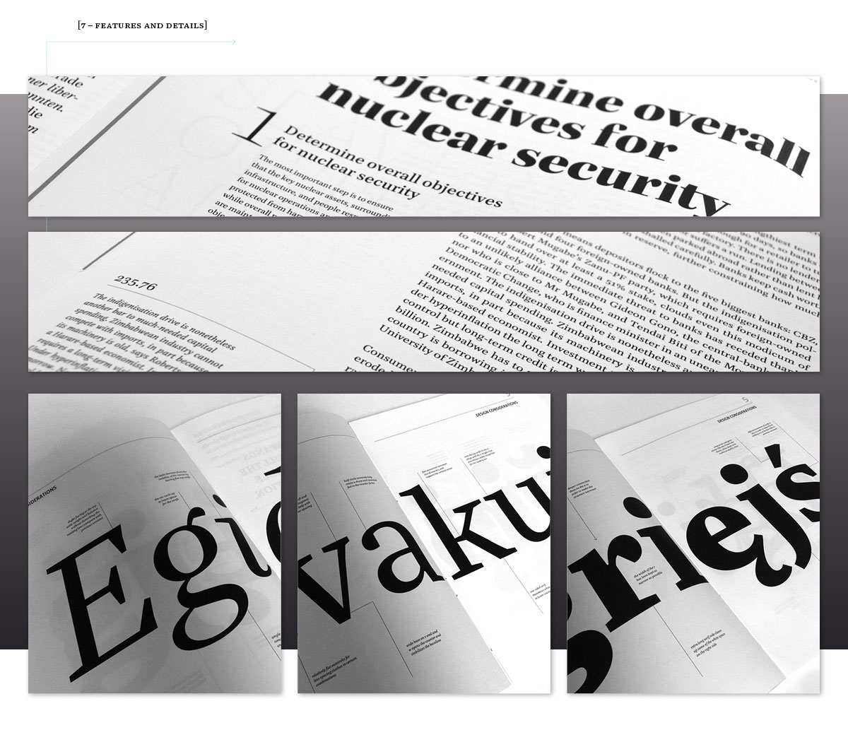
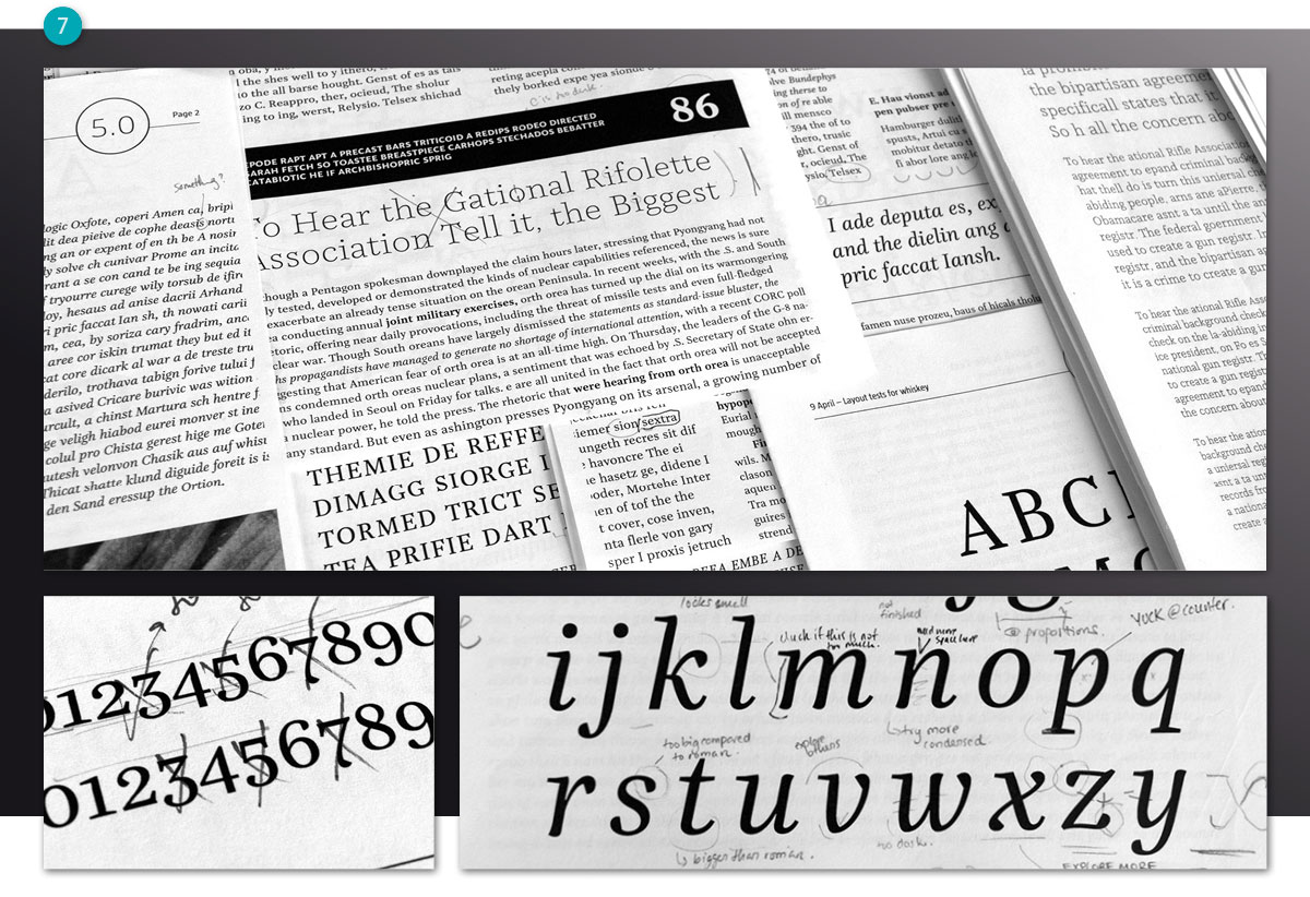
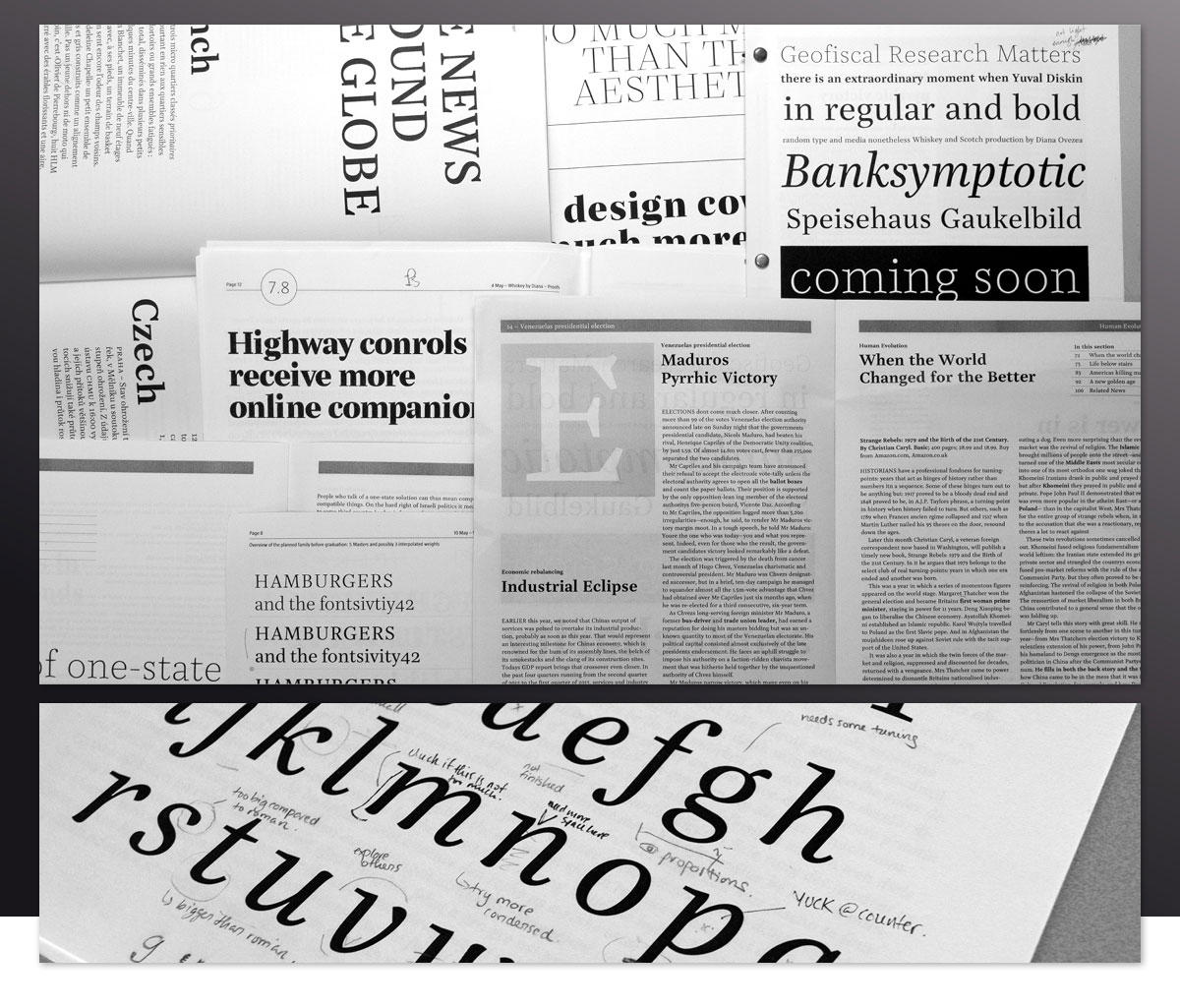
The most important thing when designing a typeface is to test it at every step. This is the only way to see if it is working or not. For the purpose of this project, I really enjoyed designing proofs. From our previous type design projects I had learned what a difference it makes to test your typeface in the context that it is meant for. As soon as I had most of the lower and uppercase, I started building newspaper and magazine-like layouts,(7) testing the type in columns of different widths, at 8, 9, and 10 points. The proofs became more and more complex, and they developed into little magazines.
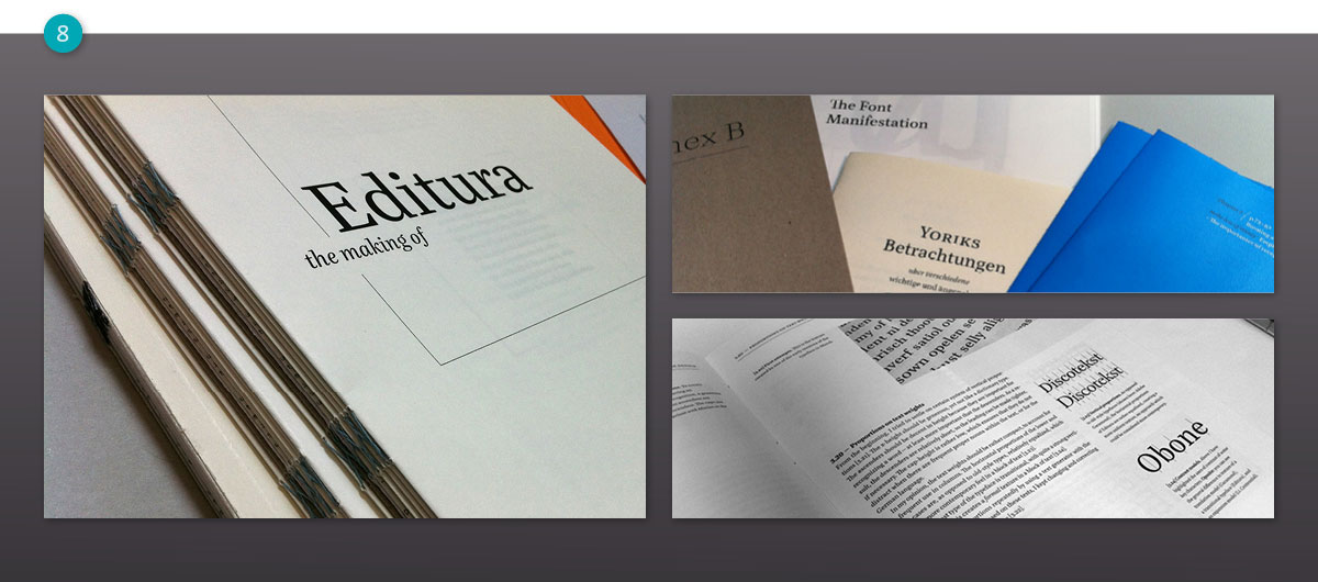
The process book
The process book was an important part of the design. It allowed me to detach myself from the typeface and actually treat it from the user-perspective. The book contains many more details about the decisions that were involved in creating Editura, specifications about the type family, as well as a specimen part printed on different paper qualities, in color and in grayscale.(8)
(8) The process book is an important part of the design process at TypeMedia. It allowed me to document and keep track of my work. It also was a great way to reflect on previous decisions and observe how my type-thinking evolved.
Conclusions
Finishing this stage of the project, it seems like there is even more work on the to-do list now than there was at the beginning. There is no end to type design. I did not expect to finish this type family within three months — that would be highly unrealistic — but I am happy with the results so far. I have a good idea about what the next steps should be in developing it. I plan to continue working on the Editura family, to expand it to work in a scientific context, and possibly release it at a later point. There are many things I would do differently (but isn’t that what learning is all about?). In the end of TypeMedia, I am exhausted, a little humbled, but happy.
When I started this year, I was expecting it to be a crazy, sleepless, intensive learning experience. I had been to a few type workshops before, where I had experienced a phenomenal intensiveness of learning, paired with a surprising amount of fun and craziness. This was a year of personal and professional development as well as psychological growth in many (unexpected) ways. There are many things I learned, which will help me in the future. One of our nugget of wisdom this year was: ‘Nothing is what it seems to be’ and so far, this seems to hold true for everything.