Inspiration
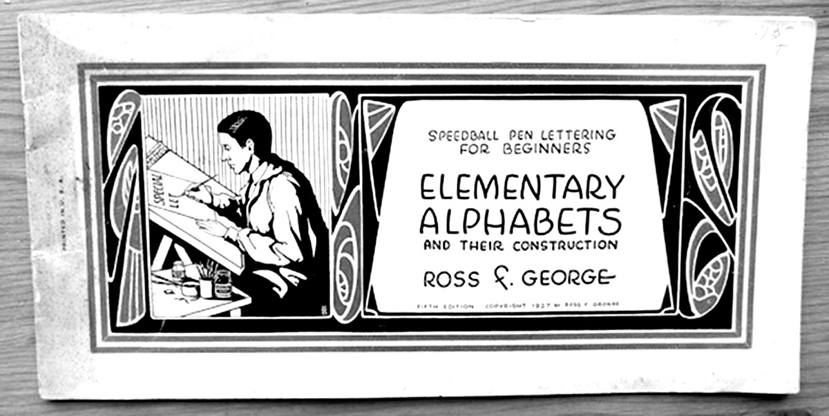
The typeface is inspired by the speedball D-series. The D-series are ball shaped nibs developed by the American sign painter Ross Frederic George. Inspiration came from looking at speedball catalogues(1,2) and showcard lettering as well as a type cooker(3) recipe that initially introduced me to the speedball tool.
(1,2) Speedball catalogue Elementary Alphabets and their construction. Ross F. George
(3) Typecooker recipe used for 1 semester assignment from typecooker.com
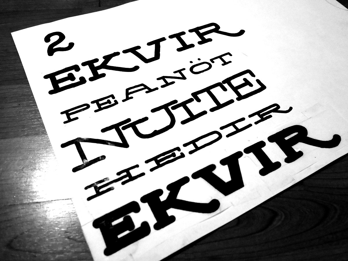
Using the speedball tool without any direction at this point. I had not decided if it would be a sans or serif typeface, a connected script or an unconnected roman. At this point it was more important for me to explore the tool, playing with different aesthetics and trying different sizes of the nib. Some of the initial ideas and sketches started as a heavy slab serif with some very extended proportions.
From drawing and writing to digital
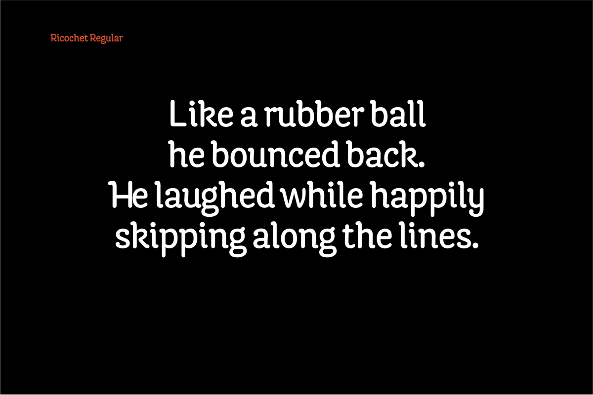
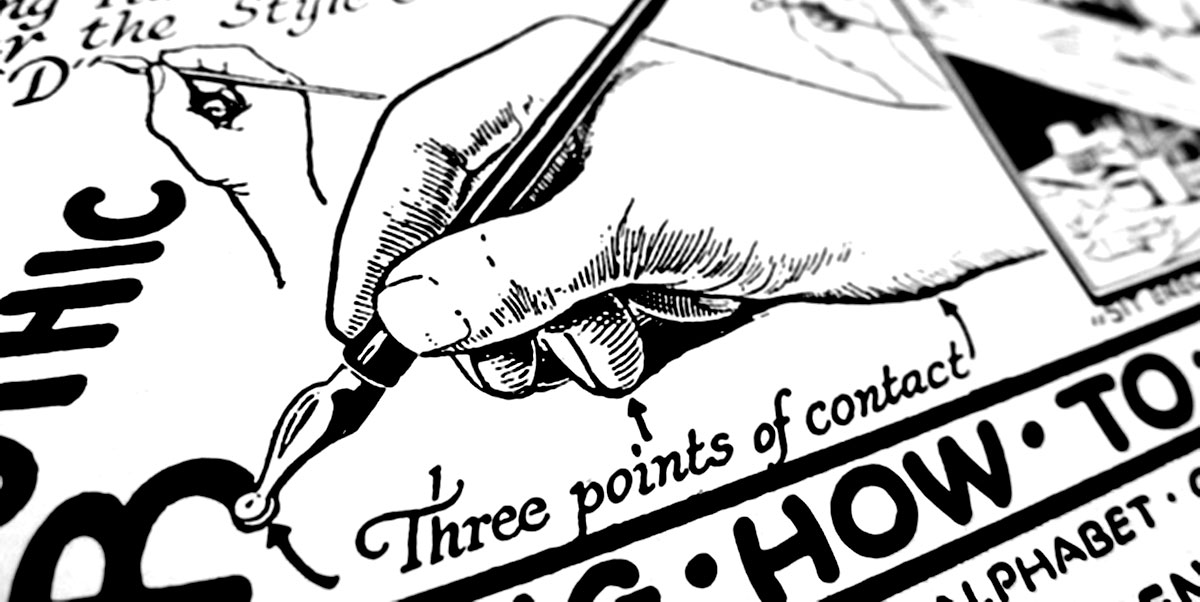
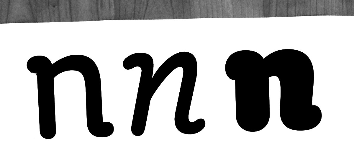
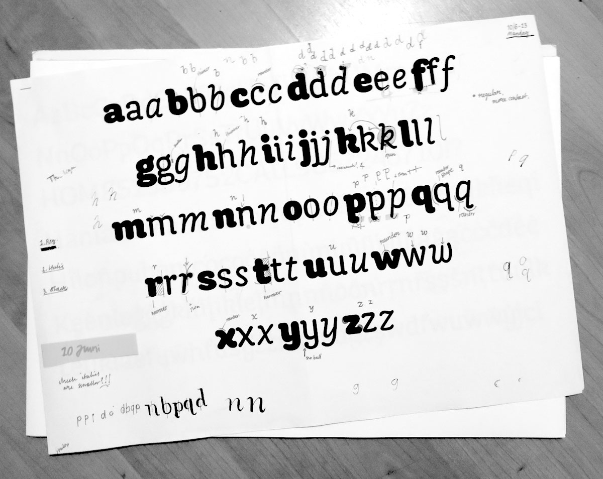
When going from sketching and writing to working digital the illustrative feeling and some of the qualities that the sketches had were stripped down and the limitations of the tool became more obvious. The speedball tool itself creates a monoline look with no contrast, but seemed as it is a tool for handwriting and lettering. The texture of the ink and amount will create details and variation in stroke.The start of a stroke usually gives a heavier blob of ink and in the joints of for example the letter n it creates dark spots. When writing with the tool there were no optical adjustments, but when going from sketching to working digital the problems with the speedball tool became more clear and had to be solved. It was a difficult task for me to find the balance between being fully dictated by the tool, and using the tool as a starting point and for guidance.
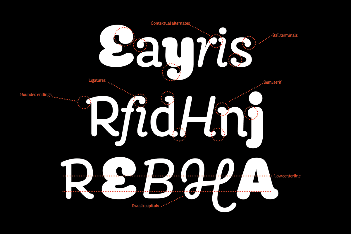
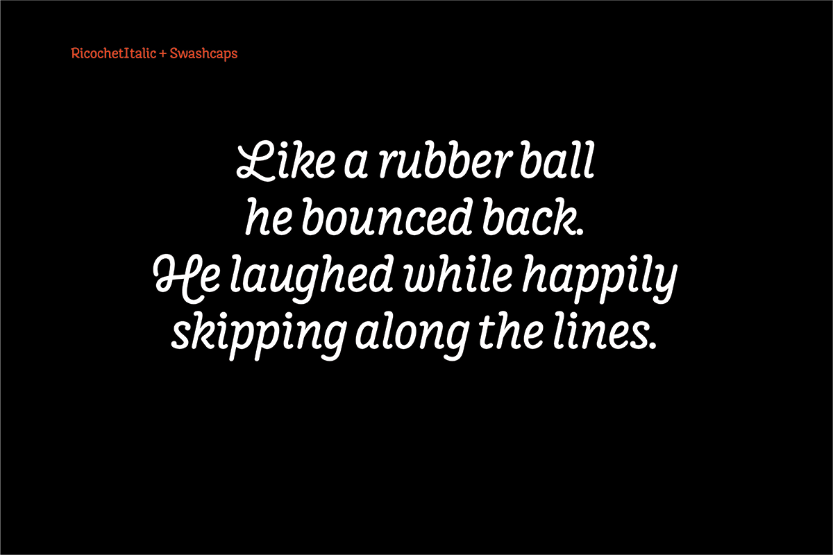
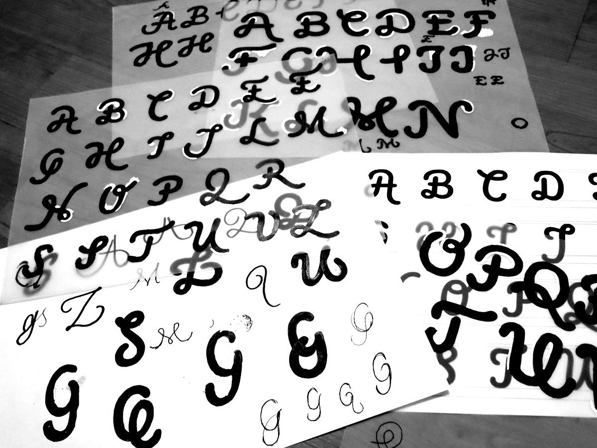
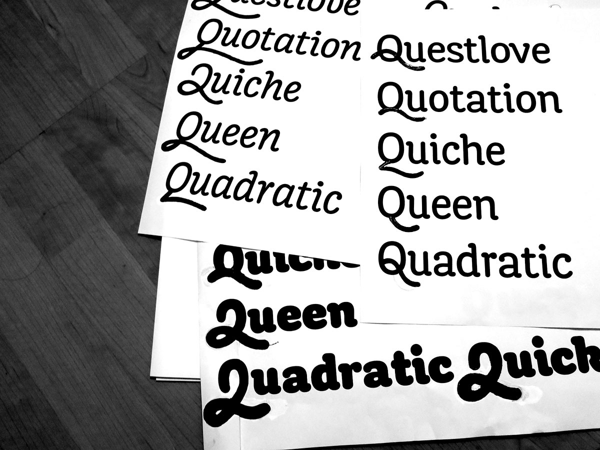
Taking inspiration in italic forms without the slant in the roman also lead to drawing a set of swash caps to accompany the italic. The constructed feeling and abrupt shapes in the early sketches lacked the more fluid shape and feeling I wanted and the construction naturally evolved into a semi serif as I wanted to imitate some of the flavor of the less predictable hand lettered style.
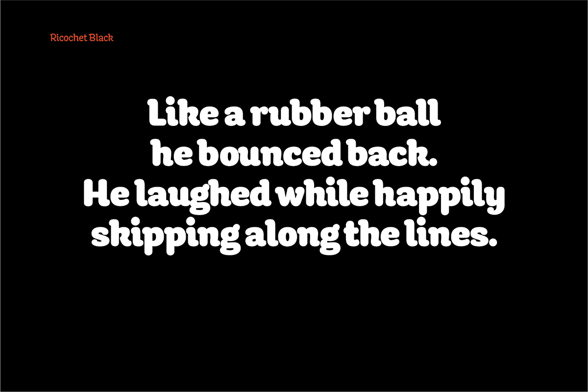
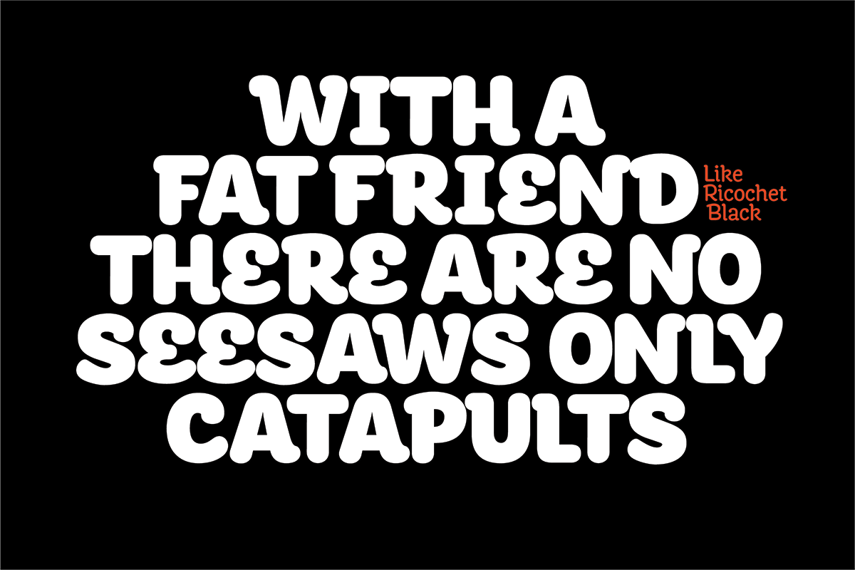
I wanted to have a heavy weight, and to gain the experience to work with an extreme, so I decided to make the third family member of the typefamily a Black style. Working with the three styles helped in the decision making as certain details had to be drawn in a way that they would cohere in all the three styles.
The experiences I have gained and the amount of new things I have learned during Type and Media are overwhelming. The learning curve has been steep, but small triumphs along the way like learning to be able to make corrections based on my own gained knowledge, seeing the project evolving and improving have been both rewarding and motivating. During the time working on the final project I can now see what I wished I had done differently and use these experiences while continuing to work on the typeface. From the final project I do feel that I am much better equipped and feel more confident to keep on working on and adding members to the Ricochet family in the future.